A kanban is a key visualization component in Quick BI designed to display critical data and performance metrics at a glance. Presenting core metrics in a clear card format helps you quickly understand your business status, identify issues, and develop timely responses. It is ideal for scenarios that require real-time monitoring of Key Performance Indicators (KPIs) or precise readings of one or more measure values within a specific dimension.
Overview
Use cases
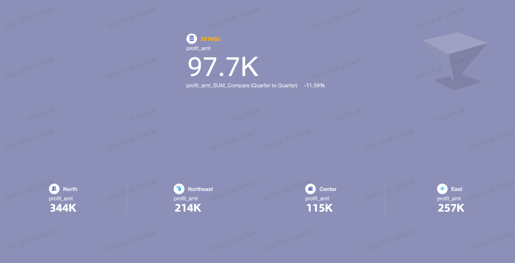
A kanban is often used to display one or more measures for a single dimension, especially in scenarios that require precise readings for specific metrics.
Benefits
Calculation capabilities: Configure advanced calculations, such as year-over-year (YoY) and month-over-month (MoM) comparison.
Visualization: Customize the visual appearance with logos, custom backgrounds, and adjustable font sizes and colors.
Interactivity: Add custom text or metric annotations and configure hyperlinks to external paths, enabling interaction between your data and other systems.
Example
Limitations
Prerequisites
Data modeling: You must have completed data modeling in advance. The dataset you use must contain a date-type dimension field with day-level granularity, such as
Order Date(day).Dashboard creation: You must have created a dashboard. For more information, see Create a dashboard.
Field configuration limits
A kanban consists of Labels (Dim.) and Metrics (Mea.):
The Labels (Dim.) area accepts one dimension, such as
region.The Metrics (Mea.) area accepts from 1 to 20 measures, such as
order_quantityandorder_amount.
Procedure
Configure chart data
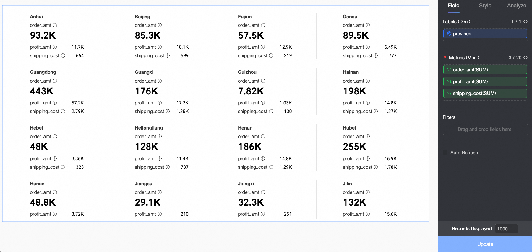
On the Fields tab, select the required dimension and measure fields:
From the Dimensions list, find
province, and then double-click it or drag it to the Labels (Dim.) area.From the Measures list, find
order_amount,shipping_cost, andprofit_amount, and then double-click or drag them to the Metrics (Mea.) area.
NoteIn the Metrics (Mea.) area, the first measure is the primary metric. To change the primary metric, you can reorder the measures in the Metrics (Mea.) area.
Click Update. The chart is automatically updated.
Configure chart style
This section describes how to configure the style of a kanban. For information about general chart style settings, see Configure the chart title area.

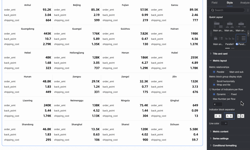
Quick layout
In the Quick Layout section, select a layout template for your chart. The first template is selected by default. During configuration, you can click the reset icon ( ) to restore the original layout style. This action does not affect content settings, such as text and colors.
Layout template | Example | |
primary-secondary template Distinguishes between a primary metric and secondary metrics. Use this template to highlight the performance of a specific key metric. | Primary-secondary 1 |
Note In the Metrics (Mea.) area, the first measure is the primary metric. All other measures are secondary metrics. |
Primary-secondary 2 |
| |
Primary-secondary 3 |
| |
Primary-secondary 4 |
| |
Primary-secondary 5 |
| |
Primary-secondary 6 |
| |
side-by-side template Treats all metrics equally. Use this template when you need to clearly display the performance of all metrics. | Side-by-side 1 |
|
Side-by-side 2 |
| |


Metric layout
In the Metric Layout section, configure the layout style of the metric blocks.

Parameter | Description |
Metric relationship | Options: Side-by-side and Primary-secondary.
|
Display format for metric block groups | Options: Horizontal scroll and Wrap and tile.
|
Number of metric block groups per row | Sets the number of metric block groups to display in each row. You can set different numbers for mobile and PC displays. Options: Adaptive or Fixed number.
|
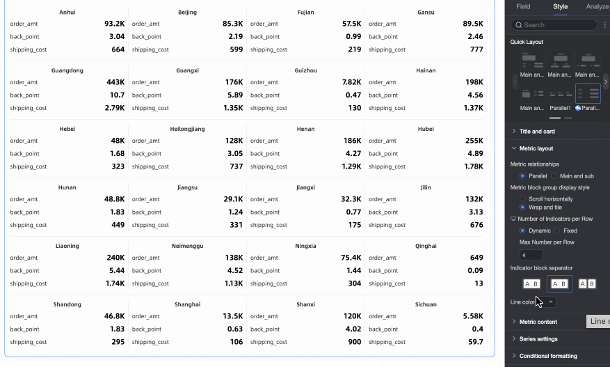
Metric block separation | Options: None, separator line, and background fill. If you select separator line, you can set the line color. If you select background fill, you can set the metric block's background color and spacing.
|


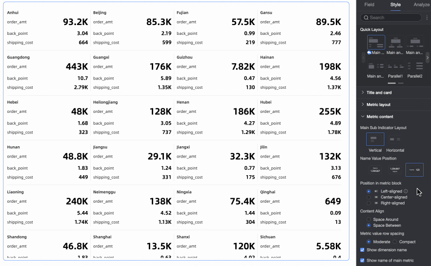
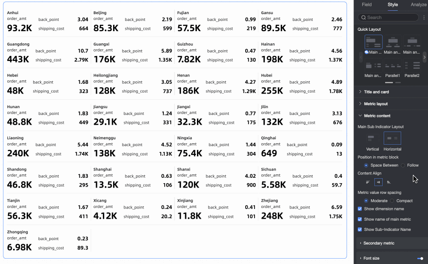
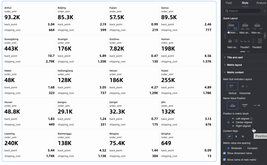
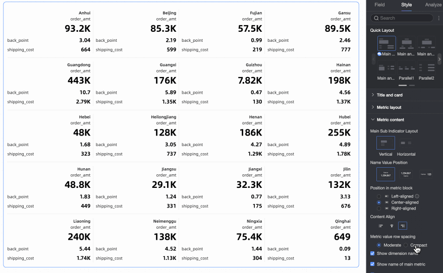
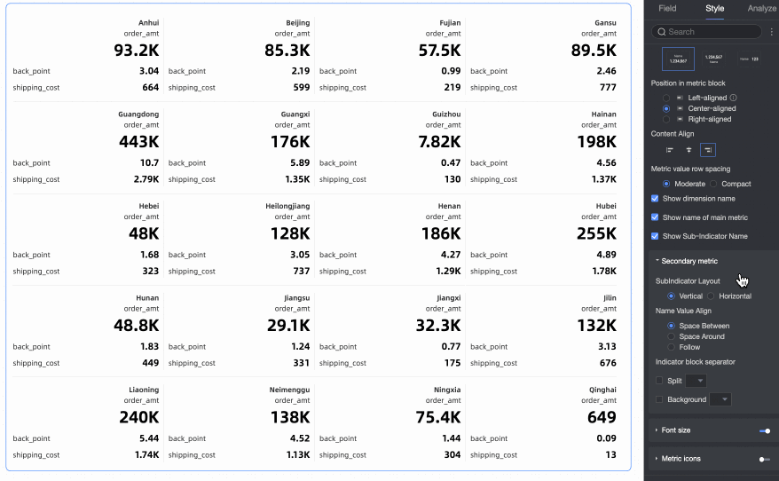
Metric content
In the Metric Content section, configure the content's position, display format, font style, and decoration style within a metric block.

Parameter | Description |
Metric layout | The available layout options depend on the selected layout template.
|
Name and value position | If Metric layout is set to Vertical, you can configure the layout position for dimension names and values. |
Content position within metric block | Sets the position of content within the metric block:
|
Content alignment | Sets the vertical alignment of text in the metric block. Options: Align top, Align middle, or Align bottom. |
Line spacing for metric values | Options: Moderate and Compact. |
Show dimension name | Specifies whether to show dimension names on the kanban. |
Show primary metric name | Specifies whether to show the primary metric name. This option is available only when you select a primary-secondary template. |
Show secondary metric name | Specifies whether to show secondary metric names. This option is available only when you select a primary-secondary template. |
Secondary metrics | When you use a primary-secondary template, you can configure the layout style for secondary metrics within the metric block. |
Font size settings | Specifies whether to enable font size settings. If enabled, you can configure the font styles for dimensions and their associated metrics. |
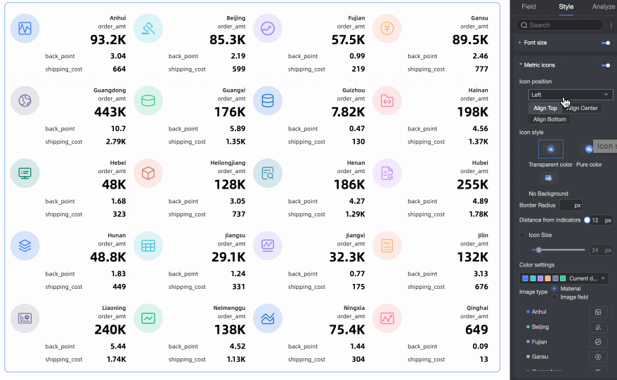
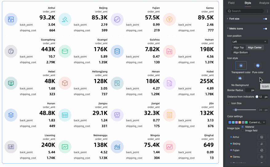
Metric decoration | Specifies whether to display a metric decoration. If enabled, you can configure its position, color scheme, type, and style.
|


 ). For more information, see
Series settings
In the Series Settings section, configure series-specific options and add prefixes or suffixes to data values.
Parameter | Description |
Select field | Select a measure that you added to the Metrics (Mea.) area. |
Prefix and suffix for metric data value | Sets a prefix and suffix for the metric data value.
|

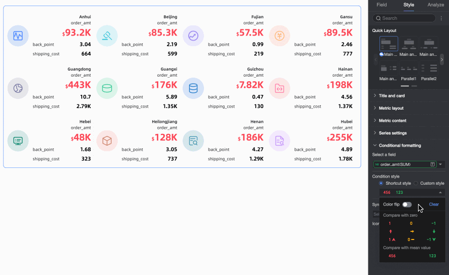
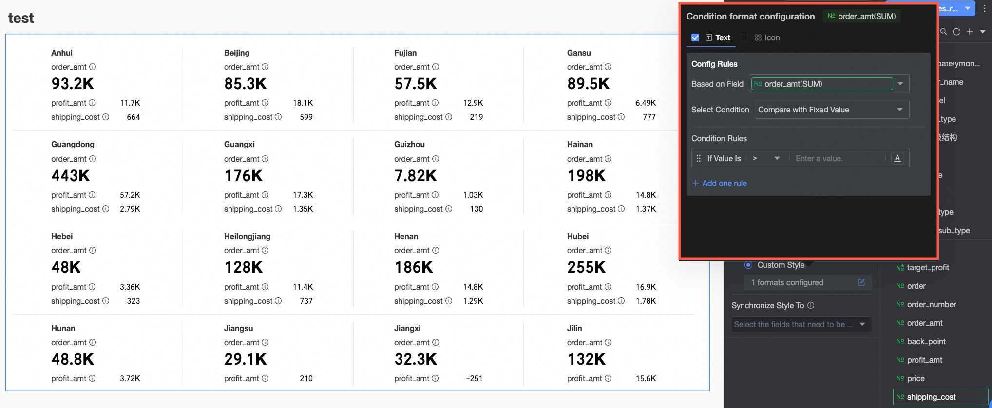
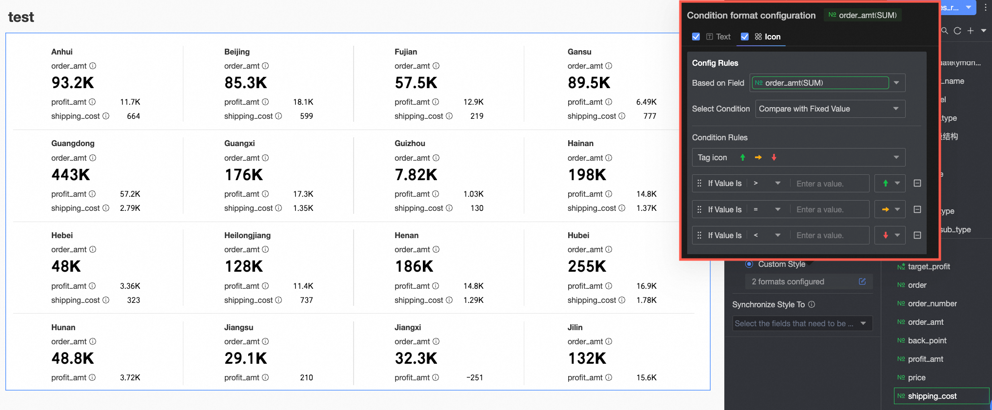
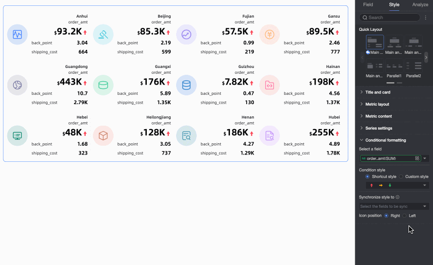
Conditional formatting
In the Conditional Formatting section, set conditional formatting rules for measure data.
Parameter | Description |
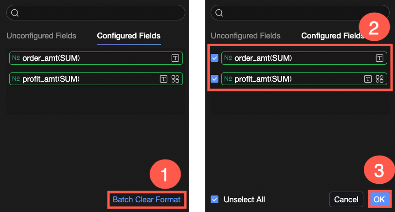
Select field | Select the field for which you want to configure conditional formatting. You can select any measure added to the Metrics (Mea.) area. After configuring styles, if you no longer need certain conditional formats, you can click Batch Clear Formats in the lower-right corner of the field panel. In the selection list, choose the formats to clear and click OK. |
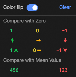
Quick style | Set the marker icon or font color for the current measure field from a predefined set of styles.
|
Custom style | In addition to the provided quick styles, you can configure custom styles for the current measure field as needed.
|
Apply style to | Applies the current conditional format to other metrics. |
Icon position | After configuring a style with an icon, you can set the icon's position. Options: Right and Left. |


Configure chart analysis
Setting | Parameter | Description |
Data interaction | linkage | If the data you need to analyze is in different charts, you can use chart linkage to connect multiple charts for interactive data analysis. For more information, see linkage. |
hyperlink | If the data you need to analyze is in multiple dashboards, you can use dashboard hyperlinks to connect them for analysis. A hyperlink can be a parameter hyperlink or an external link. For more information, see hyperlink. |
Next steps
To allow others to view the dashboard, you can share it with specific users. For more information, see Share a dashboard.
To create a complex report with a navigation menu for thematic analysis, you can integrate your dashboards into a Data Portal. For more information, see Create a PC Data Portal.
FAQ
1. What is the best use case for a kanban?
A: A kanban is best used for scenarios where you need a quick overview of core business metrics, such as displaying total sales, user count, or profit margin at the top of a dashboard. It is also suitable for clearly presenting multiple key metrics under a specific dimension, like different regions or product lines.
2. How to make a metric more prominent?
A: First, on the Fields tab, ensure the "Sales Amount" measure is the first field in the Metrics (Mea.) area, which makes it the primary metric. Then, on the Style tab, under Quick Layout, select a primary-secondary template. These templates typically make the primary metric more prominent, such as a larger font size or a more central position.
3. How to show trend arrows for metrics?
A: You can achieve this by configuring conditional formatting. Go to Style > Conditional Formatting and select your target metric field. Then, on the Custom Style section's Icon tab, set up your rules. For example, create one rule to display a green up-arrow icon when the metric is greater than 0, and another to display a red down-arrow icon when it is less than 0. You can use the system's built-in icons or upload your own.
4. What does the Labels (Dim.) field do?
A: The Labels (Dim.) field determines the dimension by which the metrics on the kanban are grouped. For instance, if you place the "Region" field here, the kanban will generate a set of metric cards for each region, or display metrics grouped by region within a single card. If you do not add a dimension, the kanban displays aggregated metrics for the entire dataset.
5. How to add units to metric values?
A: On the Style tab, go to the Series Settings section. In the Select field dropdown, select the measure to which you want to add a unit. Then, in the Prefix and suffix for metric data value settings, enter the desired unit (such as "million" or "%") into the Suffix input box.