Butterfly chart
A butterfly chart compares data across multiple categories that have a conversion relationship. For example, you can use a butterfly chart to compare metrics such as the migrant population percentage, employment rates, and commercial housing transaction volumes between two cities like Beijing and Shanghai. It displays both the data comparison for each metric and the hierarchical conversion stages of the items.
Prerequisites
You have created a dashboard. For more information, see Create a dashboard.
Limitations
A butterfly chart consists of Tier Area (Mea.) and Comparison Metrics (Dim.):
Comparison metrics use a single data dimension, such as region or product type.
The tier area uses data measures. You must select one to 10 measures, such as order quantity and order amount.
Chart overview
Use cases
A butterfly chart is used to compare business processes across different categories. By visualizing the data for each stage side-by-side, you can intuitively identify and pinpoint problem areas to inform decision-making.
A butterfly chart uses the area of its trapezoids to represent the business volume at each stage.
A butterfly chart displays a logical top-to-bottom sequence, showing how business goals are achieved for each category as the process progresses.
A butterfly chart is suitable for comparing conversions across related business processes, not unrelated ones.
Advantages
Calculation: Automatically calculates the conversion rate.
Visualization: Offers trapezoid and rectangle styles, and customizable labels.
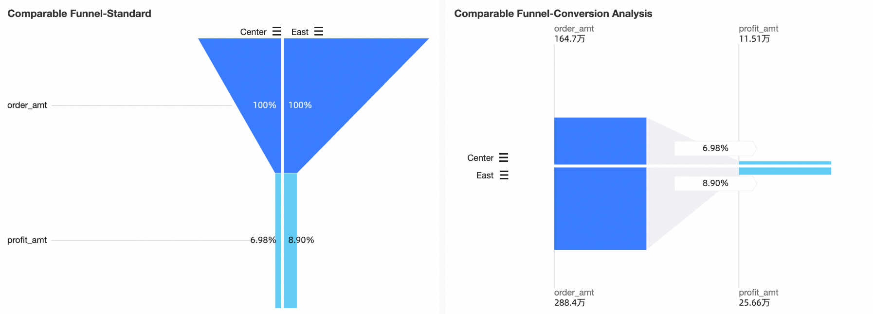
Example
Configure chart data
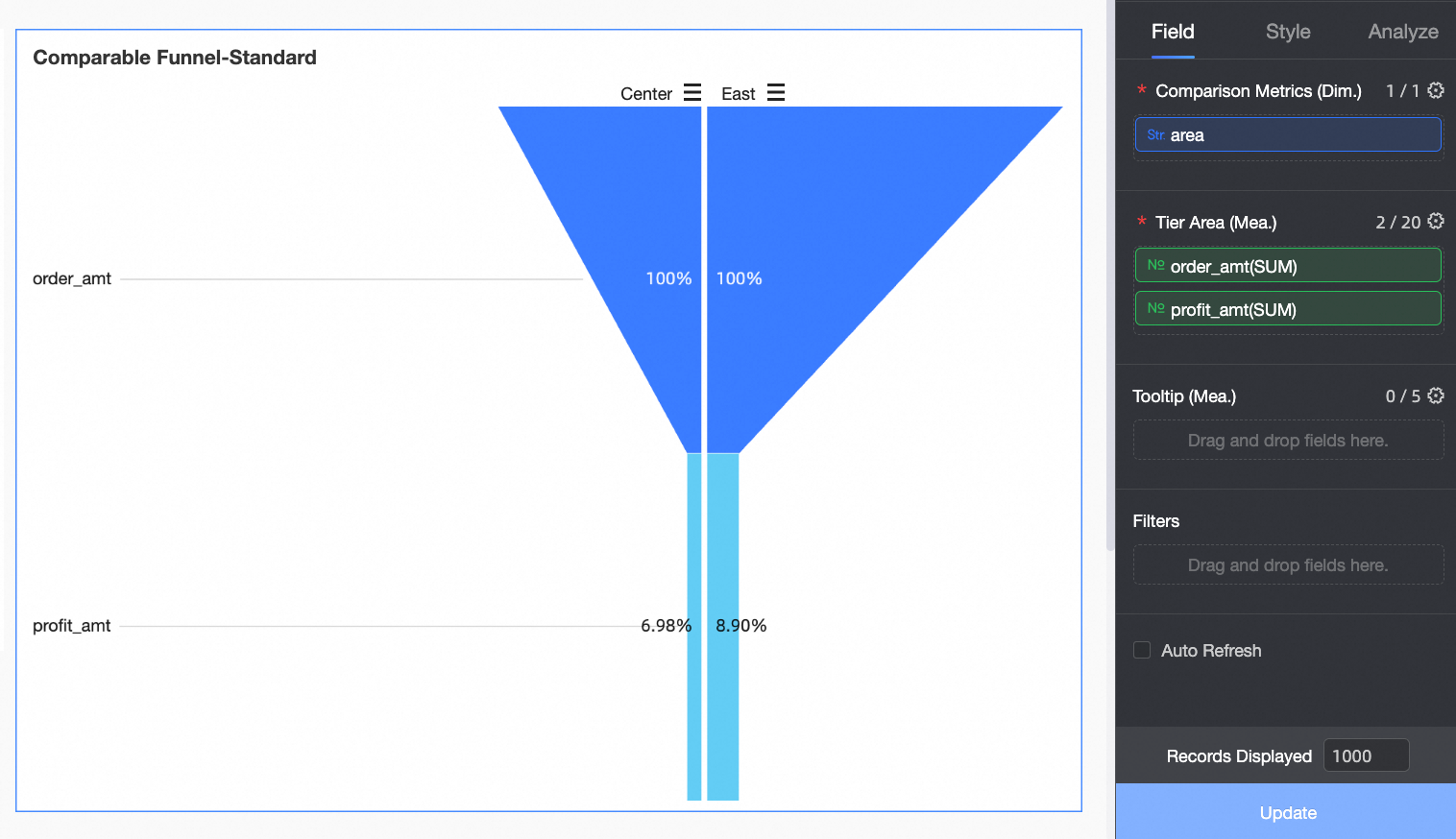
On the Data tab, select the required dimension and measure fields.
In the Dimensions list, find Region, then double-click or drag it to the Comparison Metrics (Dim.) field.
In the Measures list, find Order Amount and Profit Amount, then double-click or drag them sequentially to the Tier Area (Mea.) field.
Click Update. The chart updates automatically.
Configure chart styles
This section describes how to configure the styles for a butterfly chart. For information about configuring the chart title and card styles, see Configure a chart title section.
Funnel
You can set visual style to standard or conversion analysis.
When visual style is set to standard, it calculates the conversion rate as the percentage of data at each tier relative to the previous or first tier. The change in the trapezoid's slope visually represents data conversion. This style is ideal for scenarios where you need to clearly display the conversion at each stage of a business process, with a focus on observing the funnel as a whole.
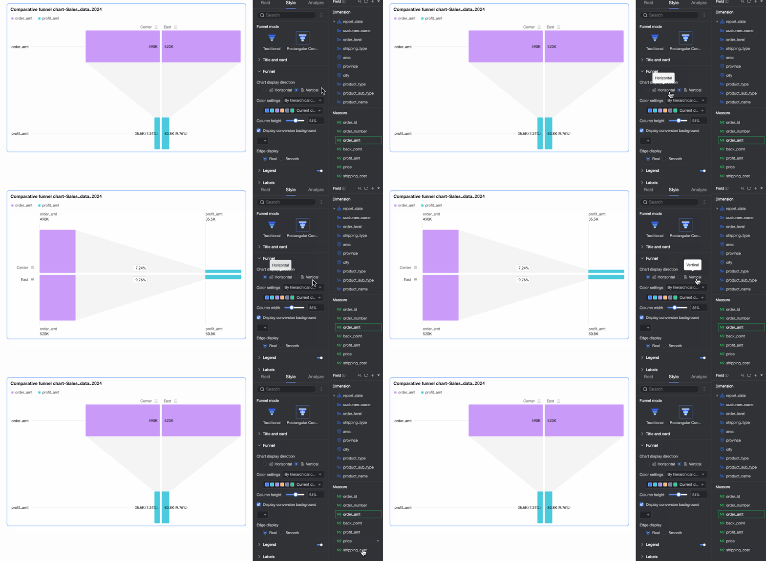
When visual style is set to conversion analysis, it calculates the conversion rate as the percentage of data at each tier relative to the previous tier. This style emphasizes the gap and specific conversion values between tiers, making it suitable for comparing conversion efficiency between adjacent stages.
Configuration options vary depending on the selected style.
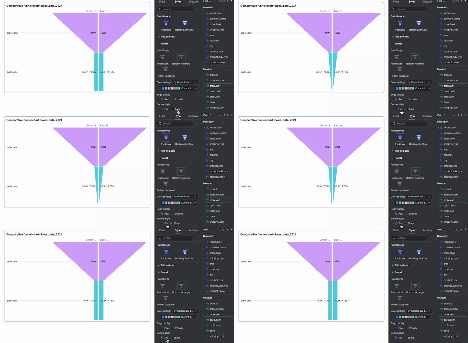
When visual style is set to standard, you can set Funnel Style to Basic, Bottom Rectangle, or Perfect Trapezoid.

Parameter
Description
Basic
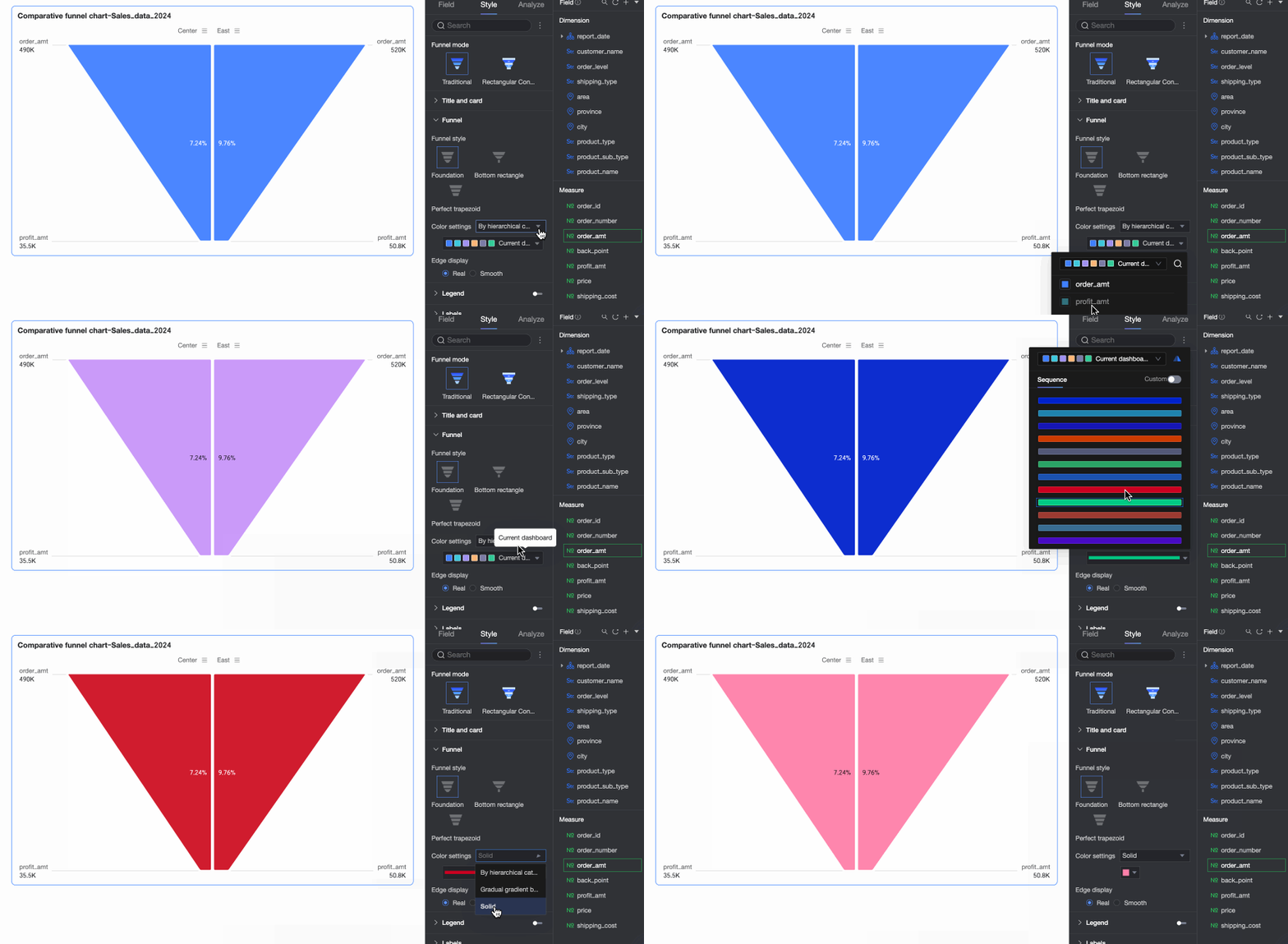
Color settings
Set the Funnel color. Color modes include By tier category, Tier gradient, and Monochrome. You can also customize the color swatches.
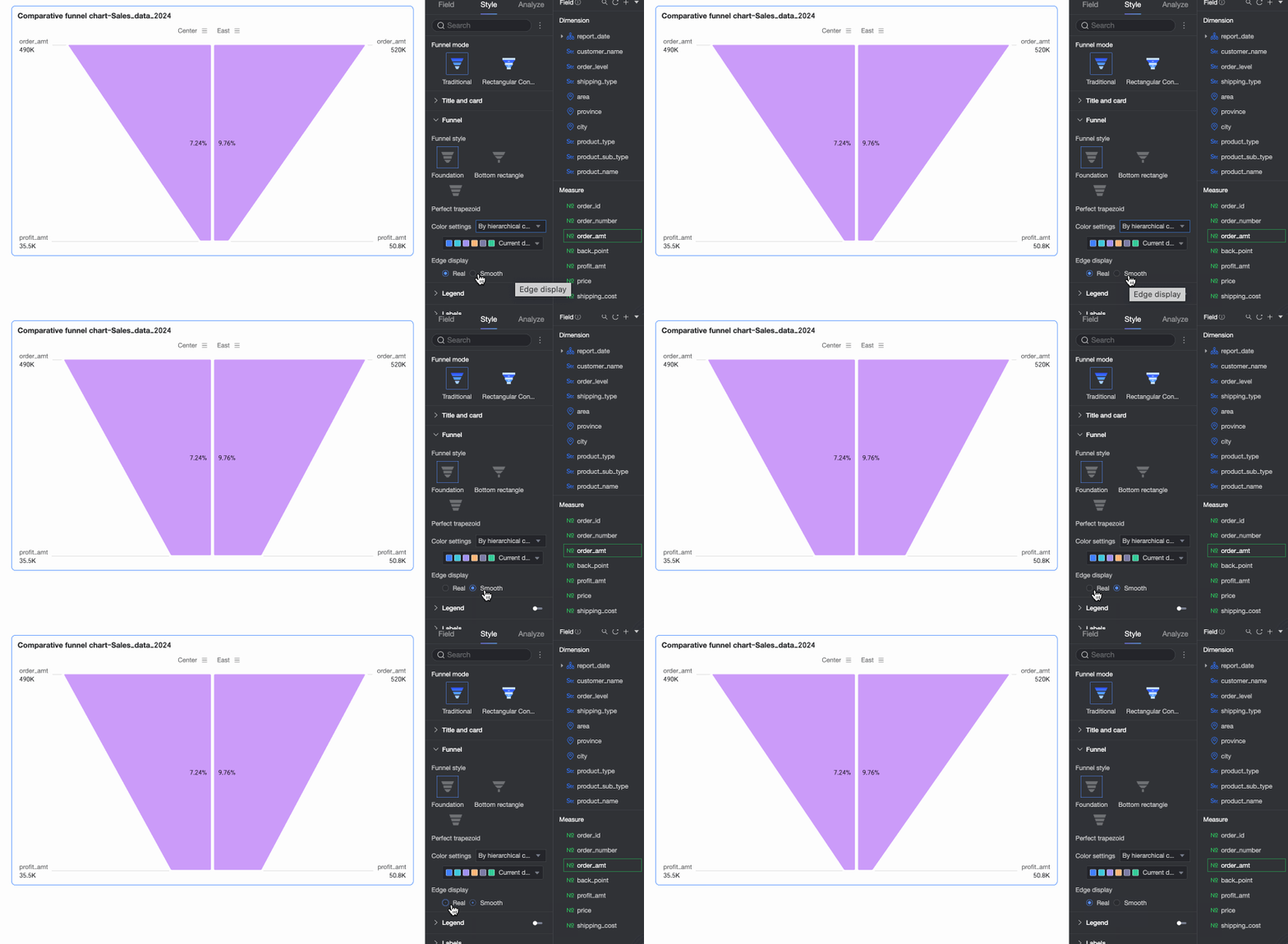
Edge display
Set the funnel edge to actual or smooth.

Bottom Rectangle
Color settings
Set the Funnel color. Color modes include By tier category, Tier gradient, and Monochrome. You can also customize the color swatches.
Edge display
Set the funnel edge to Actual or Smooth.
Bottom style
Set the bottom of the funnel to flat or pointed.
Perfect Trapezoid
Color settings
Set the Funnel color. Color modes include By tier category, Tier gradient, and Monochrome. You can also customize the color swatches.
When visual style is set to conversion analysis, the following options are available.
Parameter
Description
Chart display direction
When the Funnel Style is set to Bottom Aligned, you can set the chart display direction to Horizontal or Vertical.
Color settings
Set the Funnel color. Color modes include By tier category, Tier gradient, and Monochrome. You can also customize the color swatches.
Bar height
Set the width of the bars in the chart.
Show conversion background
Specify whether to show a background for the conversion area and customize its color.
Edge display
Set the funnel edge to Actual or Smooth.


Legend
In the legend section, toggle the switch  to show the legend and configure its Legend Position and Text Style.
Parameter | Description |
Position | Set the display position and alignment of the legend.
|
Text | Set the text style for the legend, including font color, size, weight, and whether it is italicized. |
Mobile legend | Legend settings for PC and mobile are independent. To configure the mobile legend, switch to the mobile editing view by using the PC/mobile toggle button ( |
 ) at the top of the dashboard edit page. You can then customize the legend's position and text style for mobile.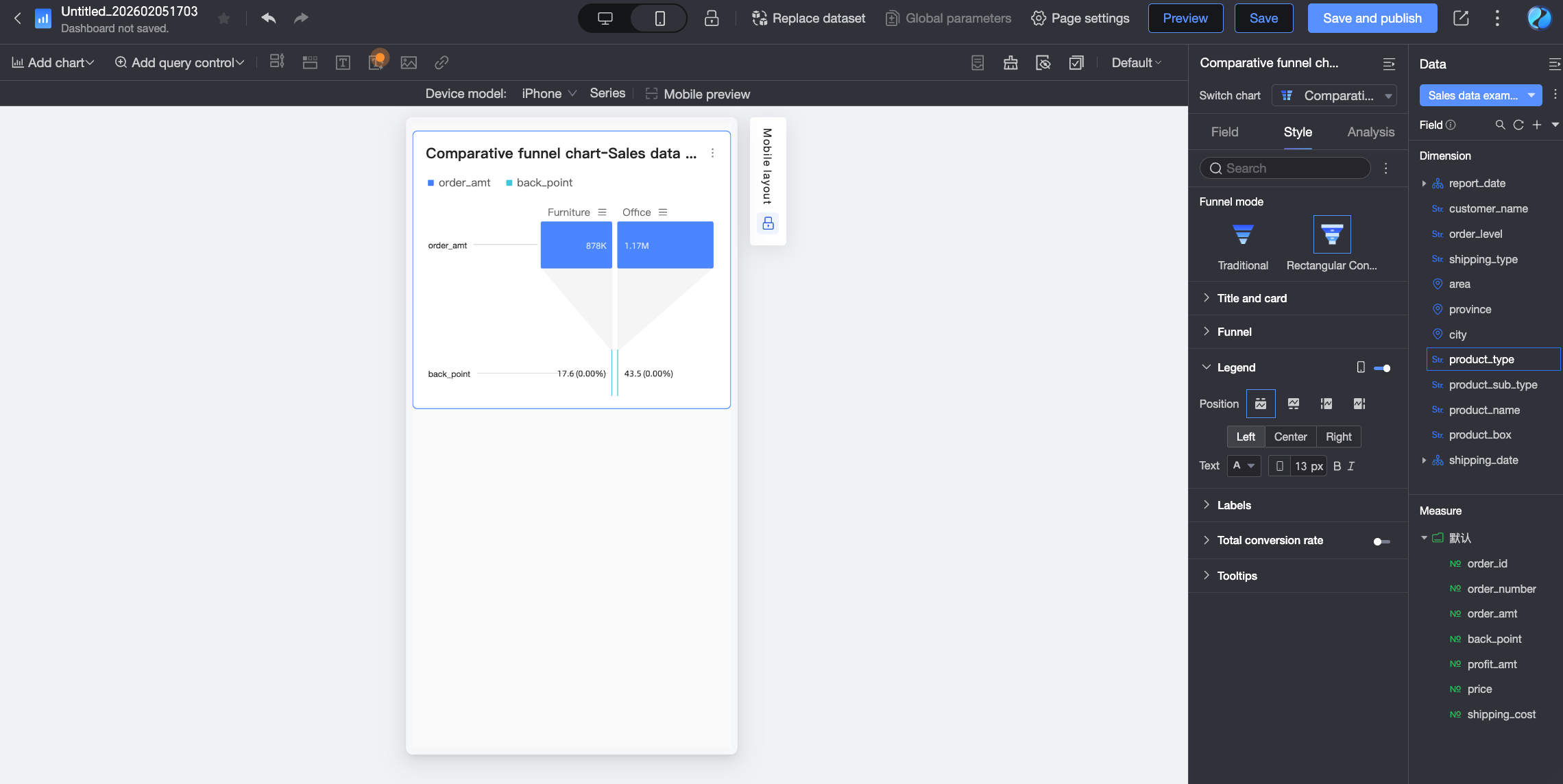
Label
In the label section, configure the labels to display on the chart and their styles.
Parameter | Description | |
Show all | Specifies whether to show all labels. If the chart contains a large amount of data, we recommend not selecting this option. In this case, the system displays a subset of data labels to keep the chart readable. | |
Category label | Position | Set the display position of the category label. |
Text | Set the text style for the category label. | |
Data label | Position | Set the display position of the data label. |
Text | Set the text style for the data label. | |
Conversion rate label | Conversion rate calculation method | Set the calculation method for the conversion rate. The formulas are as follows:
|
Arrow style | When the chart's display style is Perfect Trapezoid, you can set the style of the conversion rate arrow. | |
Show measure name | When the chart's display style is Perfect Trapezoid, this option lets you show the measure name on the label. | |
Show background | When the chart's display style is Perfect Trapezoid, you can customize the background color of the label. | |
Decimal places | Set the number of decimal places. | |
Text | Set the text style for the conversion rate label. | |

Overall conversion rate
In the Overall conversion rate section, toggle the switch to show the overall conversion rate, and then set its Position, Name, and Text Style.
Parameter | Description |
Position | Set the display position of the overall conversion rate. Options include Above or Top Left of the chart. |
Custom name | You can set a custom display name for the overall conversion rate based on your business needs. |
Decimal places | Set the number of decimal places for the conversion rate. |
Name | Set the text style for the name. |
Value | Set the text style for the value. |
Tooltip
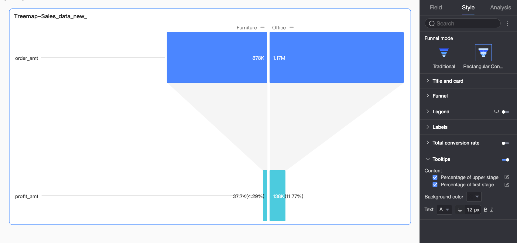
In the tooltip section, click the  icon to enable the tooltip and configure its style.
Parameter | Description |
Content | When the visual style is set to conversion analysis, you can choose whether to display percentage of the previous tier and percentage of the first tier in the tooltip. |
Background color | Set the background fill color for the tooltip box. |
Text | Set the text style for the tooltip, including font color, size, weight, and whether it is italicized. |
Mobile tooltip | Tooltip settings for PC and mobile are independent. To edit the tooltip for mobile devices, switch to the mobile editing view by using the PC/mobile toggle button ( |
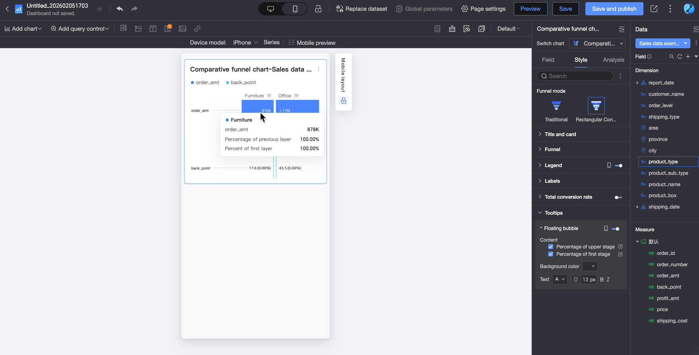
Chart analysis
Parameter | Description |
Filter interaction | When you need to analyze data from different charts, use filter interaction to link multiple charts for data analysis. For more information, see Filter Interaction. |
Hyperlink | When the data you need to analyze is in multiple dashboards, you can use hyperlinks to connect them for data analysis. Hyperlinking supports two methods: Parameter and external link. For more information, see Hyperlink. |
Next steps
To allow others to view the dashboard, you can share it with them. For more information, see Share a dashboard.
If you need to create a complex, thematic analysis with a navigation menu, you can integrate your created dashboards into a data portal. For more information, see Create a PC data portal.