A timeline chart dynamically displays events over time, such as key stages of enterprise development. Add data and configure styles to build your timeline visualization.
Prerequisites
A dashboard is created. Create a dashboard.
Overview
Benefits
Displays events at specific time points with customizable content.
Rendering example
Create a chart
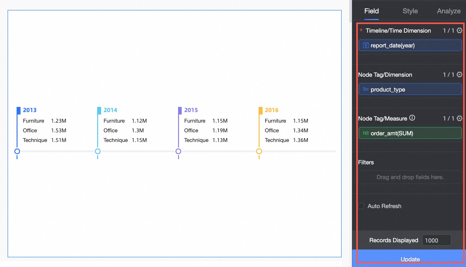
On the dashboard editing page, configure chart data as shown below.
The timeline supports multiple time dimension and node tag combinations. Configurations and renderings vary by combination.
Scenario | Procedure | Renderings |
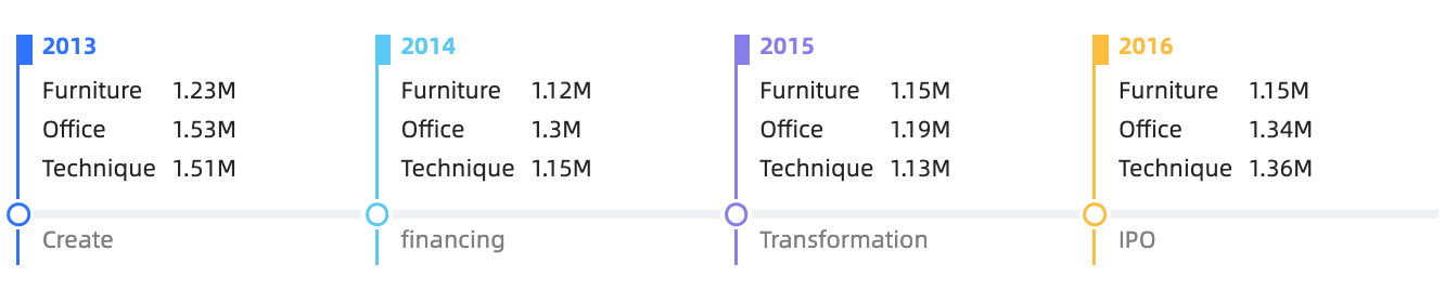
Use only the time dimension to statically display major events within a time range. Example: View events within a specified time interval. |
|
|
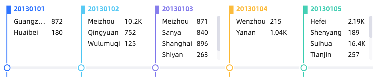
Use a time dimension and one non-time dimension to dynamically display events by category within a time interval. Example: View cities with order records within a time range. |
|
|
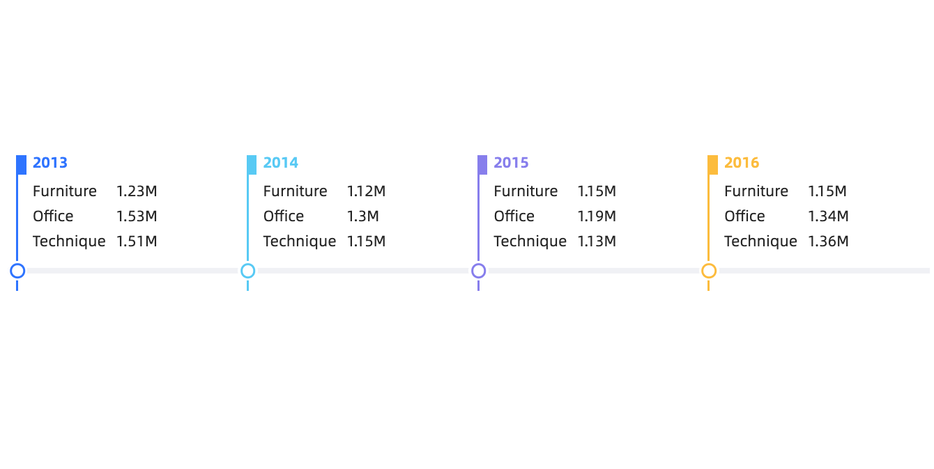
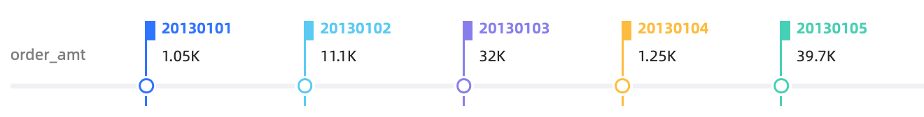
Use a time dimension and one measure to dynamically display changes in a single metric over time. Example: View the daily average order amount over a time period. |
|
|
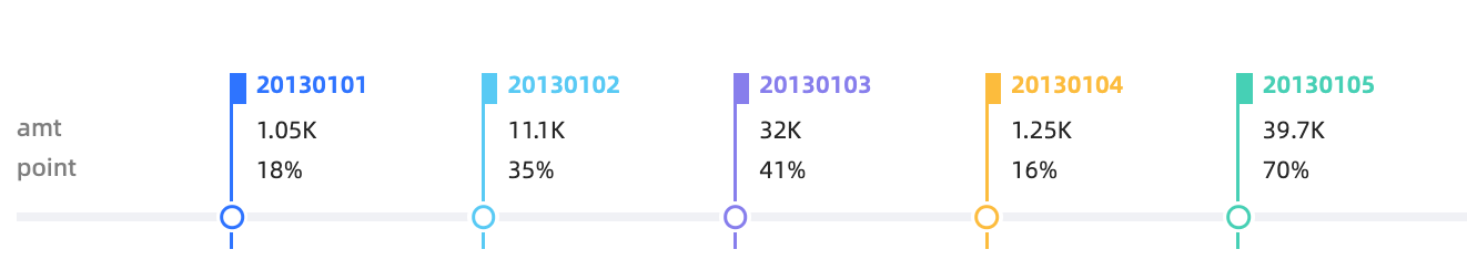
Use a time dimension and multiple measures to dynamically display changes in several metrics over time. Example: View changes in insurance order count and monthly fulfillment rate over time. |
|
|
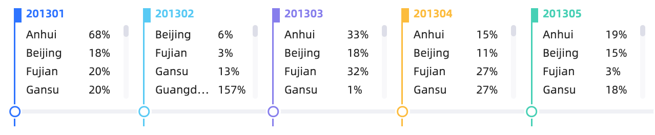
Use a time dimension, one non-time dimension, and one measure to dynamically display measure data broken down by dimension over time. Example: View the monthly achievement rate by province over time. |
|
|
Configure chart styles
Configure the styles of a timeline chart below. For common chart style settings, see Configure the chart title.
Enter a keyword in the search box to find configuration items. Click ![]() Expand /Collapse All Categories to expand or collapse sections.
Expand /Collapse All Categories to expand or collapse sections.
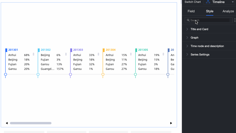
In the Graph section, configure time node color, visual style, and empty value auto-fill.

Chart configuration items
Description
Mark Time Node Color
Set the time node color.
Visual Style
Supports Time Granularity and Milestones.
node tag layout
Sets the layout of the node tag.
Staggered and Above Axis are supported.
NoteAvailable only when Timeline /Time Dimension is the only field specified in Field.
Empty Value Auto-fill Display
When the selected time in Timeline/Time Dimension is earlier than the current system time, the system auto-fills the gap.
NoteApplies only when Visual Style is set to Time Granularity.
In the Time Node and Description section, configure Style and Description Content.
Show time node icon: specifies whether to display or adjust the icon of the time node.
Mark Time Node: Specify the icon and event description for each time node.
In the Series Settings section, configure Series and Prefix and Suffix for Data Value.
NoteAvailable only when data is specified in node tag /Measures.
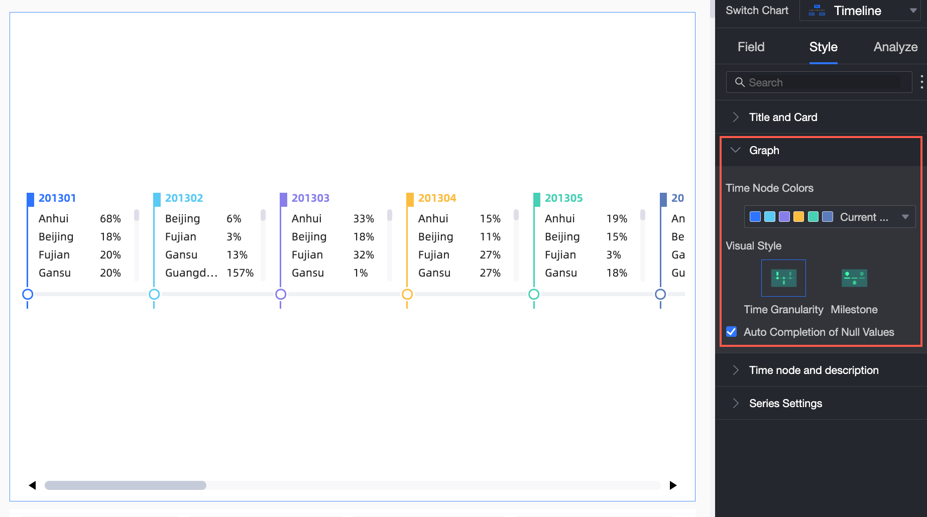
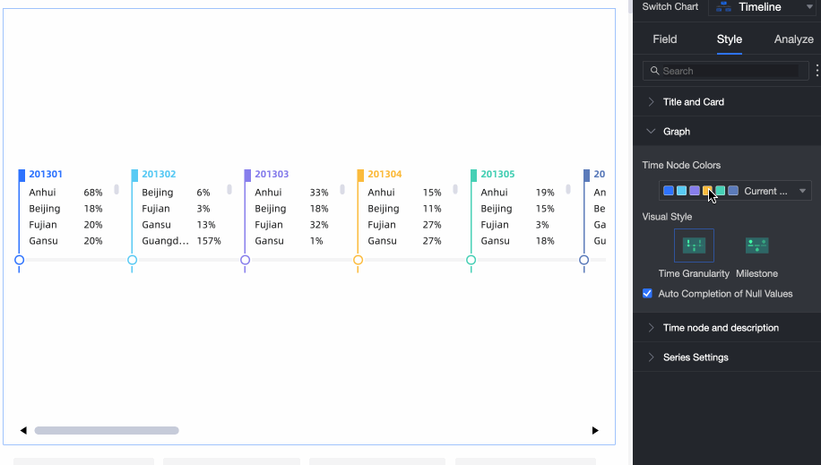
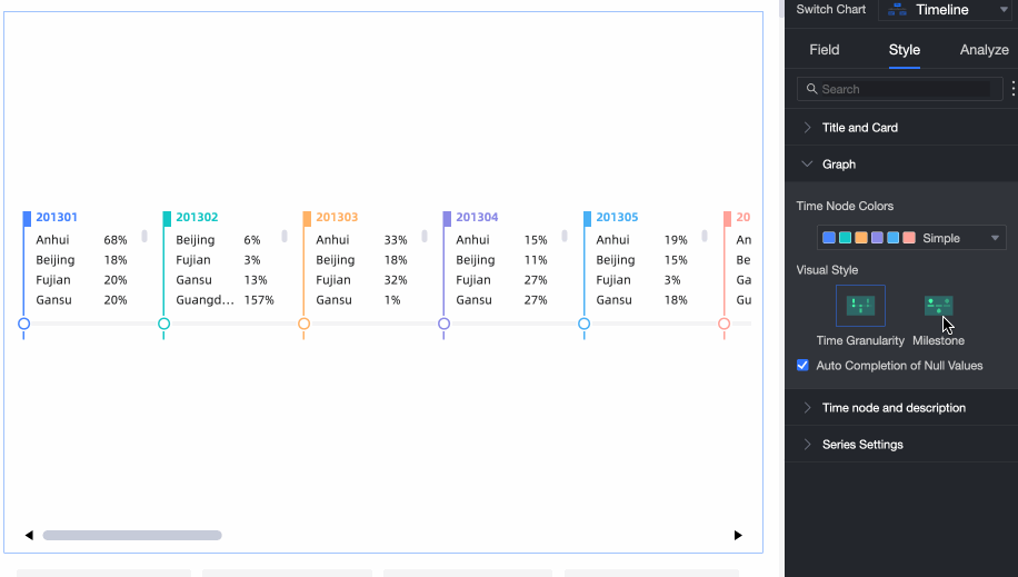
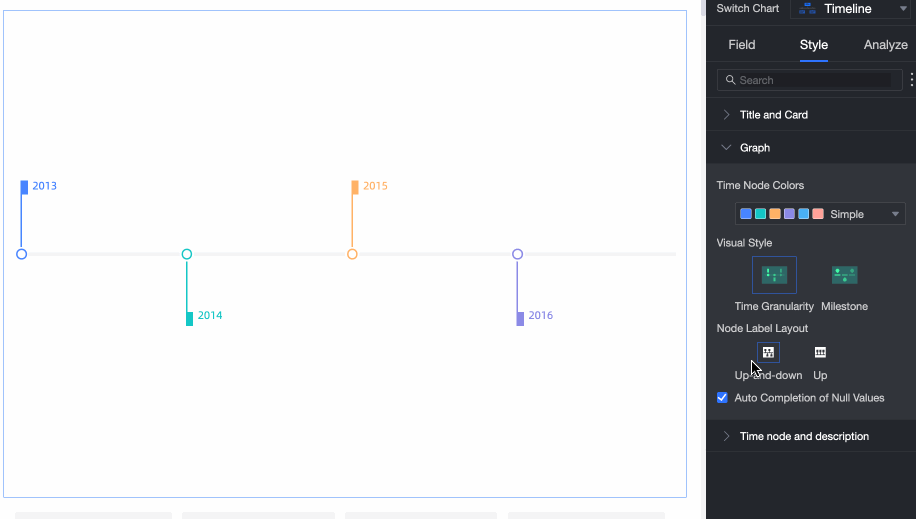
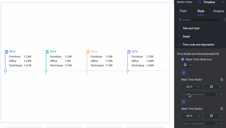
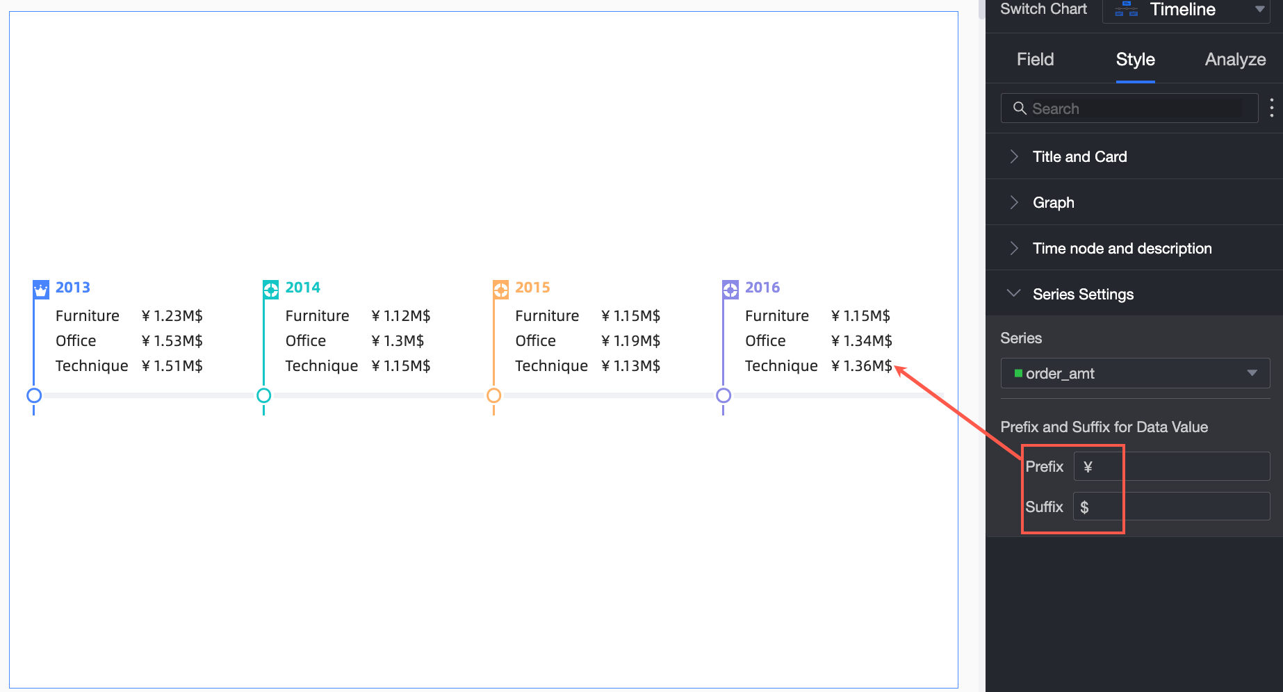
Chart analysis
Parameter | Event | Description |
Interaction analysis | Linkage | Associate charts and tables to analyze data across visualizations. Linkage, |
Limits
A timeline consists of Timeline /Time Dimension, node tag /Dimension, and node tag /Measure.
Only 1 date dimension can be selected for the timeline
Dimensions or metrics that node tag data:
When you select a dimension field, you can select a maximum of one dimension.
When you select a measure field, you can select a maximum of three measures.
After you select one node tag dimension, you can select only one more measure. By default, the calculation of the measure value within the specified date is split by dimension.
What to do next
Share your dashboard with others. Share a dashboard.
To create a navigation menu for thematic analysis, integrate your dashboard into a BI portal. Create a BI portal.