A waterfall chart, also known as a cascade chart or bridge chart, is named for its resemblance to a waterfall. It shows how an initial value is affected by a series of positive and negative changes, making it useful for business and financial analysis. This topic describes how to add data to a waterfall chart and configure its style.
Prerequisites
You have created a dashboard. For more information, see Create a dashboard.
Overview
Use cases
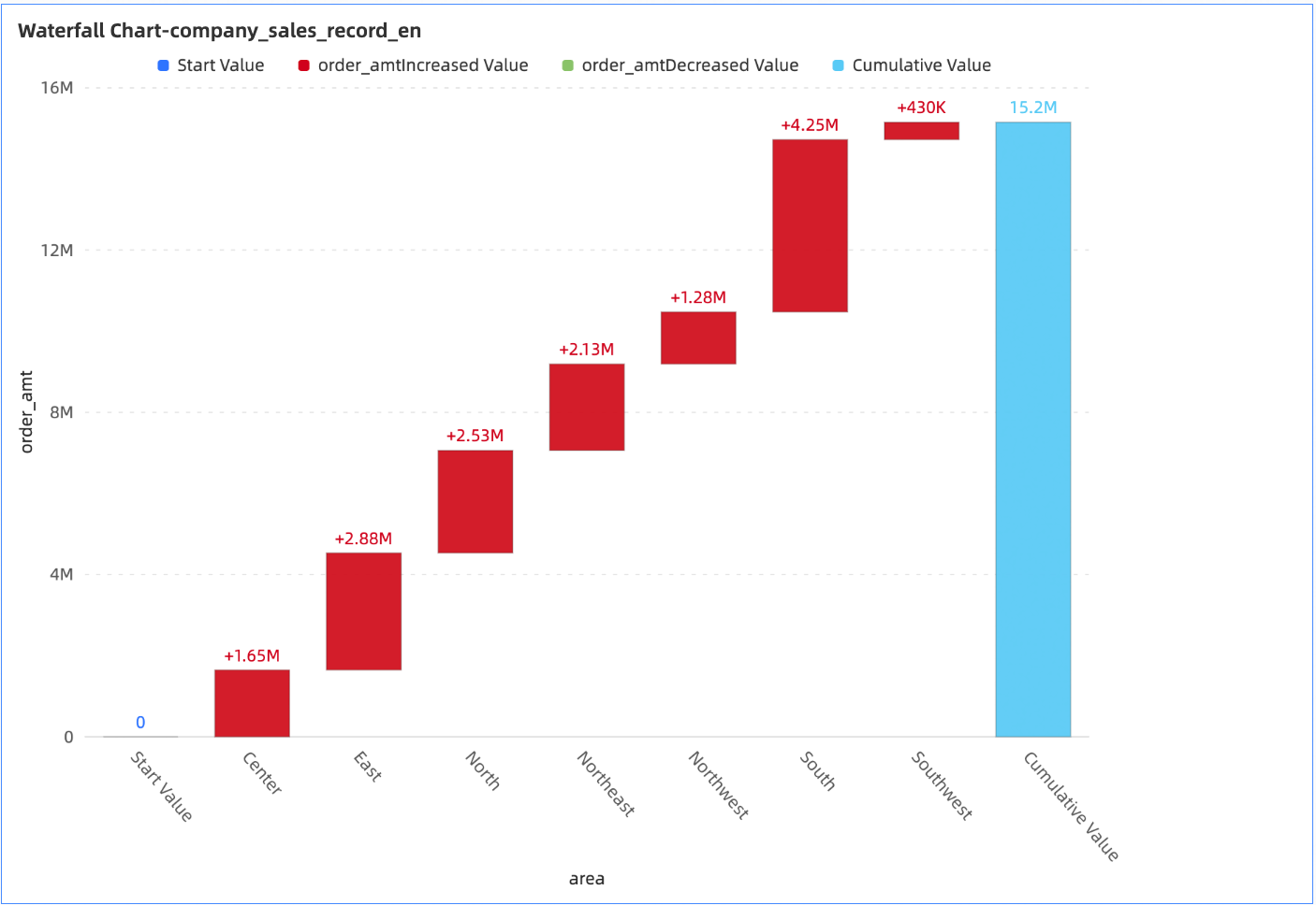
A waterfall chart helps visualize the contribution of positive values (such as income) and negative values (such as expenses) to a final total.
Benefits
Powerful calculations: Easily configure period-over-period and cumulative calculations.
Rich visualization: Customize the chart's appearance by configuring elements such as data labels, the legend, and cumulative values.
Example
Limitations
A waterfall chart consists of a Category Axis (Dim.) and a Value Axis (Mea.).
The Category Axis (Dim.) field requires at least one dimension, such as province or product type.
The Value Axis (Mea.) field supports a maximum of one measure, such as order quantity or profit amount.
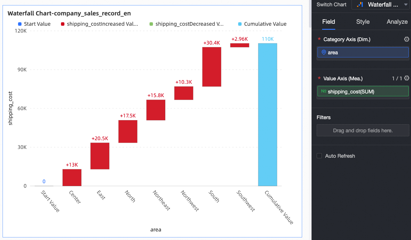
Configure chart data
On the Data tab, select the required dimension and measure fields.
From the Dimensions list, find province, and then double-click it or drag it to the Category Axis (Dim.) field.
From the Measures list, find shipping_cost, and then double-click it or drag it to the Value Axis (Mea.) field.
Click Update. The chart updates automatically.
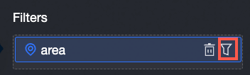
If the province field contains many values, use a filter to display only the data you need.
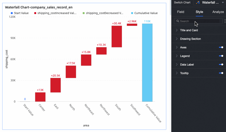
Configure chart style
This section describes chart-specific style parameters. For information about common style settings, see Configure the chart title bar.
You can enter a keyword in the search box at the top of the configuration pane to quickly find a parameter. You can also click the  icon to Expand/Collapse All Categories.
Plotting area
In the Plotting area section, configure the waterfall chart style.
Parameter |
Description |
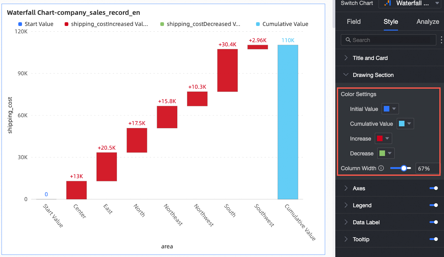
Color Settings |
Specifies the colors for the initial value, cumulative value, Increase, and Decrease bars. |
Bar Width |
Specifies the width of the bars. |
Axes
In the Axes section, configure the axis styles. By default, the axes are displayed.
Category |
Parameter |
Description |
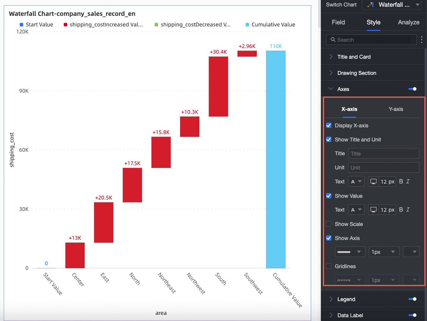
X-Axis |
Show X-Axis |
Shows or hides the x-axis. |
Show Title and Unit |
Shows or hides the axis title and unit on the x-axis. |
|
Show Value |
Shows or hides labels on the x-axis, and lets you configure the label display rule and text style. |
|
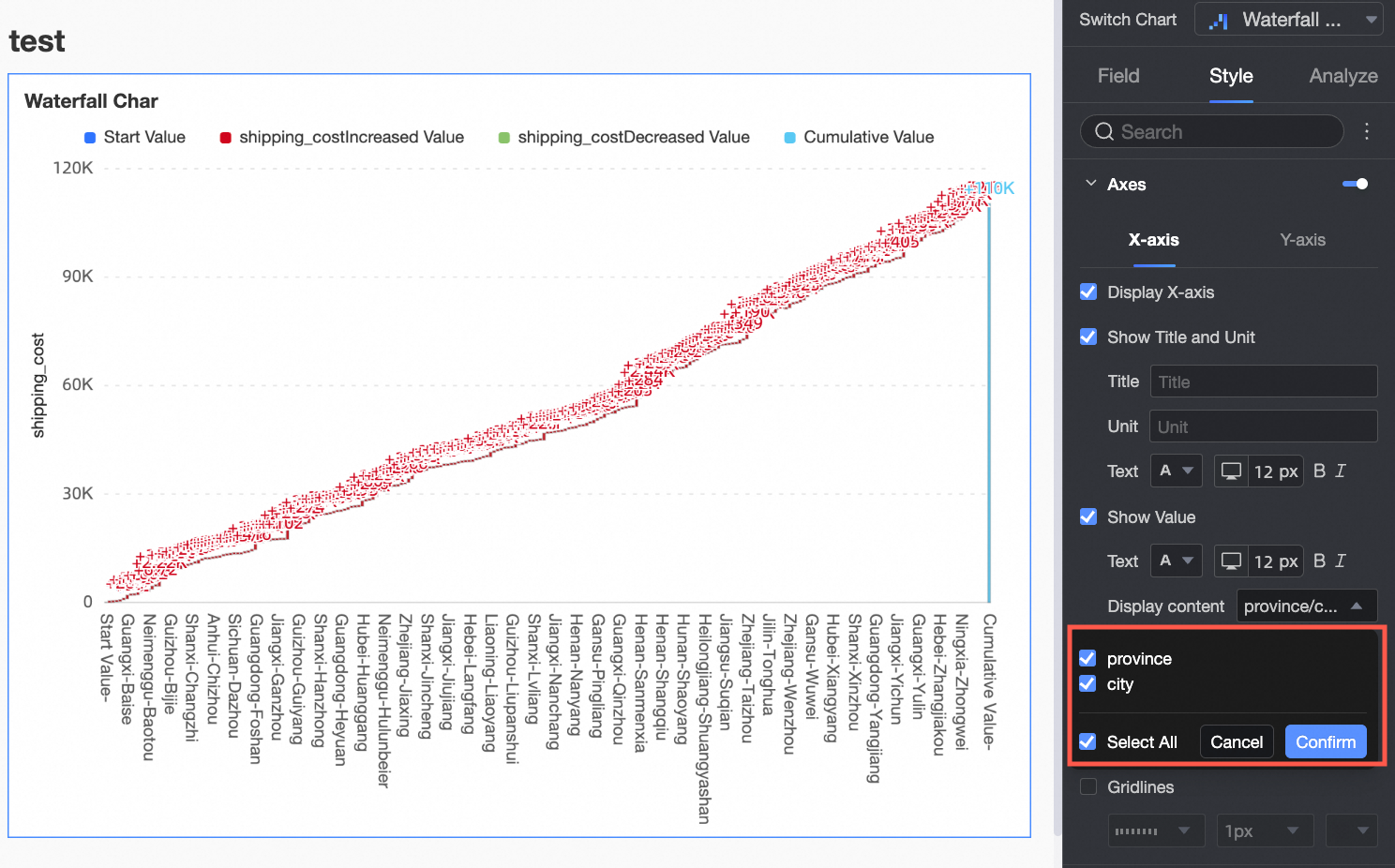
Content to Display |
Specifies whether to display all dimension values or only a portion.
|
|
Show tick marks |
Shows or hides tick marks on the x-axis. |
|
Show Axis |
Shows or hides the x-axis line, and lets you configure its style, width, and color. |
|
Gridlines |
Shows or hides gridlines for the x-axis, and lets you configure their style, width, and color. |
|
Y-Axis |
Show Y-Axis |
Shows or hides the y-axis. |
Show Title and Unit |
Shows or hides the axis title and unit. |
|
Show Value |
Shows or hides labels on the y-axis. If shown, you can configure the axis label format and text style. You can set the axis label format to AutoFit or Custom.
|
|
Show tick marks |
Shows or hides tick marks on the y-axis. |
|
Show Axis |
Shows or hides the y-axis line, and lets you configure its style, width, and color. |
|
Gridlines |
Shows or hides gridlines for the y-axis, and lets you configure their style, width, and color. |
|
Axis range and interval |
Sets the value range (maximum and minimum) of the y-axis and the interval size between tick marks.
|
 icon to open the Data Display Format dialog box and configure the data format as needed. For more information about the parameters in the dialog box, see
Legend
In the Legend section, click the  icon to enable the chart legend and configure its style.
Parameter |
Description |
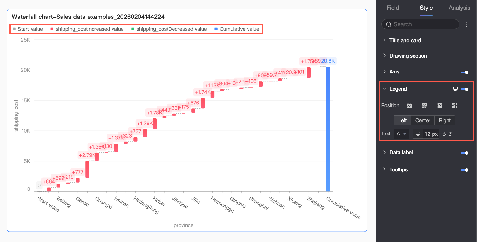
Position |
Specifies the position and alignment of the legend.
|
Text |
Configures the text style for the legend, including font color, size, weight, and style (italic). |
Mobile legend settings |
PC and mobile legend settings are independent. Switch to the mobile layout by clicking the PC/Mobile toggle button ( |
 ) at the top of the editor to customize the legend's position and text style for mobile devices.
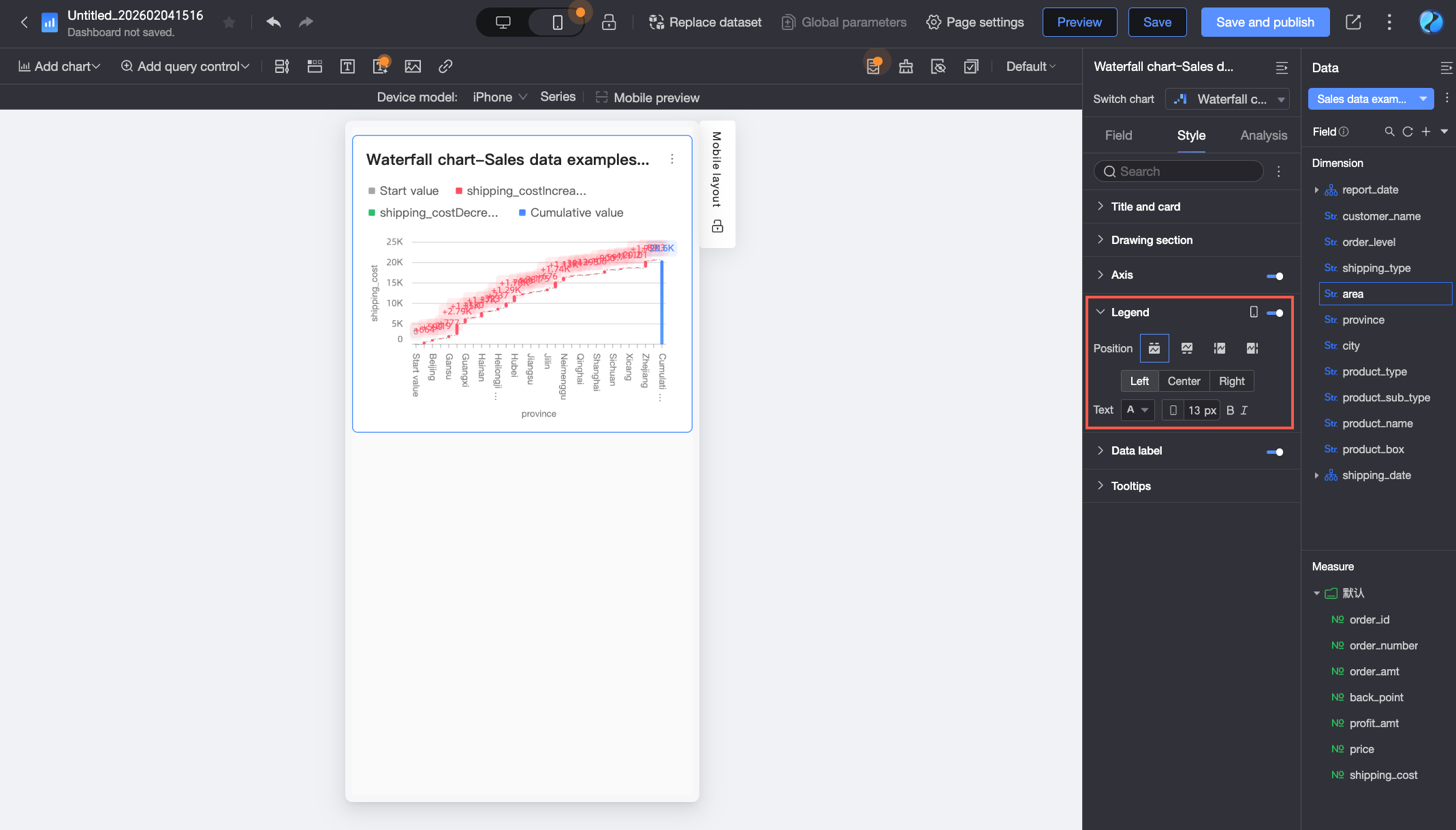
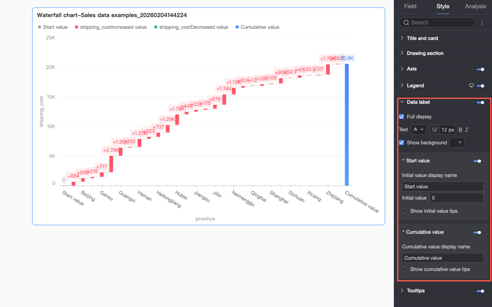
Data labels
In the Data labels section, configure whether to show data labels and their styles.
Parameter |
Description |
Full |
Shows or hides all data labels. |
Text |
Configures the text style for the labels. |
Show background |
Shows or hides a background for the data labels. If shown, you can customize the background color. |
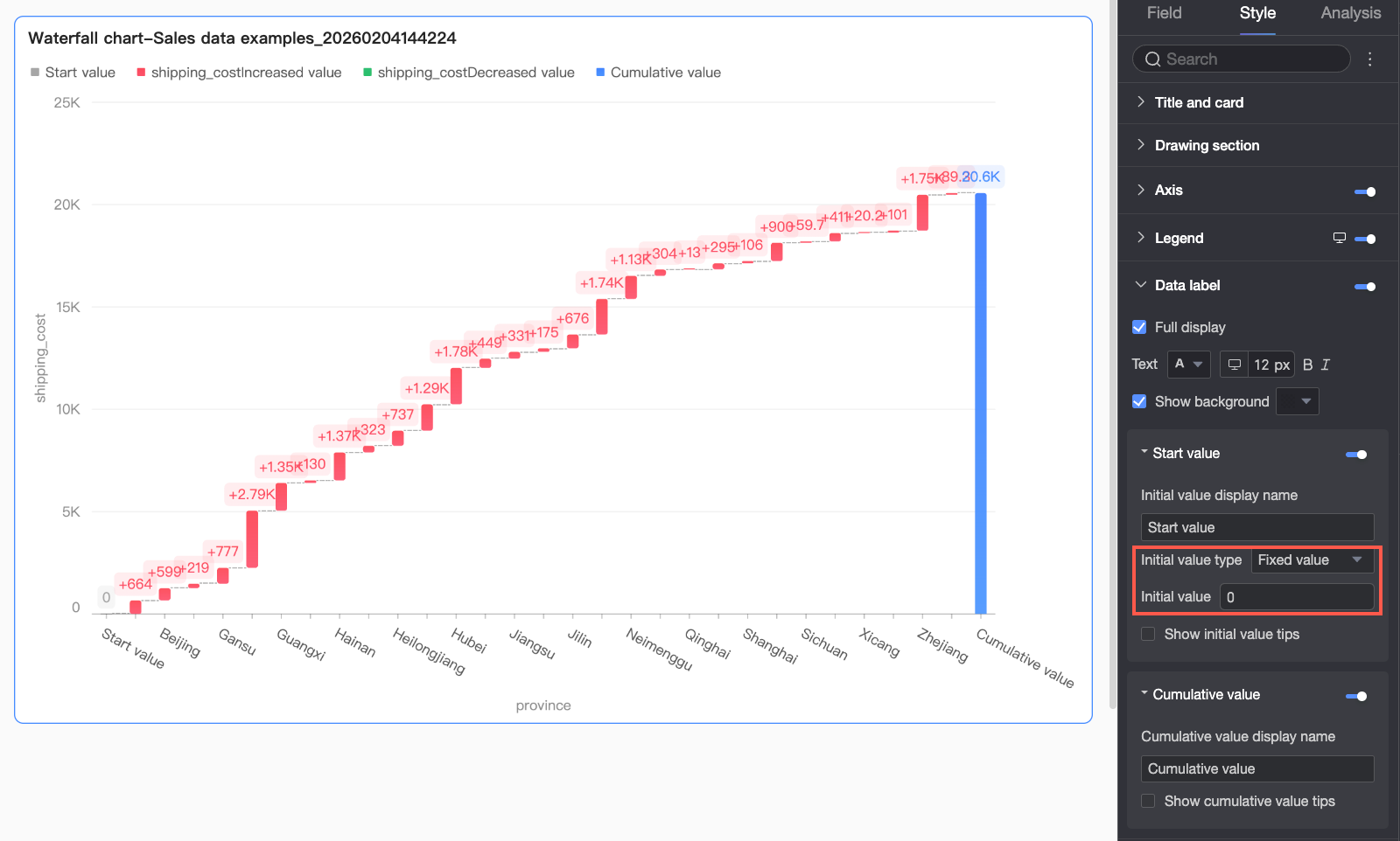
Initial value |
Shows or hides a label for the initial value. If shown, you can configure the following parameters.
|
Cumulative value |
Configures the label style for the cumulative value. You can customize the alias and show or hide a tooltip for the cumulative value. |
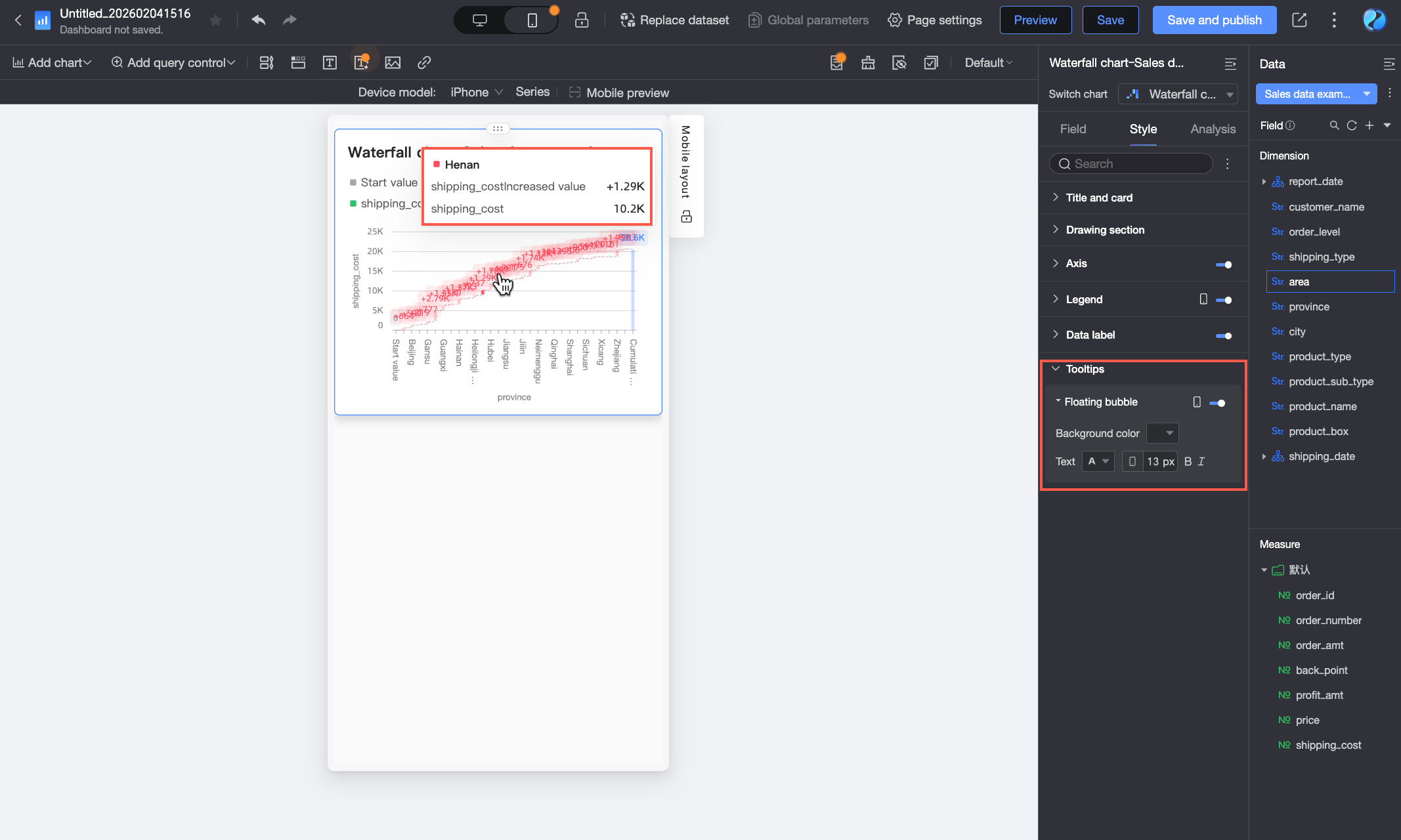
Tooltip
In the Tooltip section, click the icon to enable tooltips and configure their style.
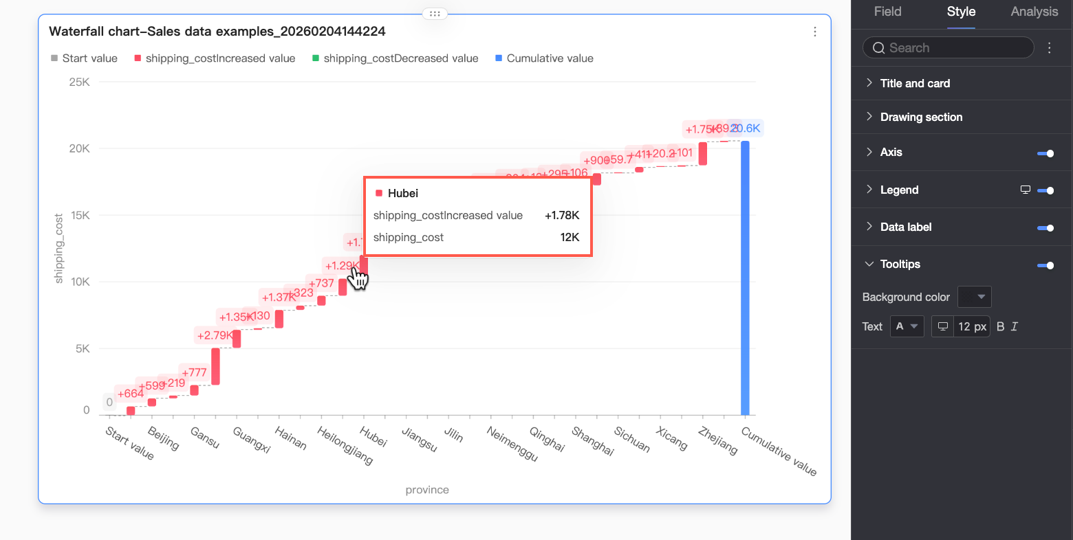
Parameter |
Description |
Background color |
Sets the background color of the tooltip. |
Text |
Configures the text style within the tooltip, including font color, size, weight, and style (italic). |
Mobile tooltip |
The tooltip settings for PC and mobile views are independent. You can switch to the mobile layout by clicking the PC/Mobile toggle button ( |
Configure analysis features
Feature |
Name |
Description |
Data Interaction |
Drill-down |
If you have configured drill-down fields in the data pane, you can use this setting to customize the display style for the drill-down hierarchy. |
Interaction |
If your analysis requires data from different charts, you can use chart interactions to link multiple charts together. For more information, see Interaction. |
|
Hyperlink |
If your analysis spans multiple dashboards, you can use hyperlinks to connect them. The Parameter and External Link modes are supported. For more information, see Hyperlink. |
Next steps
Share the dashboard with specific users. For more information, see Share a dashboard.
To create a complex report with navigation menus for thematic analysis, you can integrate your dashboards into a data portal. For more information, see Create a PC data portal.