Word cloud chart
A word cloud chart visualizes large amounts of text data as a colorful, cloud-like image of words. For example, it helps you build a user profile, cluster users, and implement precision marketing. This topic describes how to add data to a word cloud chart and configure its style.
Prerequisites
You have created a dashboard. For more information, see Create a dashboard.
Overview
Use cases
A word cloud chart displays keywords (tags) from a website or visualizes free-form text. It helps you compare the relative importance of words.
Benefits
Visual effects: You can set the word cloud shape to a rectangle, triangle, heart, or ellipse.
Annotation features: You can add remarks and endnotes to metrics. You can also configure navigation links to interact with external systems.
Example
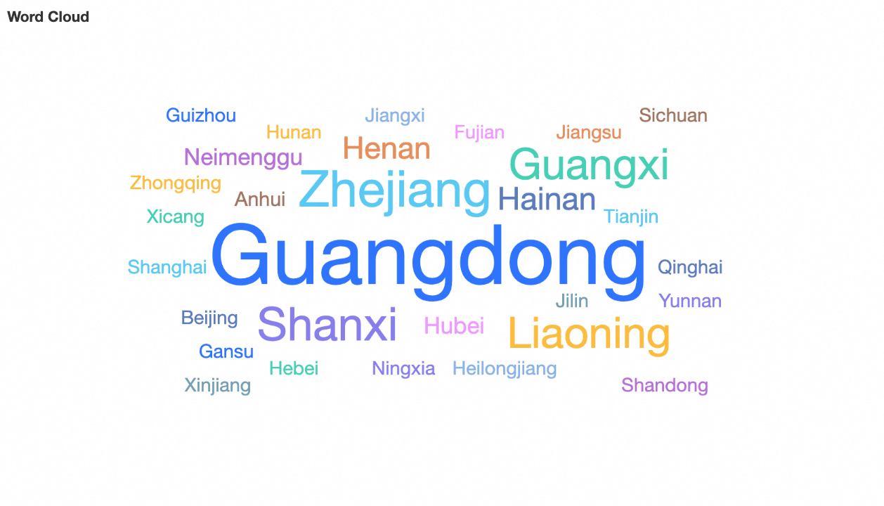
Configure chart data
A word cloud chart consists of Word Label/Dimension and Word Size/Measure.
On the Field tab, select the required dimension and measure fields to add data to the word cloud chart.
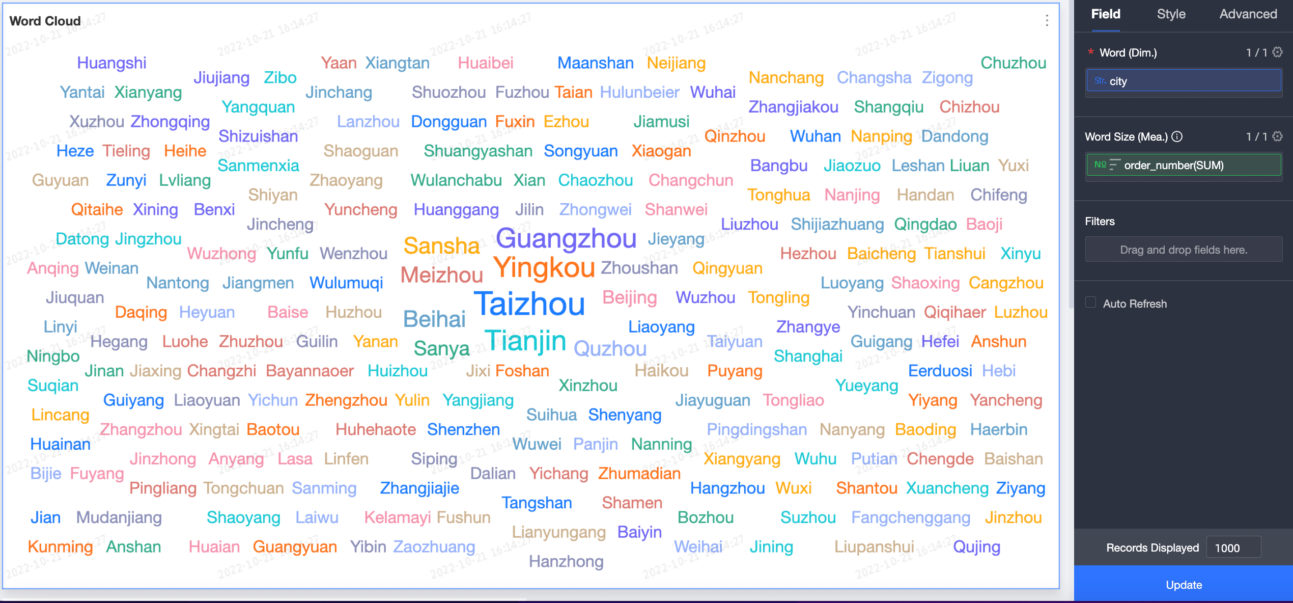
Method 1: Determine word size based on measure values. Add both a dimension field and a measure field. Follow these steps:
On the Field tab to the right of the chart, select the required dimension and measure fields.
In the Dimension list, find province, then double-click or drag it to the Word Label/Dimension field well.
In the Measure list, find order_amount, then double-click or drag it to the Word Size/Measure field well.
Click Update. The chart updates automatically.
The updated chart appears as follows.
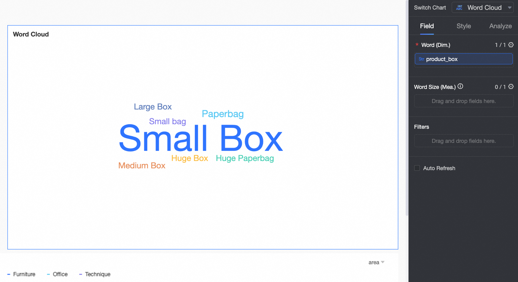
Method 2: Determine word size based on word frequency. Add only a dimension field. Follow these steps:
On the Field tab to the right of the chart, select the required dimension field.
In the Dimension list, find product_package, and double-click or drag it to the Word Label/Dimension field well.
Click Update. The chart updates automatically.
The updated chart appears as follows.
If your source text is long and keywords are difficult to identify, use word segmentation mode to quickly display them. For more information, see word segmentation mode.
Word segmentation mode
Word segmentation mode intelligently breaks down text into individual words:
If you add only a dimension field, the size of each word is determined by its frequency after segmentation.
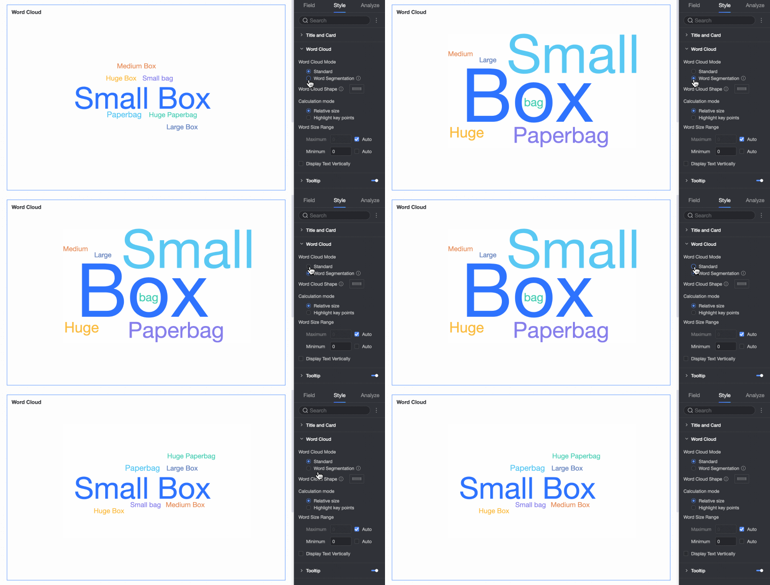
If you add both a dimension and a measure field, the size of each word is determined by its measure value after segmentation.
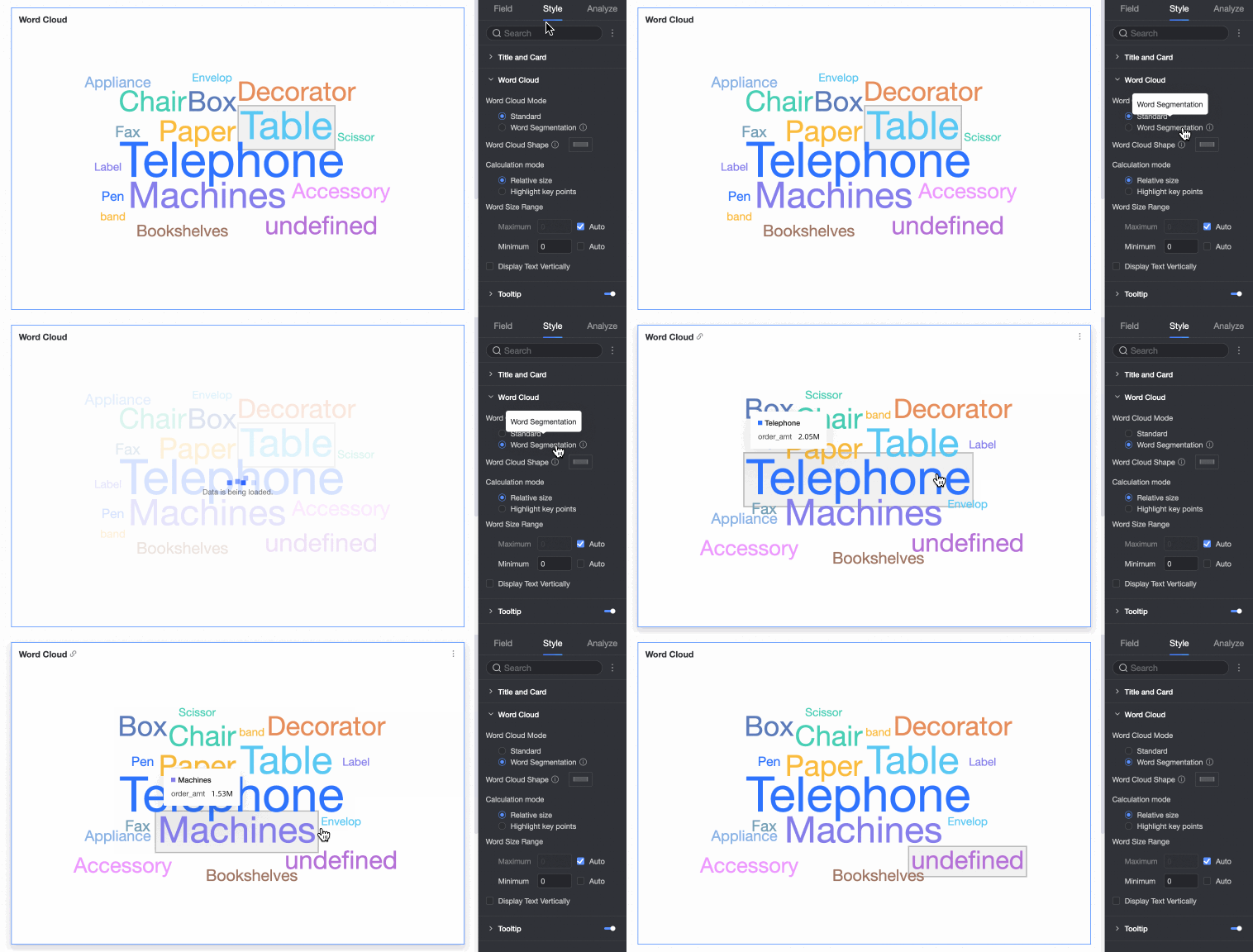
Configure chart style
The following section describes the style settings for the word cloud chart. For information about configuring the chart title and card styles, see Configure chart title area.
On the Style tab, configure the chart style in the Chart Style section.
Parameter
Description
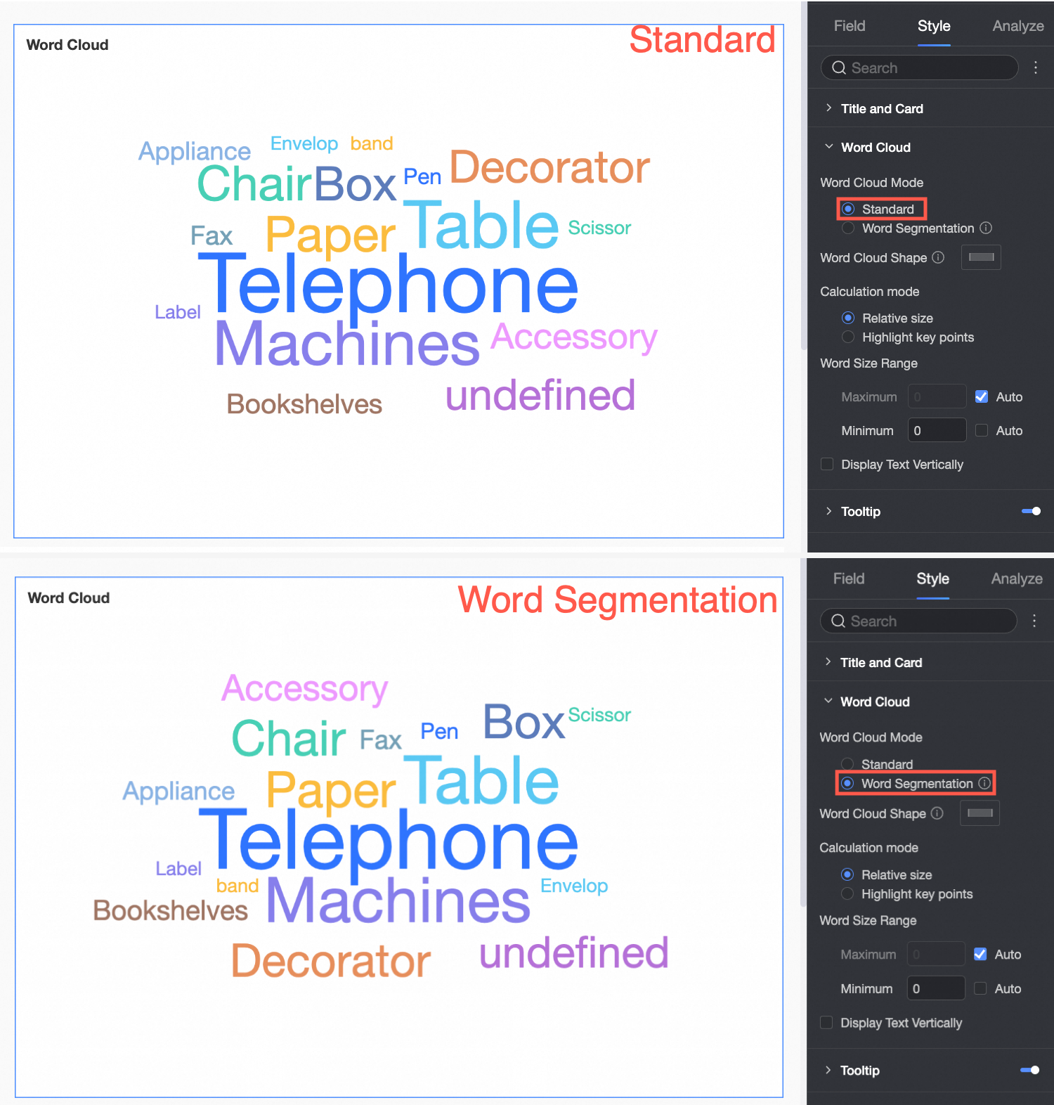
Word cloud mode
Supports normal mode and word segmentation mode.

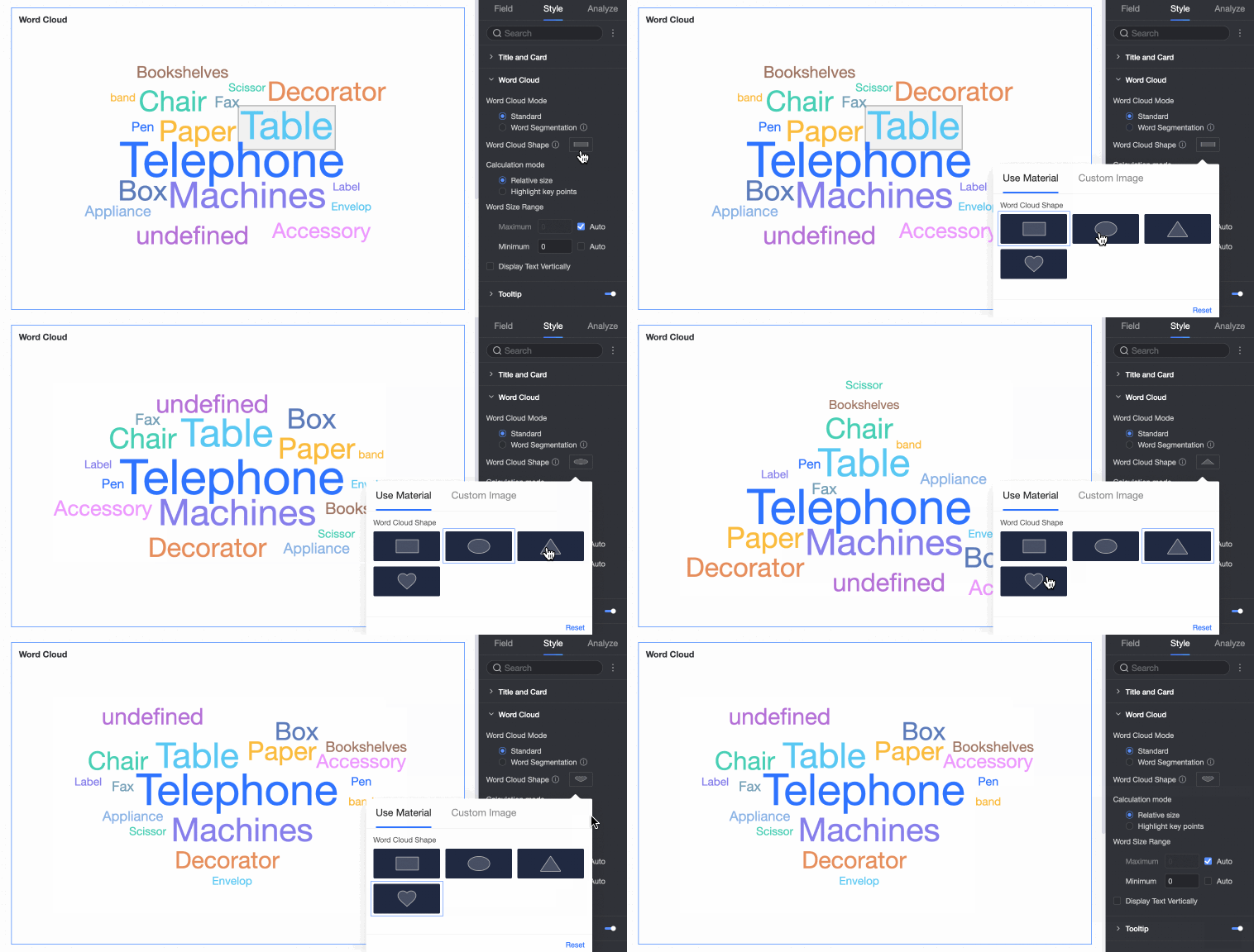
Word cloud shape
Supports four shapes: Rectangle, Ellipse, Triangle, and Heart.
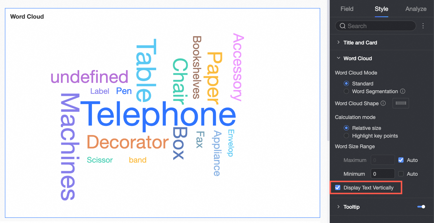
Display text vertically
Displays some words vertically.
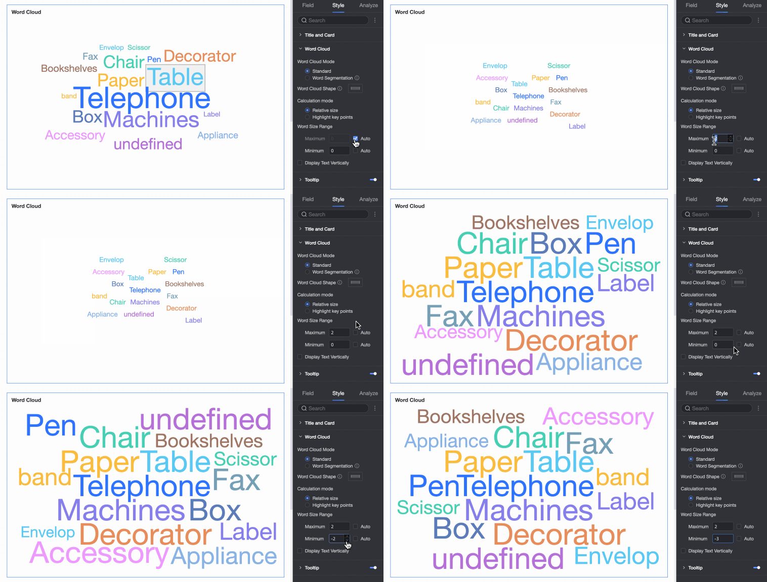
Word size range
Customize the font size range to make the differences between words more distinct.
Tooltip
Click the
icon to enable the tooltip and configure its style.NoteTooltip settings for PC and mobile views are independent. Switch to the mobile editing view using the PC/mobile toggle button (
) at the top of the dashboard editor to configure the tooltip for mobile devices. The font size can be set separately for PC and mobile views, while other style settings are applied to both.
 icon to enable the tooltip and configure its style.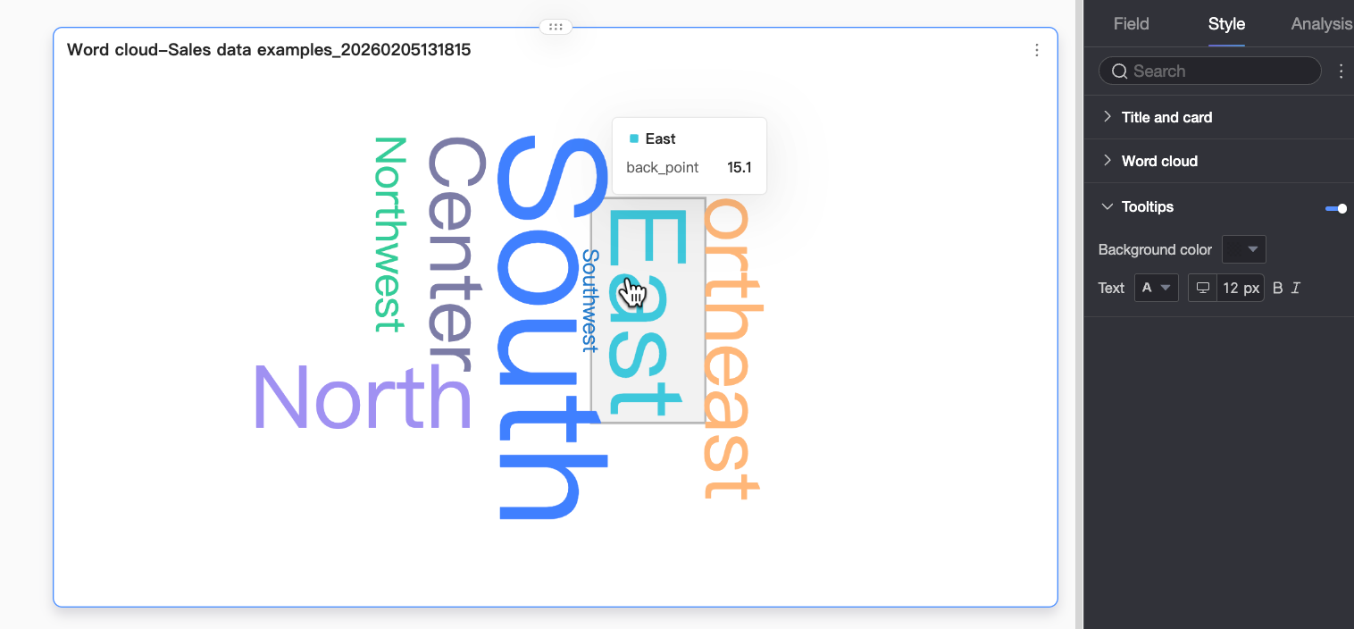
 ) at the top of the dashboard editor to configure the tooltip for mobile devices. The font size can be set separately for PC and mobile views, while other style settings are applied to both.
Configure chart analysis features
Feature | Description |
Interaction | If your analysis requires data from multiple charts, use the interaction feature to link them. For more information, see Interaction. |
Navigation | If your analysis spans multiple dashboards, use the navigation feature to link them. This feature includes two methods: parameter-based navigation and external link. For more information, see Navigation. |
Annotation | When data in a chart is anomalous or requires special attention, you can use annotations such as color highlights, icons, comments, or data points to highlight and provide context for the data. For more information, see Annotation. |
Limitations
The following limitations apply when you add data to a word cloud chart:
For Word Size/Measure, you can add up to one measure.
For Word Label/Dimension, you can add only one dimension.
Next steps
To allow other users to view a dashboard, share it with them. For more information, see Share a dashboard.
To create a complex portal with navigation menus for thematic analysis, integrate your dashboard into a BI portal. For more information, see Create a BI portal.