A decomposition tree chart breaks down a core metric to identify key contributors through root cause analysis. Use it to visualize how members across multiple dimensions contribute to a total, or to analyze a measure split into groups.
Chart overview
Use cases
Split a value into multiple groups and compare the percentage share of each group.
Example
Limitations
-
Prerequisites: You have created a dashboard.
-
A decomposition tree chart requires an Analysis (Measure) and a Decomposition Basis (Dimension):
-
Select 1 to 10 dimensions from your data for the decomposition basis.
-
Select exactly one measure from your data for the analysis.
NoteA decomposition tree chart supports up to 10 rows and 500 columns when splitting fields.
-
Procedure
Chart data
-
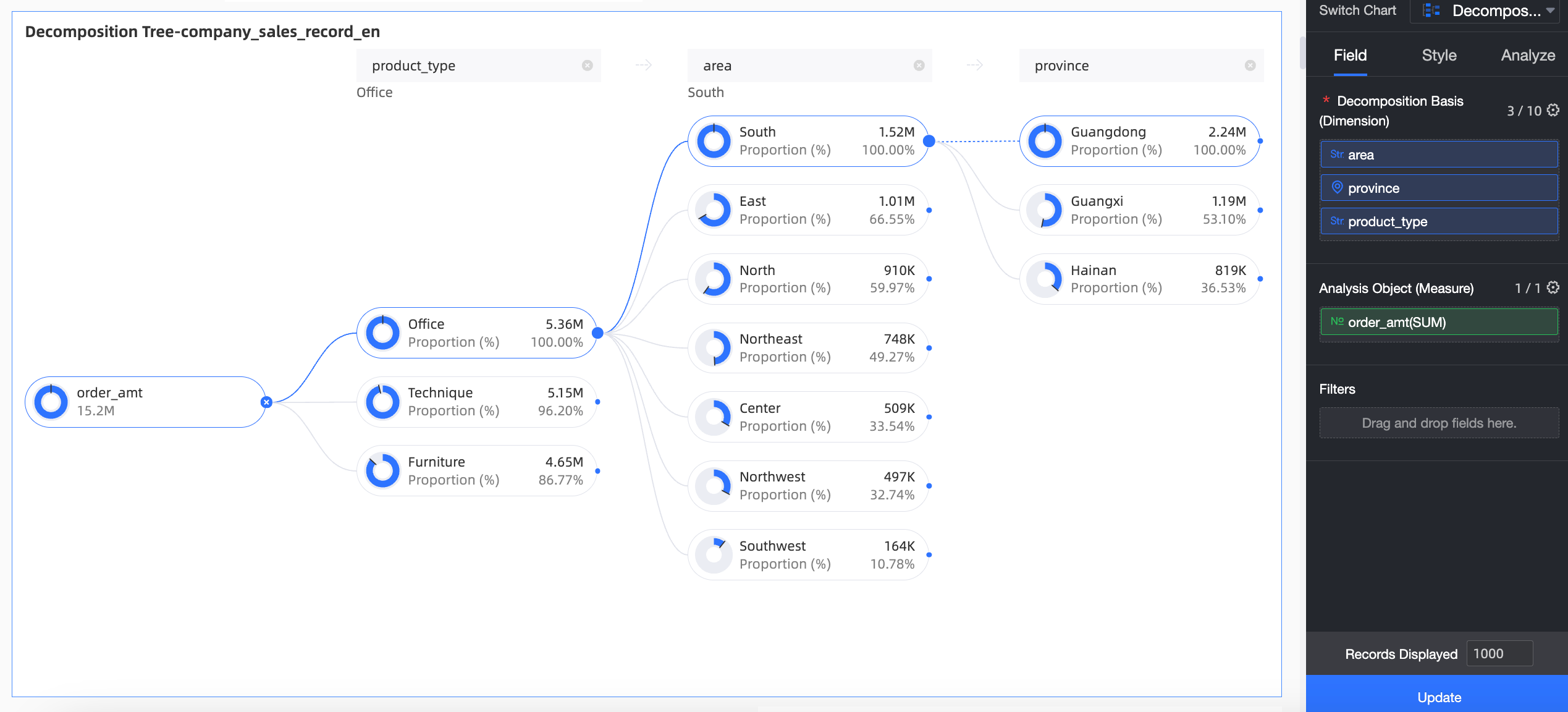
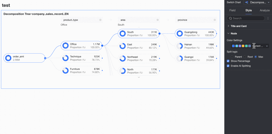
On the Data tab, select the required dimension and measure fields:
-
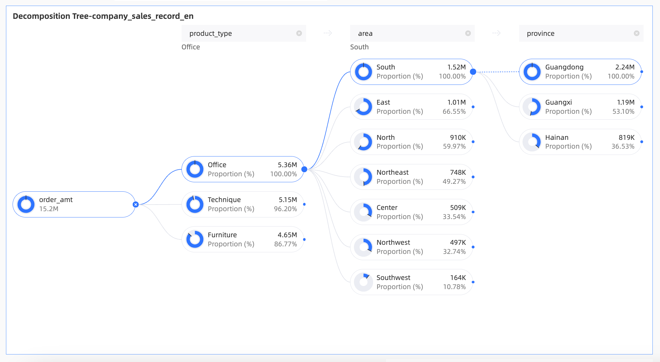
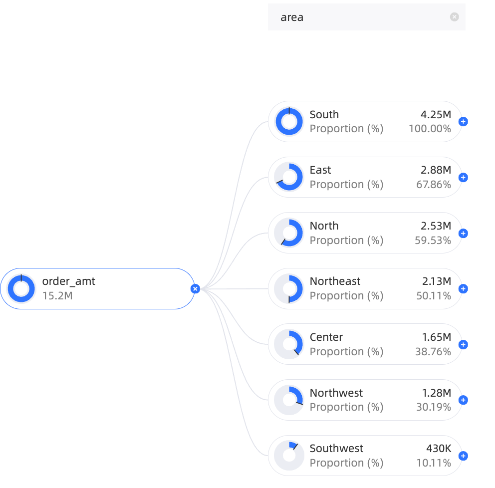
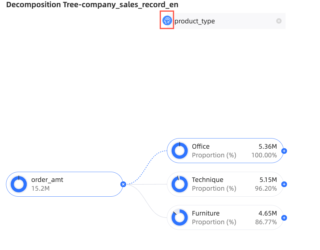
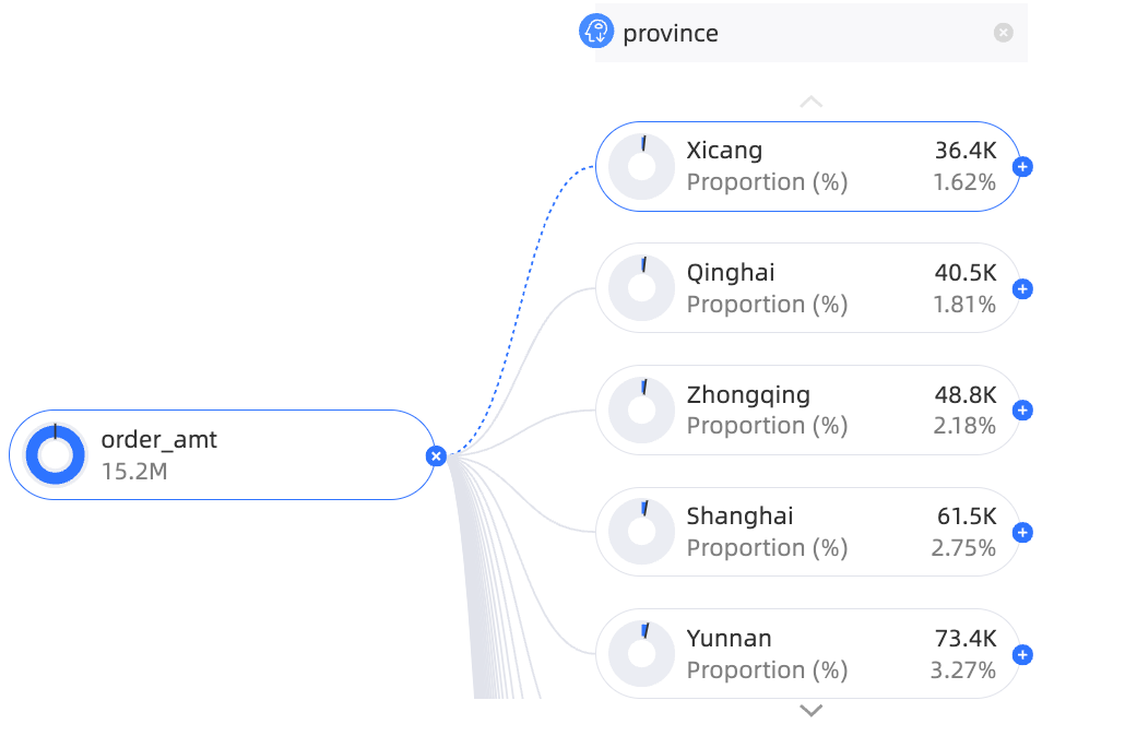
From the Dimensions list, find Region, Province, and Product Type. Double-click or drag them to the Decomposition Basis (Dimension) field.
-
From the Measures list, find Order Amount. Double-click or drag it to the Analysis (Measure) field.
-
-
Click Update to refresh the chart.
Decomposition analysis
After you configure the chart data, analysts and viewers can interactively decompose the data.
-
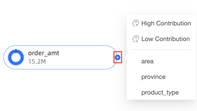
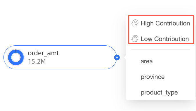
On the chart editing page, hover over a node icon.
-
Select a splitting method:
-
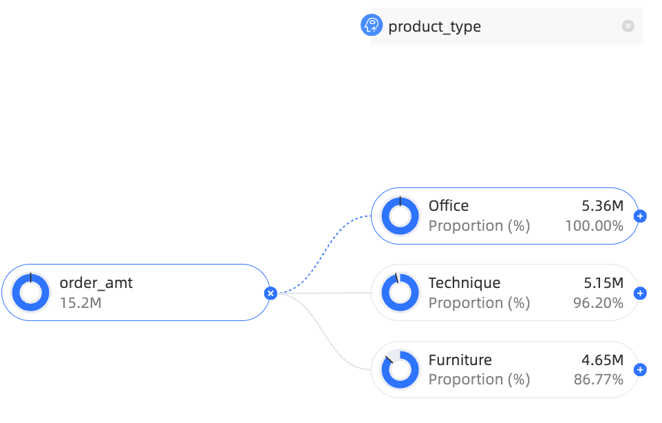
Custom splitting: Split the data by any dimension in the Decomposition Basis (Dimension) field.
In this example, you can split by Region, Province, or Product Type.
-
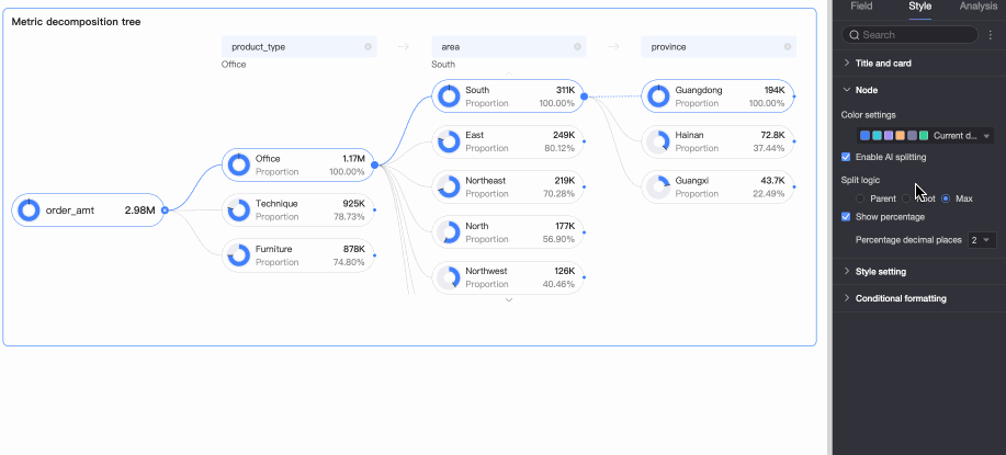
Smart splitting: Quick BI AI automatically splits the data by high contribution or low contribution.
In this example, the data is split by high contribution.
 Note
NoteIf you use smart splitting and set the decomposition path to Product Type > Province, this path is saved with the dashboard. When you reopen the dashboard, the default path remains Product Type > Province. To see the latest AI-driven recommendations, you must perform a smart split again.
-
-
Modify a decomposition item.
For example, to change a split from Province (added by smart splitting) to Product Type (a custom split):
-
Click the delete icon next to the Province node.

-
Hover over the target area and select Product Type.
-
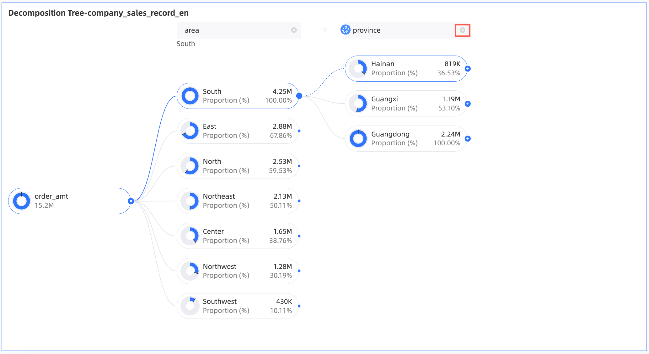
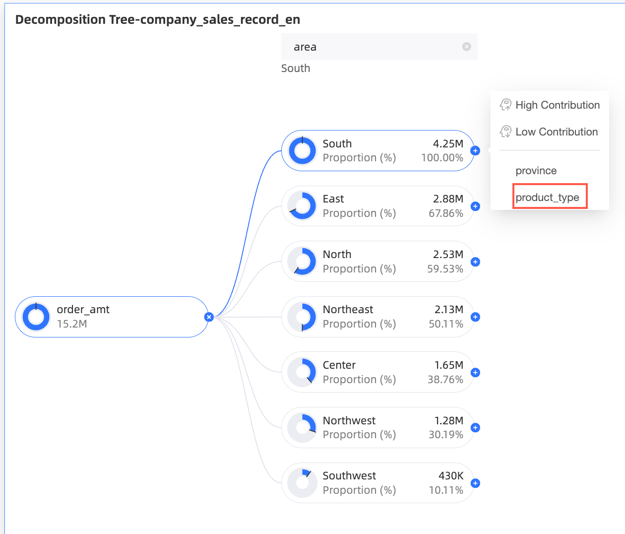
Chart styles
The following settings are specific to this chart type. General style settings are covered in Configure the chart title area.
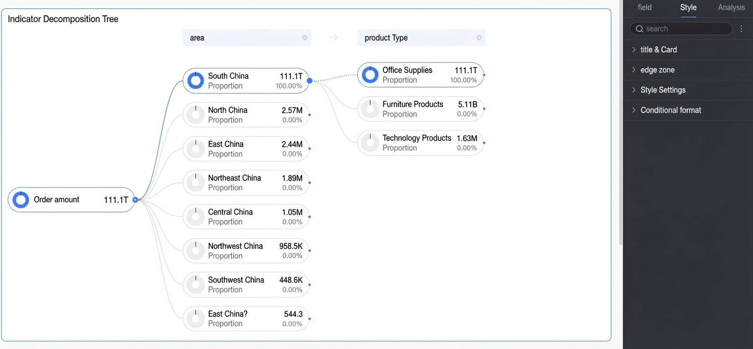
Node
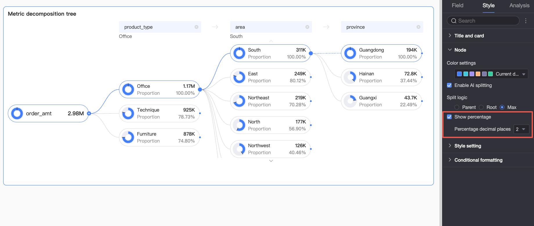
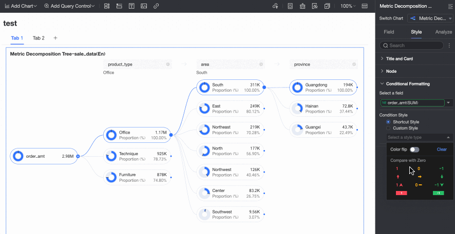
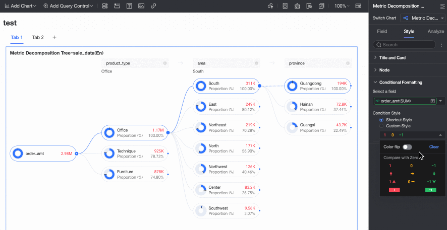
In the Node section, configure Color Configuration and Decomposition Logic.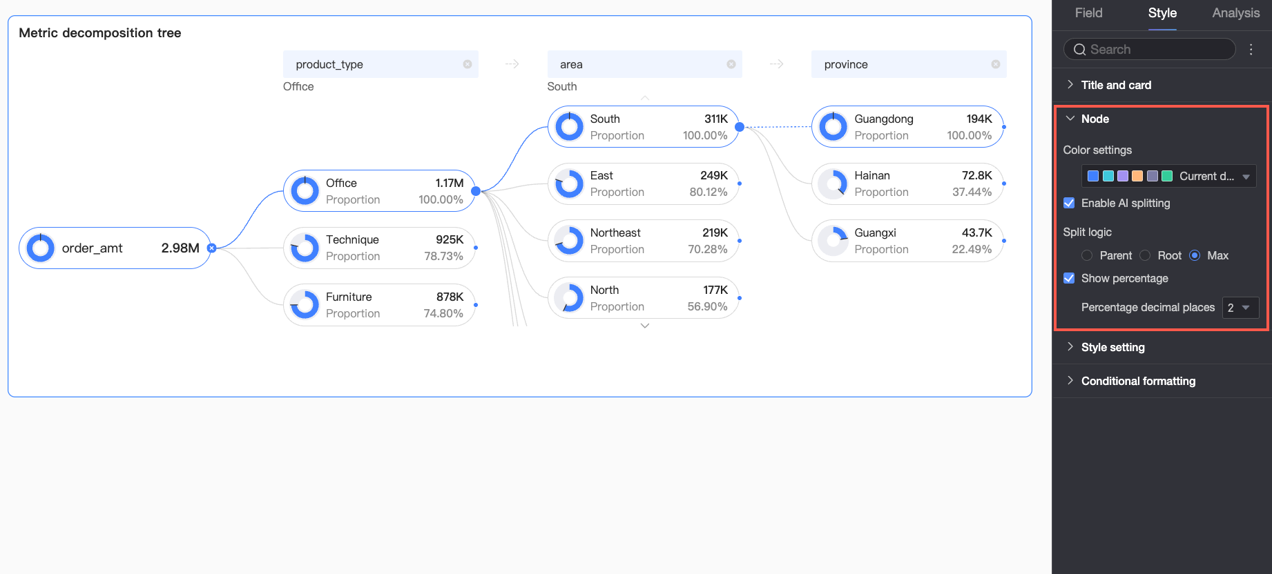
|
Parameter |
Description |
|
Positive/negative color scheme |
Sets the colors for positive and negative values of the measure in the Analysis (Measure) field.
|
|
Enable AI splitting |
Toggles the smart splitting feature. The supported AI analysis type is Absolute Analysis. When enabled, the following options appear.
Absolute Analysis: Analyzes absolute data values. In this example, the measure is Order Amount, and the split dimensions are Province and Product Type (e.g., Technology, Furniture, and Office Supplies):
|
|
Decomposition logic |
Sets how the donut chart percentage is calculated: parent node, root node, or max node.
|
|
Show percentage |
Shows or hides the percentage value. If you enable this option, you can also set the number of decimal places.
|
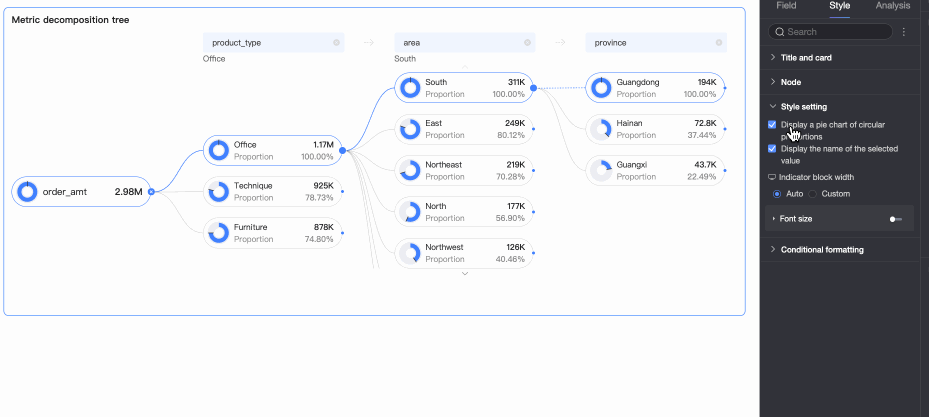
Styles
Configure the visual style of the chart.
|
Parameter |
Description |
|
Show percentage donut chart |
Toggles the percentage donut chart on each node. |
|
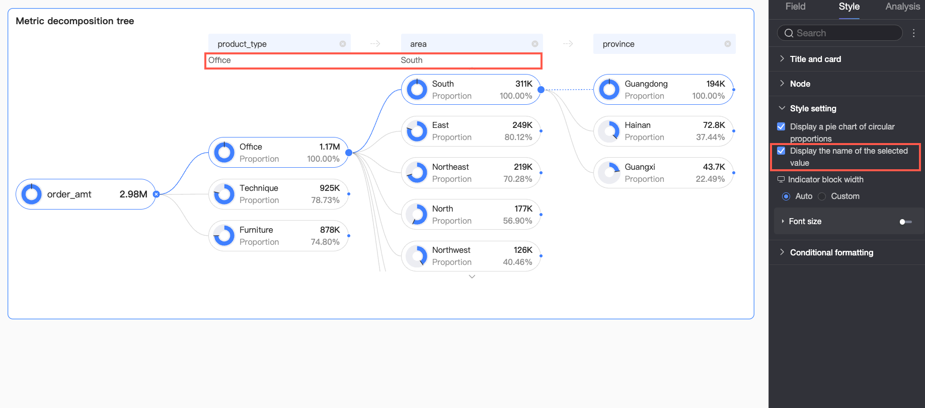
Display name for selected value |
Toggles display of the selected value's name in the chart. |
|
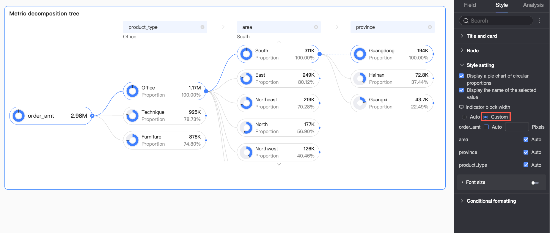
Metric block width |
Sets the width of the metric blocks. You can select Auto or Custom.
PC and mobile block widths are configured independently. Use the PC/mobile toggle ( |
|
Font settings |
Click the Note
You can format the percentage text only if the Show percentage option is enabled in the Node section. |
 ) at the top of the dashboard editing page to switch views.
 icon to configure font color, size, weight, and style (italic) for metric and percentage text. Switch to the mobile editing view to set mobile font sizes.
Conditional formatting
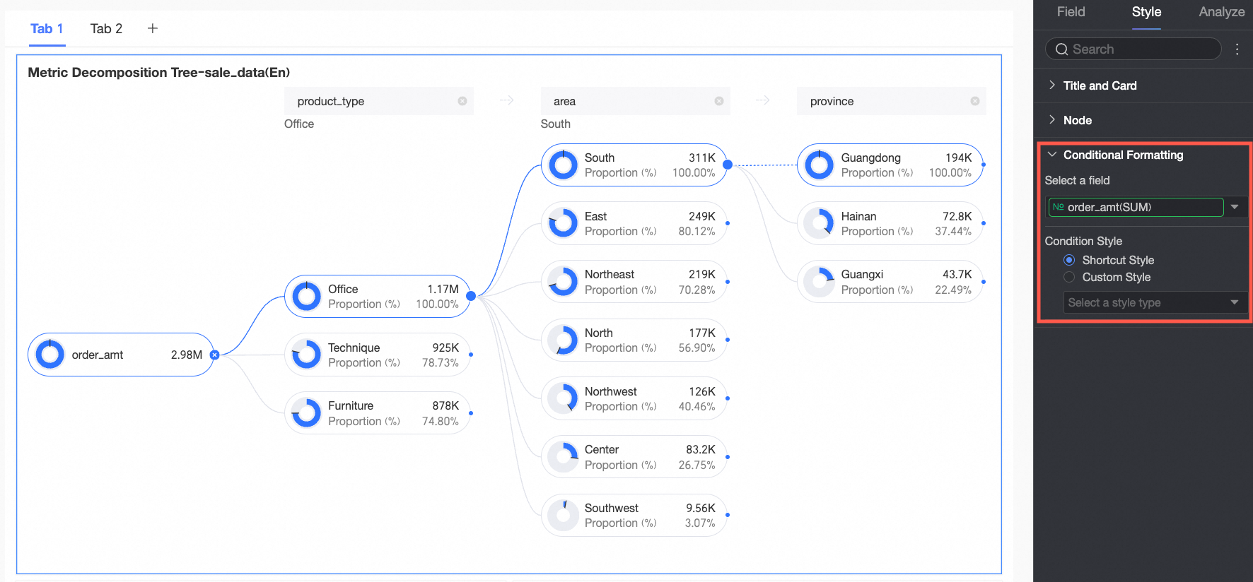
Configure conditional formatting rules for measure fields.
|
Parameter |
Description |
|
|
Select field |
Select a measure from the Analysis (Measure) field to apply conditional formatting. |
|
|
Conditional formatting |
Quick styles |
Select Quick Styles and click Select style type to choose a predefined format from the drop-down list.
|
|
Custom styles |
Configure custom styles by comparing the measure against a fixed value.
|
|
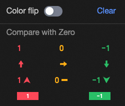

 Configure the following:
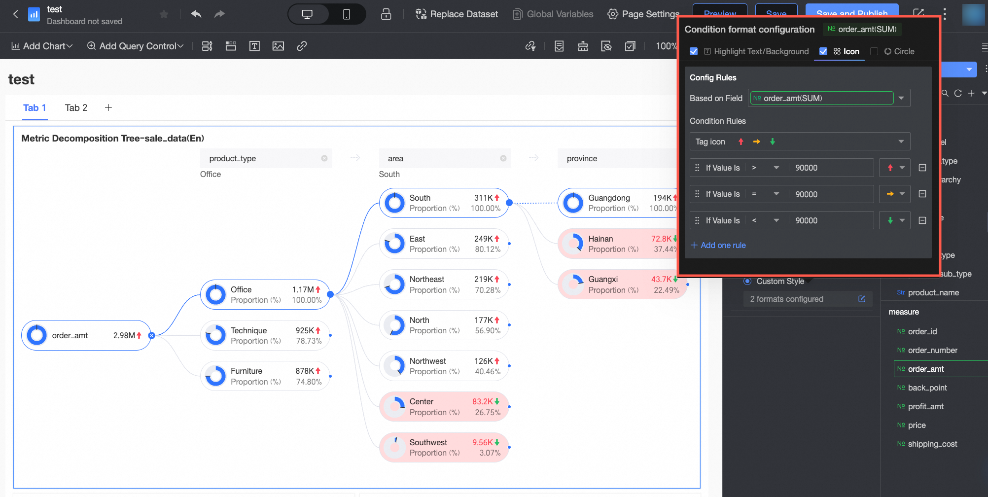 Configure the following:
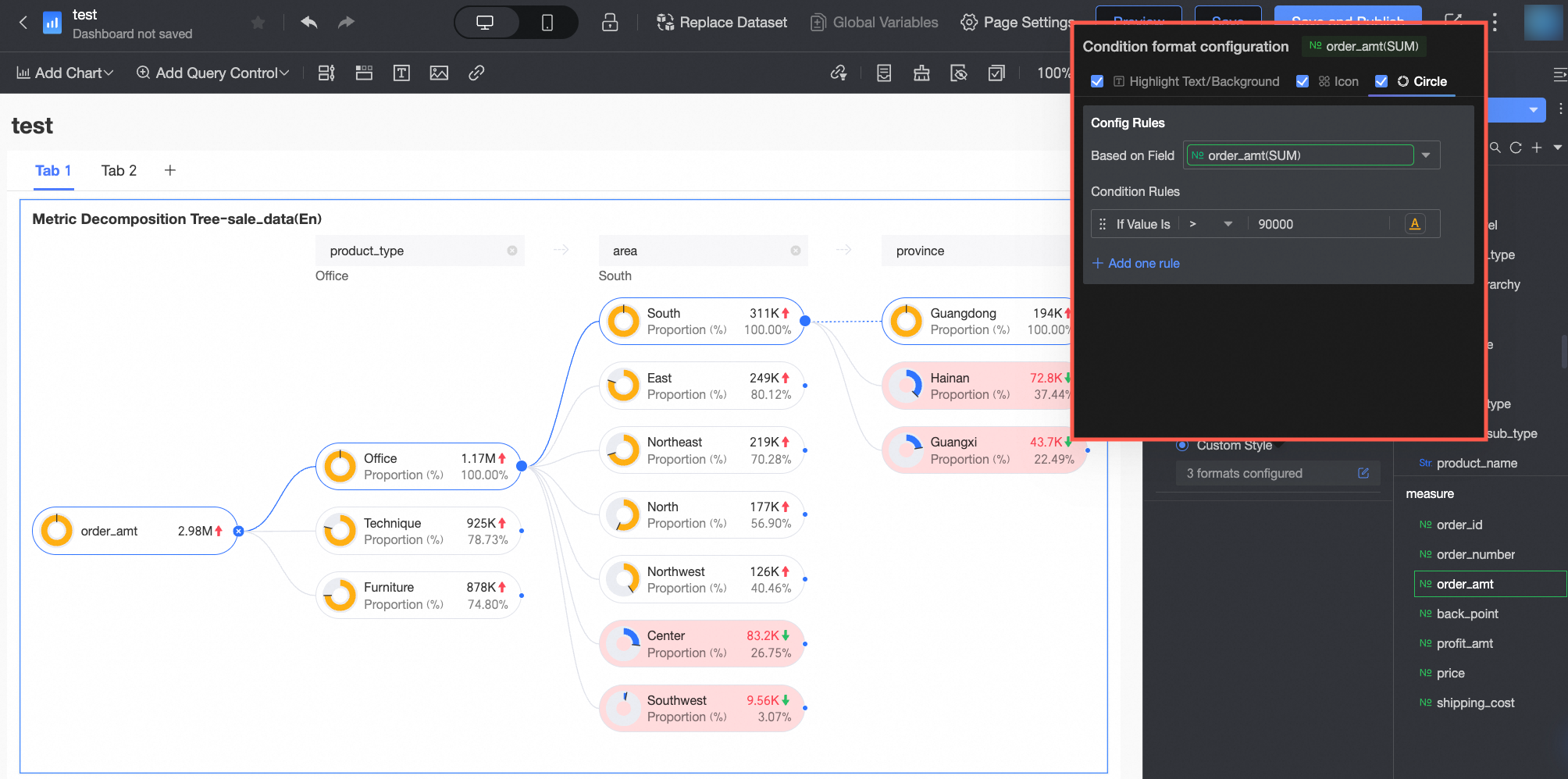 Configure the following:
Chart analysis
|
Section |
Parameter |
Description |
|
Interaction analysis |
Linkage |
Associate multiple charts for cross-chart data analysis. Linkage. |
Next steps
-
Share a dashboard with other users who need to view it.
-
Integrate dashboards into a PC data portal for menu-driven thematic analysis.
FAQ
1. What are the metric and dimension limits?
A: A decomposition tree chart supports only one core metric in the Analysis (Measure) field and up to 10 dimensions in the Decomposition Basis (Dimension) field for interactive, level-by-level decomposition.
2. Smart splitting vs. custom splitting
A: Custom splitting requires you to manually select which dimension to analyze next. Smart splitting uses AI to recommend the dimension with the highest or lowest contribution, helping you discover key factors when you have many dimensions.
3. Why is the smart splitting option unavailable?
A: Go to Style > Node and enable Enable AI Splitting. The smart splitting option only appears when this setting is on.
4. Donut chart representation and calculation
A: The donut chart (when Show percentage is enabled) shows a node's value as a percentage of a baseline node. The baseline is set in Style > Node > Decomposition logic and can be the parent node, root node, or max node (topmost node in the column).