Pie chart
A pie chart is used to analyze the proportion of data. For example, you can use a pie chart to obtain the proportion of each portion of a category. This topic describes how to add data to a pie chart and configure the style of a pie chart.
Prerequisites
A dashboard is created. For more information, see Create a dashboard.
Overview
Scenario
In most cases, a pie chart is used to display the distribution of dimension values based on the proportion of metrics. Data can be expressed by using various methods such as data highlights and data magnification.
Benefits
Easy-to-use interactive operations: A pie chart allows you to switch between metrics and configure filters.
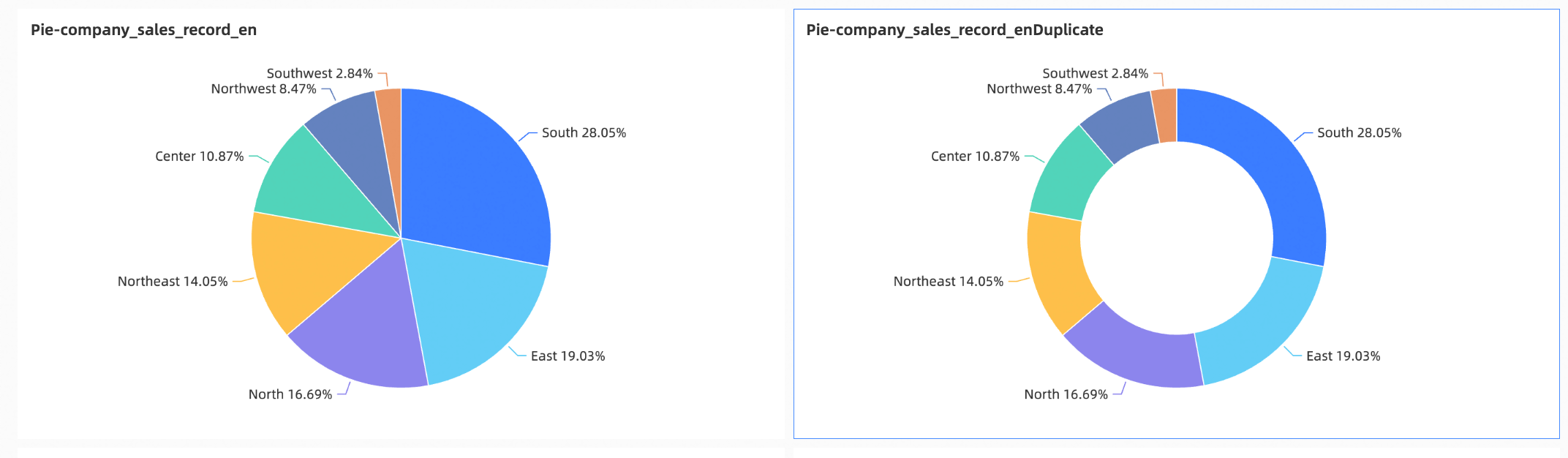
Abundant data visualization: The chart type of a pie chart can be a pie and a ring. A pie chart allows you to configure parameters, such as Show Labels.
Various interactive options: You can add remarks or endnotes to metrics in pie charts. You can also add links to pie charts to interact with external systems.
Example
Limits
Take note of the following limits when you add data to a pie chart:
You can add 1 to 10 measures to the Central Angle (Mea.) field.
You can add only one dimension to the Labels (Dim.) field.
Configure a pie chart
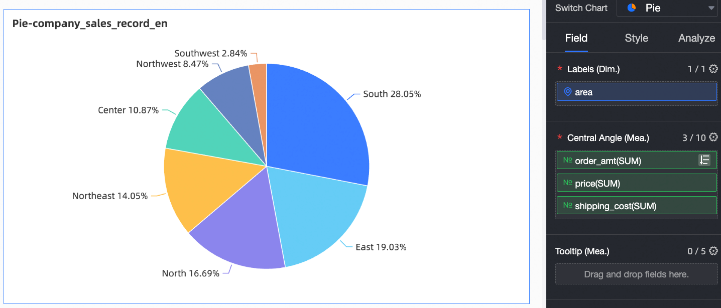
On the Field tab, select the required dimension and measure fields.
In the Dimension list, find area, and then double-click or drag it to the Labels (Dim.) field.
In the measure list, find shipping_cost, price, and order_amt, and then double-click or drag them to the Central Angle (Mea.) field.
Click Update.
The updated chart appears as shown in the following figure.
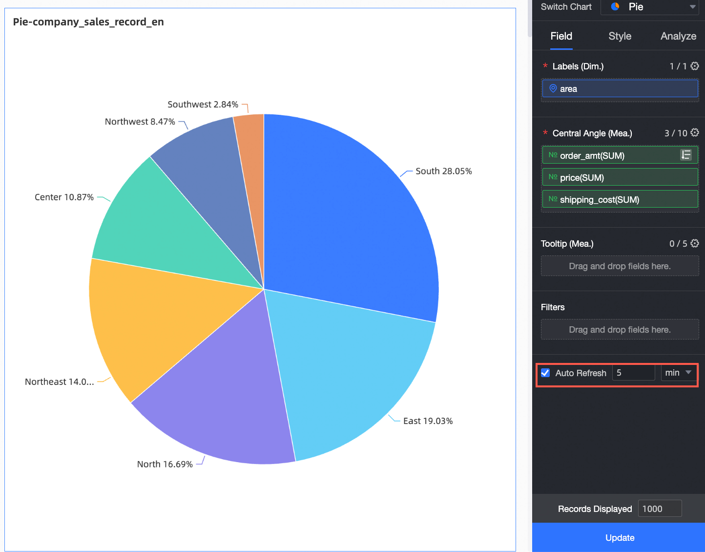
Configure the Auto Refresh parameter.
When enabled, the chart data refreshes automatically. For example, if you set the refresh interval to 5 minutes, the chart data updates every 5 minutes.
Configure the style of a pie chart
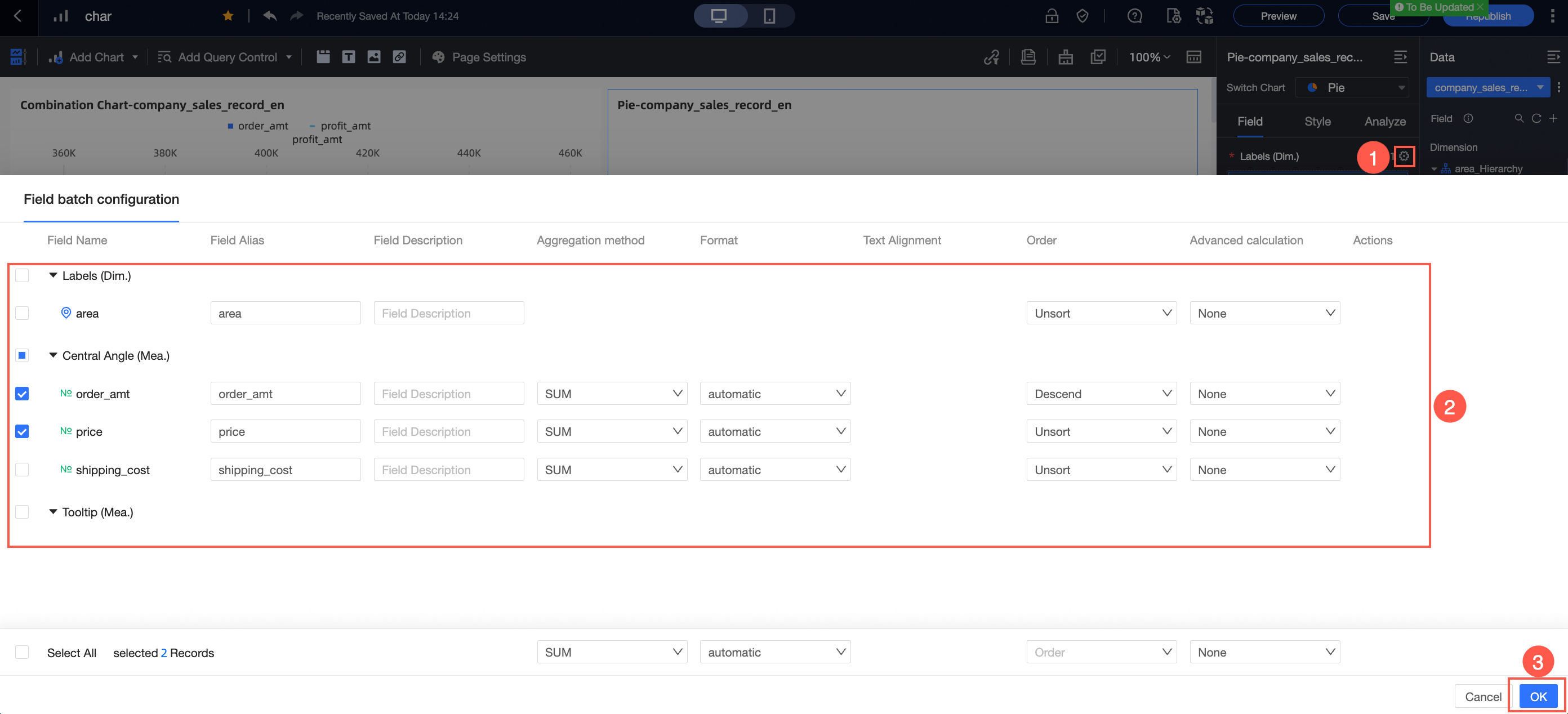
On the Field tab of the chart designer, you can configure formats for multiple fields at once.
For more information about chart data configuration, see Configure a chart.
This topic describes the style settings for the chart. For general chart style settings, see Configure the chart title area.
You can enter a keyword in the search box at the top of the configuration pane to quickly find a parameter. You can also click the  icon on the right to expand or collapse all categories.
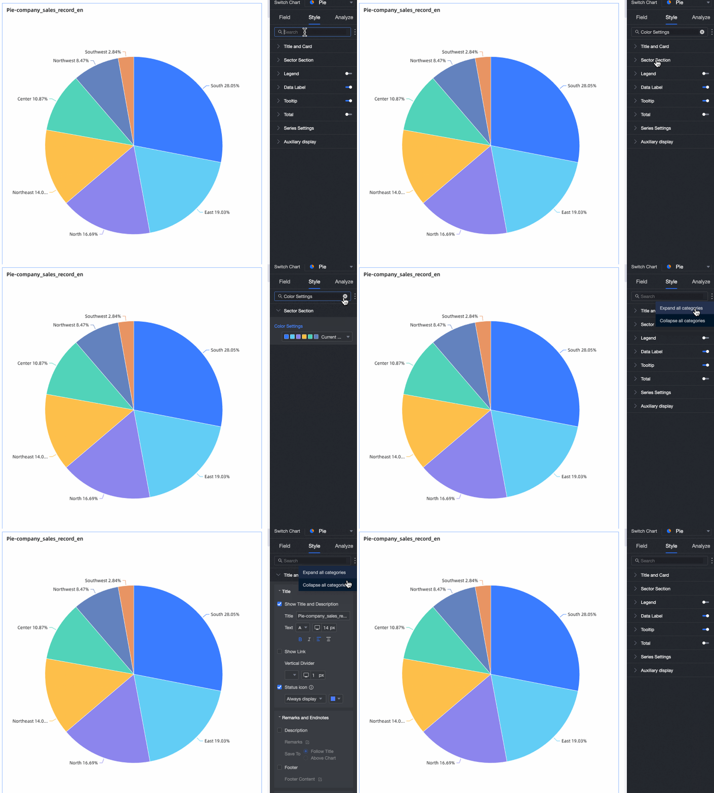
Slice area
In the Slice Area section, configure the following parameters.
Parameter | Description |
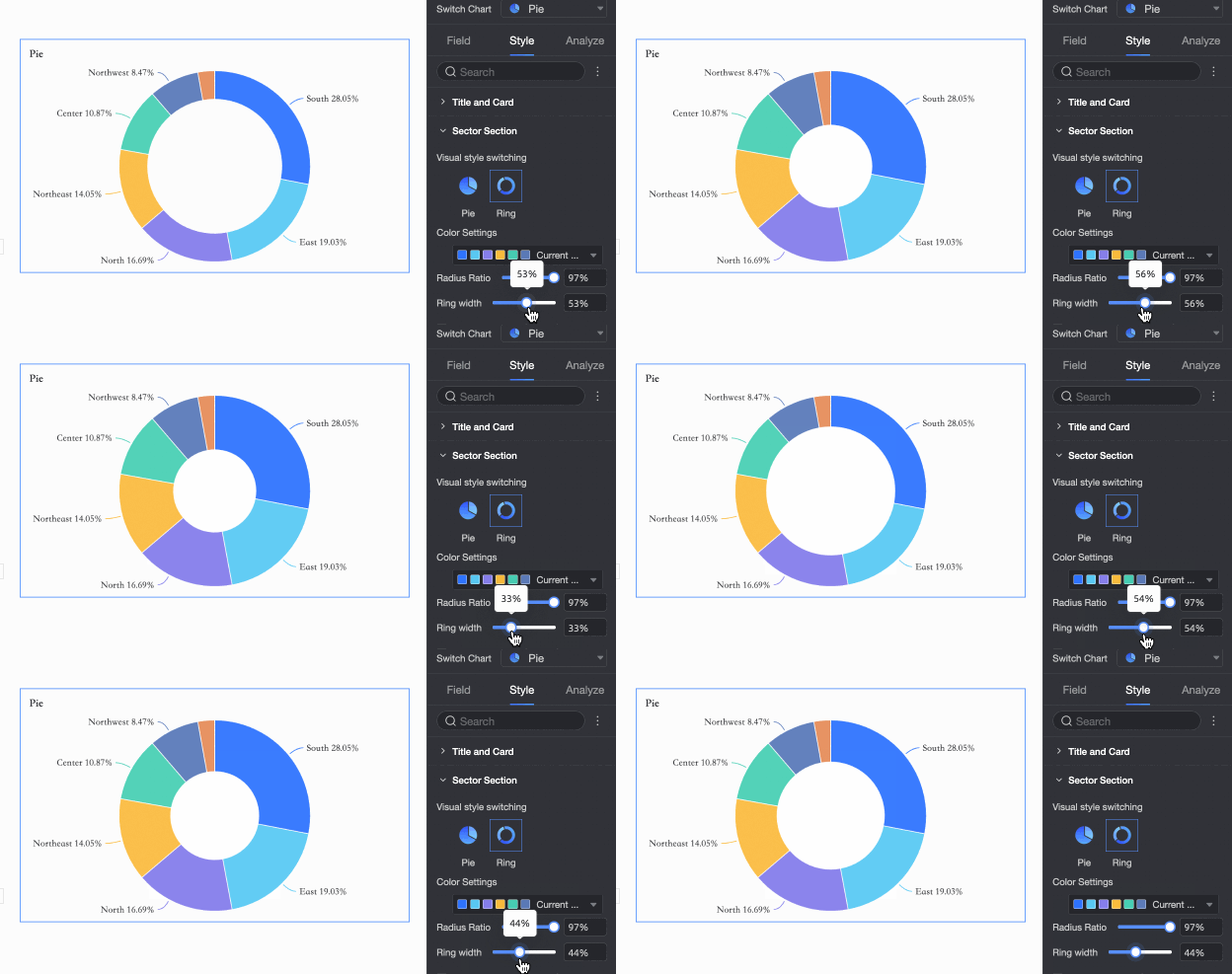
Visual style | Supports two formats: pie and ring.
Note For the Ring style, you can customize the ring width. |
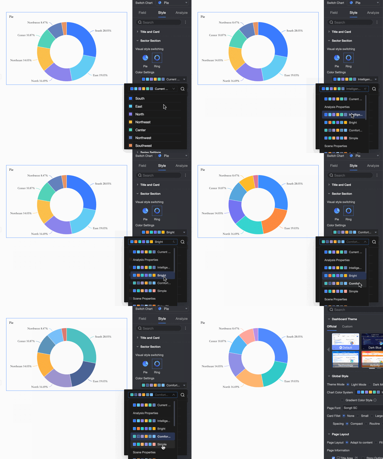
Color settings | Set a color scheme for the pie chart.
|
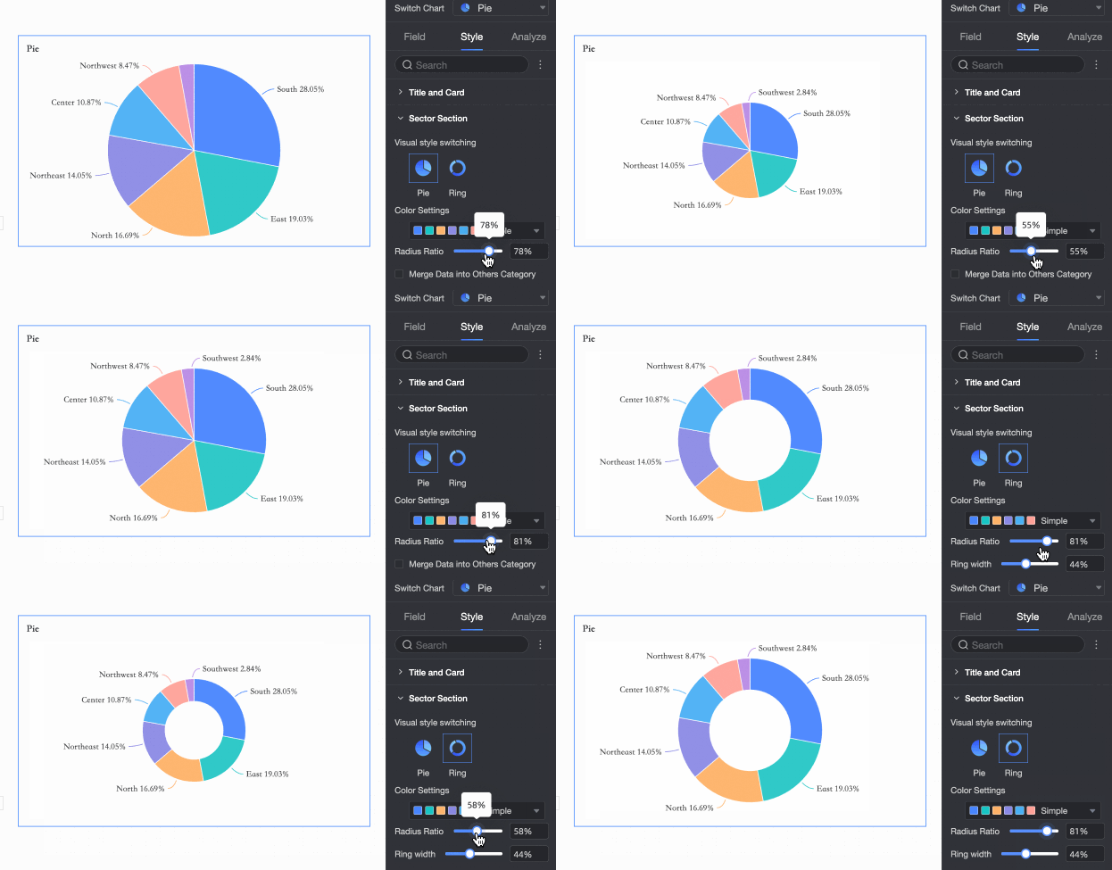
Radius ratio | Sets the pie chart's radius as a percentage of its container.
|
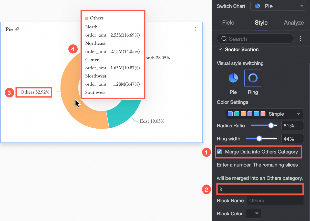
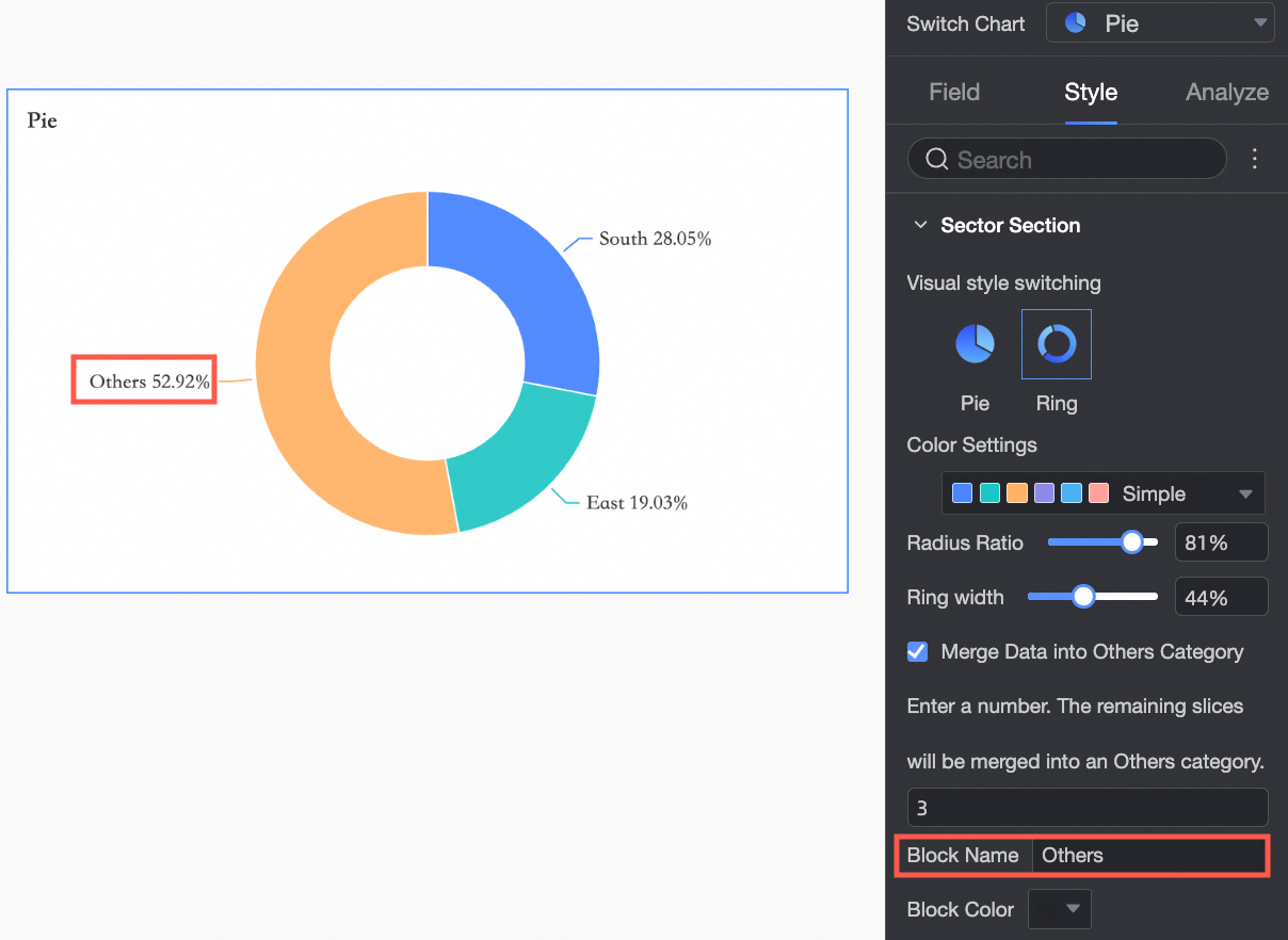
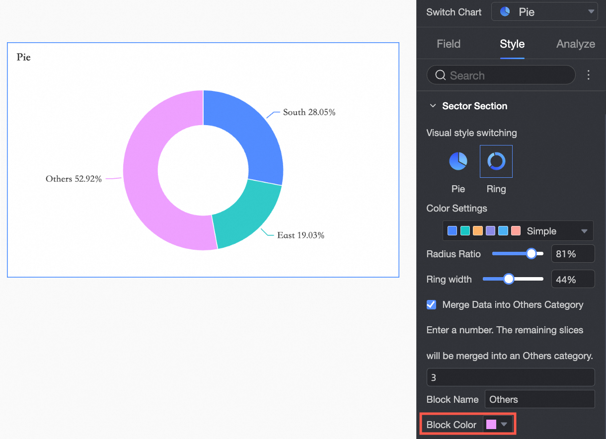
Merge data into 'Others' category | If you select Merge Data into Others Category and set the number of slices to 3, the remaining slices are grouped into an 'Others' category. When you hover over the Others slice, you can see the merged content.
|
Block name: You can customize the name of the 'Others' category, for example, | |
Block color: You can set the color for the 'Others' category. |
Legend
In the Legend section, click the  icon to enable the chart legend and configure its styles.
Desktop configuration

Parameter
Description
Position
Sets the position and alignment of the legend on a desktop.
When the position is Top or Bottom, you can align the legend to the left, center, or right.
When the position is Left or Right, you can align the legend to the top, center, or bottom. You can also set the distance between the legend and the chart.
Text style
Sets the text style for the legend, including font color, size, weight, and italics.
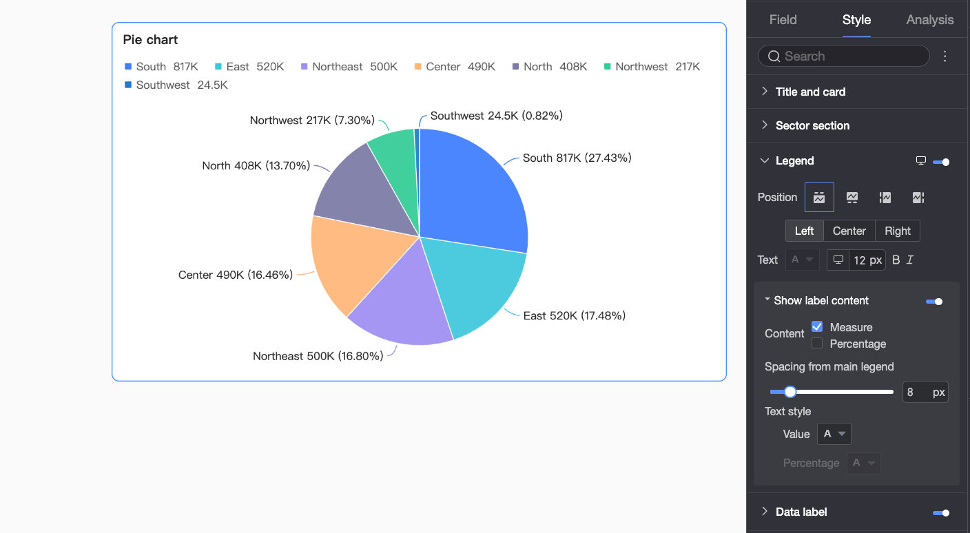
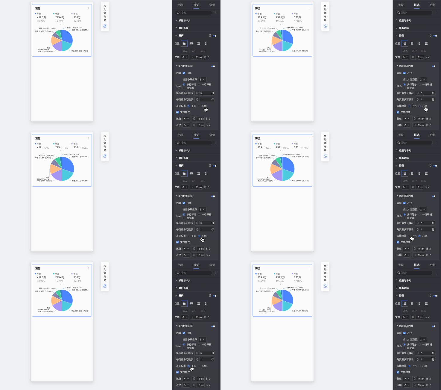
Show label content
Click the
icon to display data content.Content
Specifies the content to display next to each legend item. You can select measure and percentage.
When you select to display the percentage, you can set the number of decimal places to 0, 1, or 2 in Decimal Places.
Spacing from main legend
Sets the spacing between the legend item text and its corresponding value.
Text style
You can format the text for the selected measure or percentage.
Mobile configuration
Parameter
Description
Position
Sets the position and alignment of the legend on a mobile device.
When the position is Top or Bottom, you can align the legend to the left, center, or right.
When the position is Left or Right, you can align the legend to the top, center, or bottom. You can also set the distance between the legend and the chart.
NoteWhen the position is set to Top, you can enable labels below the legend, but custom alignment is not supported.
Text style
Sets the text style for the measure names in the legend on a mobile device, including font color, size, weight, and italics.
Show label content
When Position is set to Top, click the
icon to enable labels below the legend.Content
Specifies the content to display below each legend item. You can show the percentage. If you select to display the percentage, you can also set the number of decimal places to 0, 1, or 2 in Decimal Places.
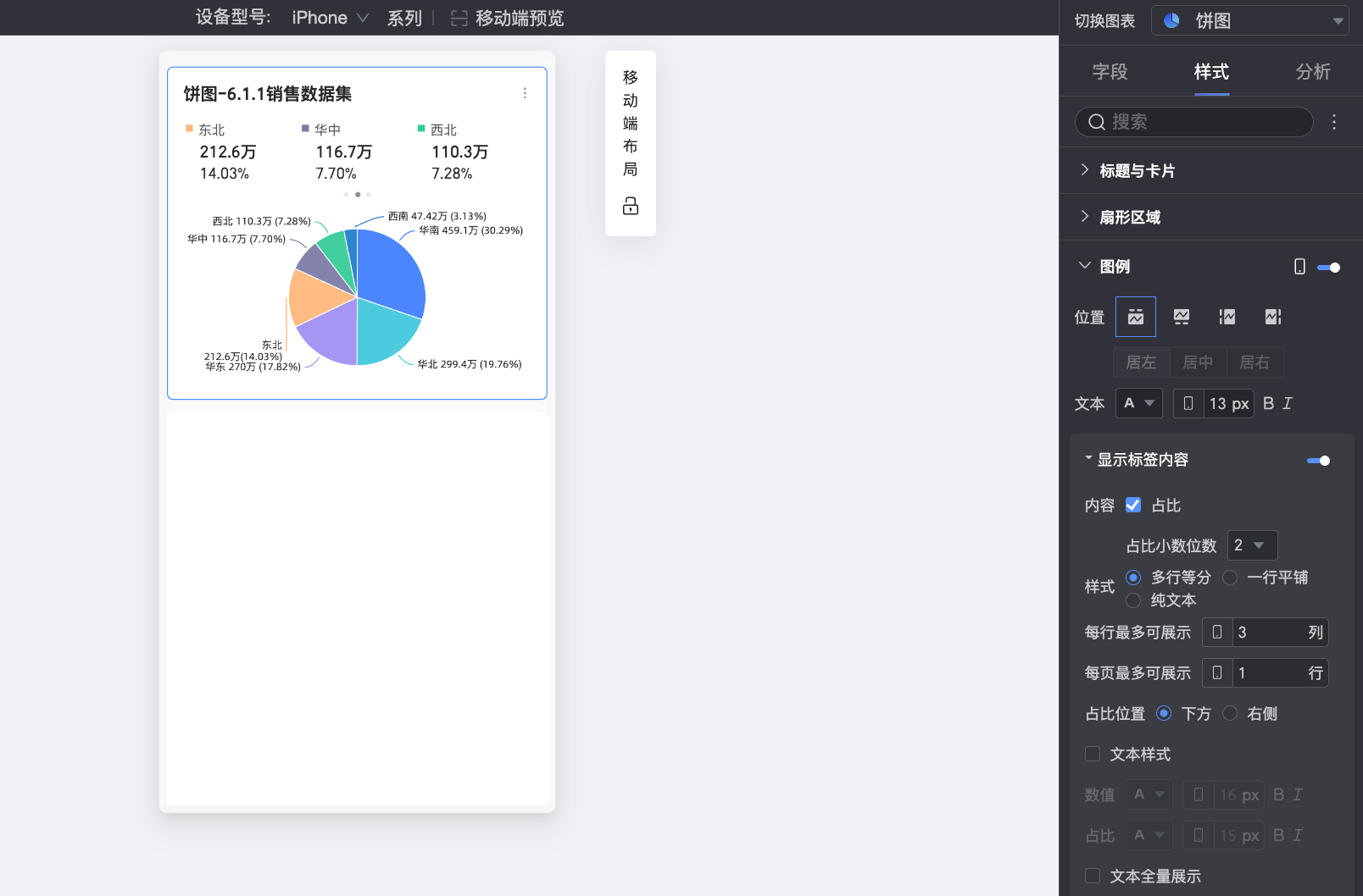
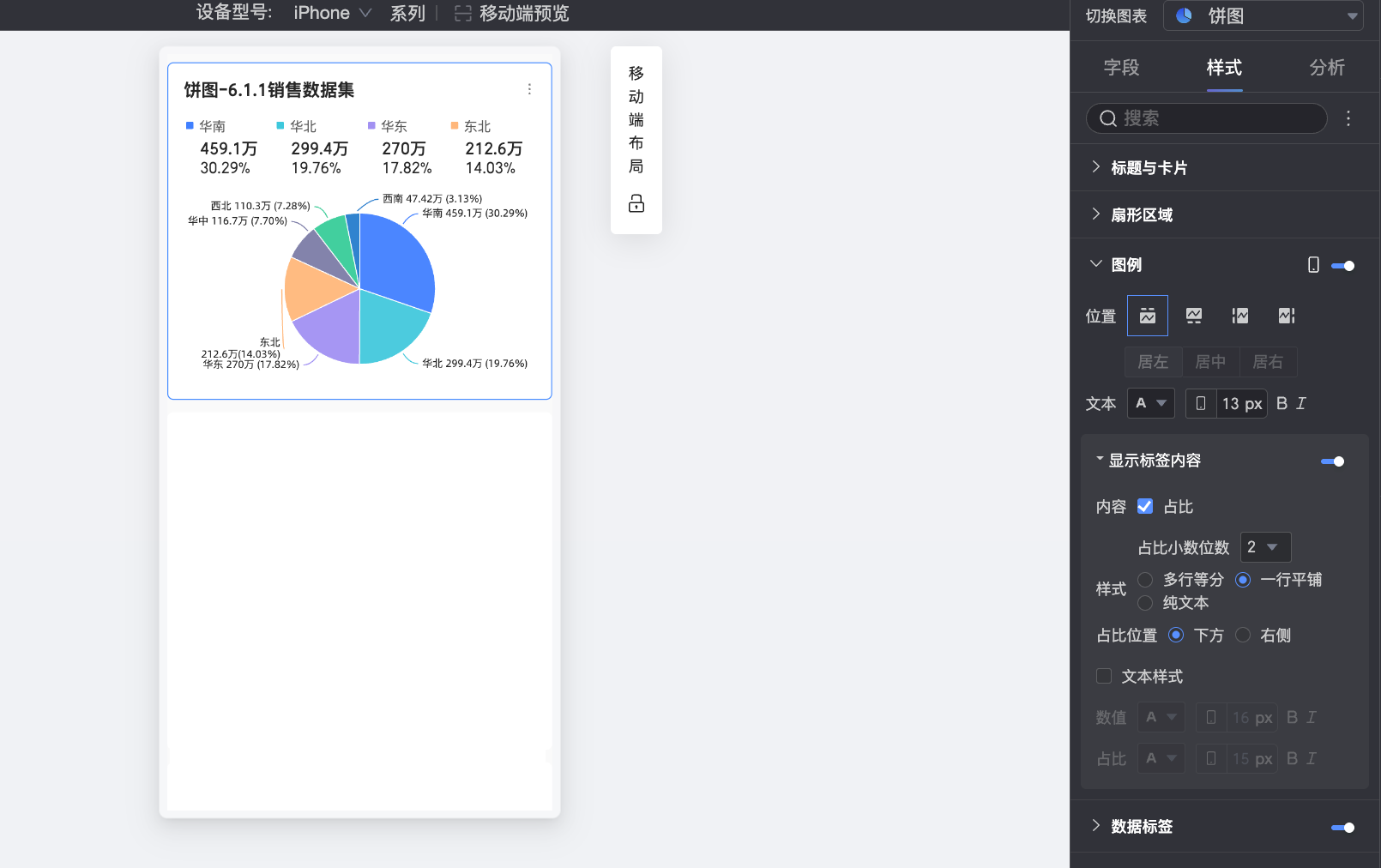
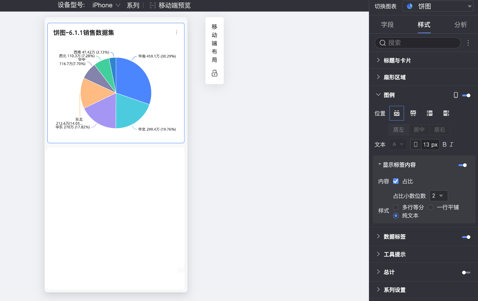
Style
Sets the layout of the labels below the legend. The following options are available:
Grid: Arranges labels in a grid based on the number of columns specified in Max items per row and the number of rows in Max items per page.
Inline: Displays all labels in a single line.
Plain text: Displays only text without icons. The text color matches the corresponding measure's color in the chart.
Percentage position
When you select to display the percentage in Content and set the Style to Grid or Inline, you can specify the position of the percentage value relative to the legend item's name. Options are Below or Right.
Text style
When Style is set to Grid or Inline, you can configure the style for the value text.
You can format the text for the value and percentage separately to create a visual distinction.
Decimal places
When you choose to display the percentage, you can adjust the number of its decimal places.
 icon to display data content.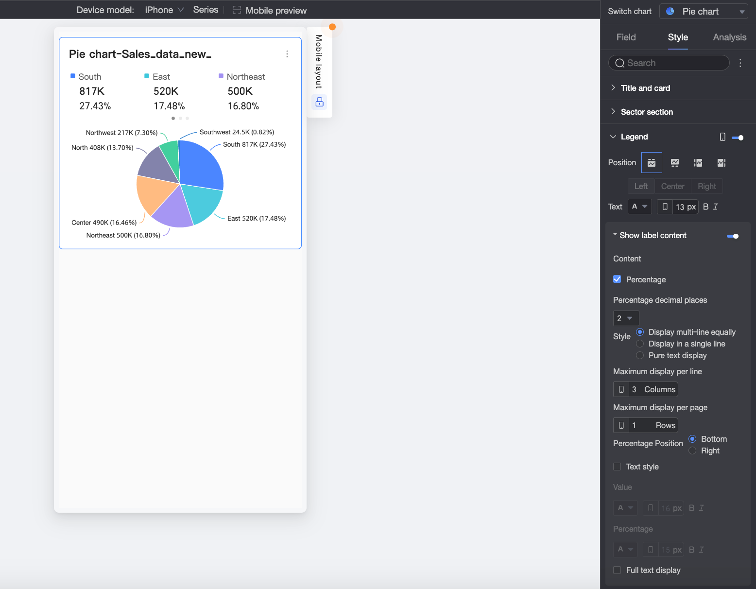
Data labels
In the Data labels section, configure data label visibility and style.
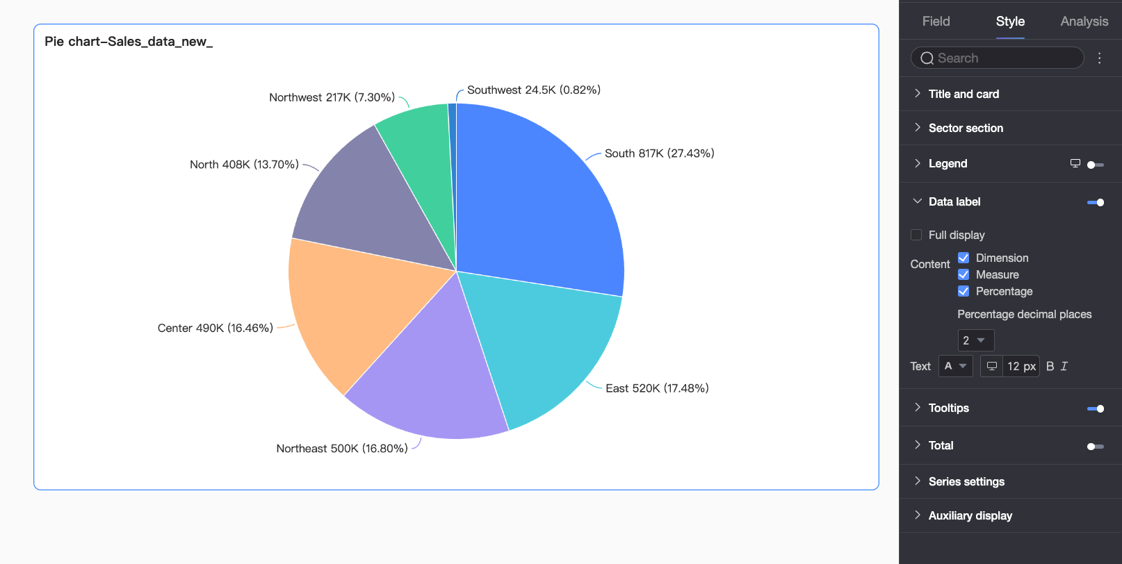
Parameter | Description |
Show all | Specifies whether to show all data labels. |
Content | Specifies the content of the data labels. You can select dimension, measure, and percentage. When you select to display the percentage, you can set the number of decimal places to 0, 1, or 2 in Decimal Places. |
Position | Sets the position of the data labels. |
Text style | Sets the style of the label text. |
Tooltip
In the Tooltip section, click the icon to enable tooltips and configure their style.
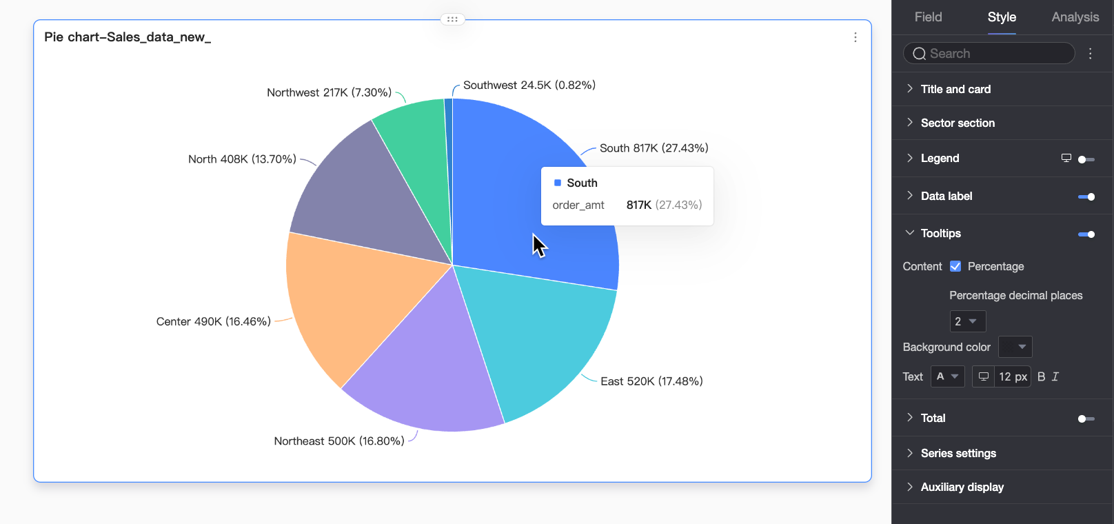
Parameter | Description |
Content | Specifies the content of the tooltip. You can choose whether to show the percentage. When you select to display the percentage, you can set the number of decimal places to 0, 1, or 2 in Decimal Places. |
Background color | Sets the background color of the tooltip. |
Text style | Sets the text style within the tooltip, including font color, size, weight, and italics. |
Mobile tooltip | The tooltips for desktop and mobile are enabled independently. You can switch to the mobile editing view by using the desktop/mobile toggle button (
|
 ) at the top of the dashboard editor to configure the mobile tooltip. Font size can be set separately for desktop and mobile, while other styles are applied universally.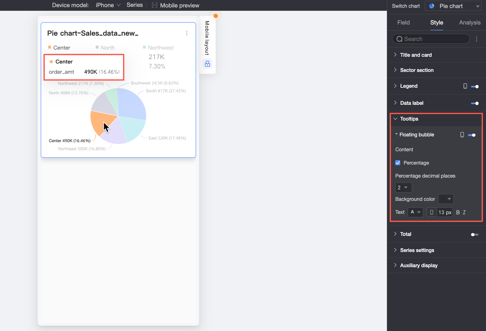
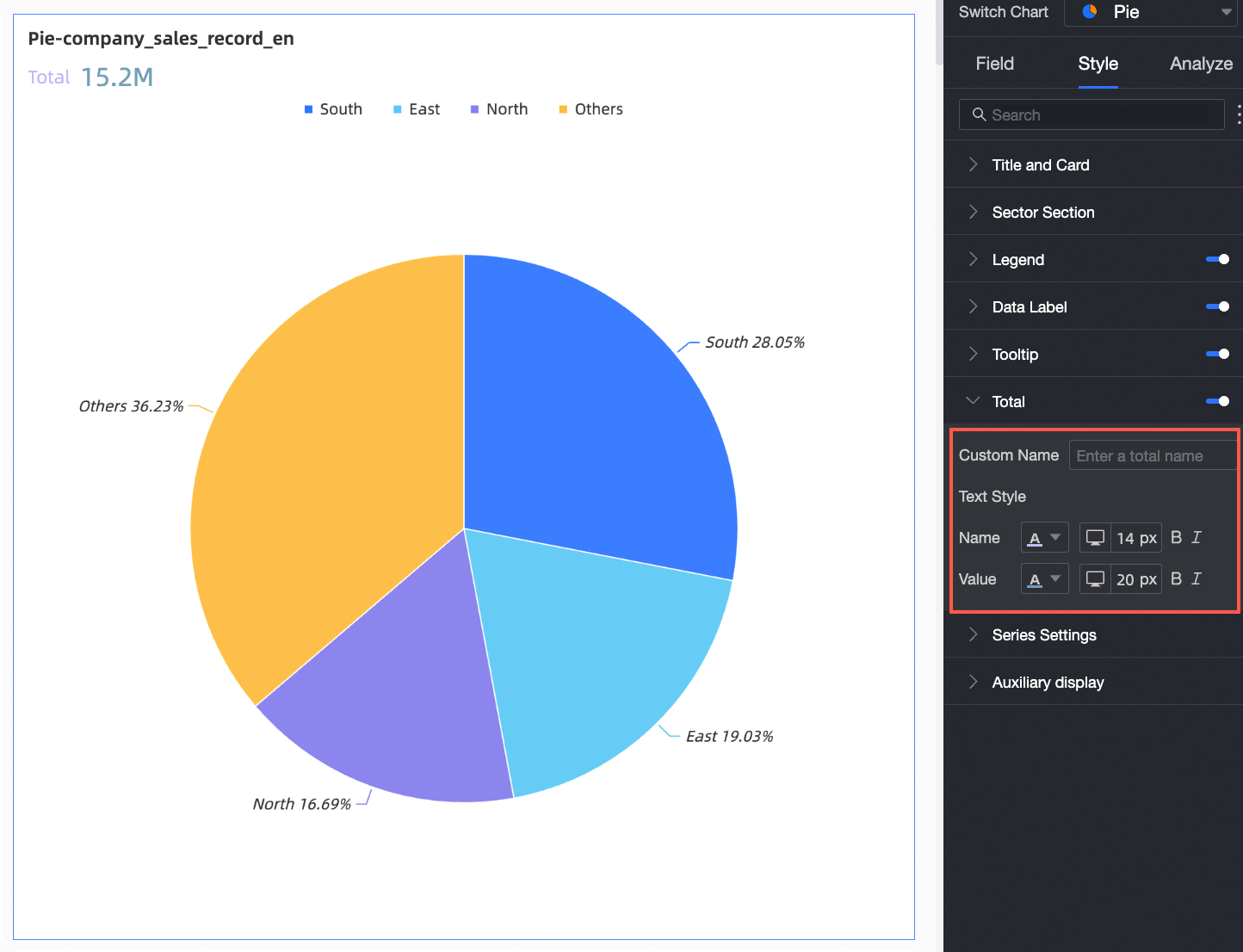
Total
In the Total section, configure whether to show the total.
Parameter | Description |
Custom name | You can customize the name of the total. |
Text style | Sets the style for the name and value text. |
Series settings
In the Series Settings section, configure the series style.
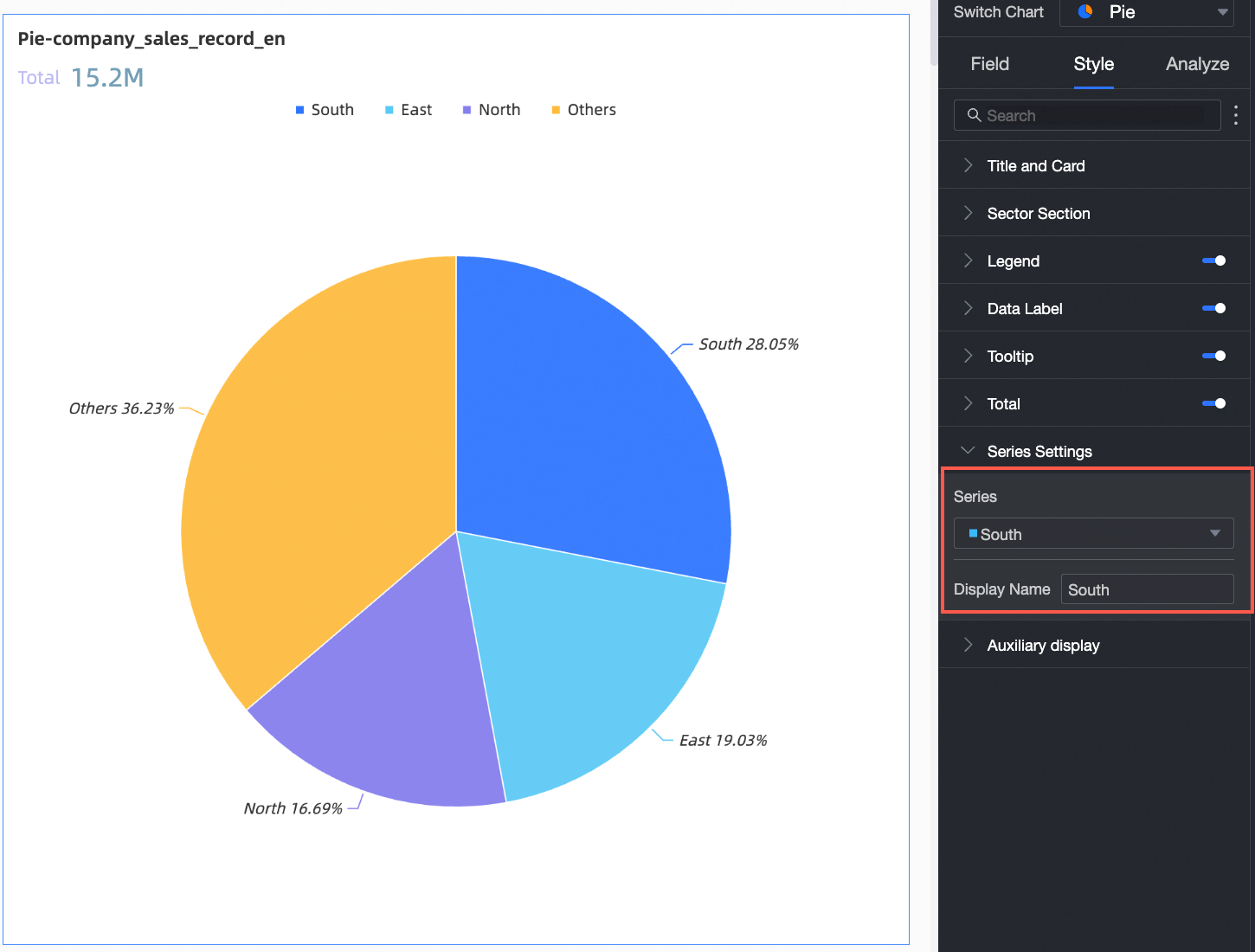
You need to configure the display name and numeric format in Series Settings only when Color Legend/Dimension is enabled.
Parameter | Description |
Series | Select a dimension or measure item based on your use case. |
Display name | Sets a custom display name for the series. |
Functionality settings
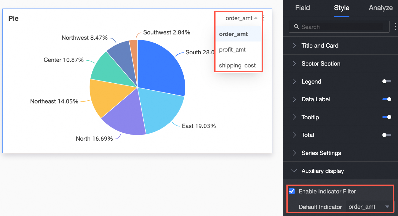
In the Functionality Settings section, configure the indicator filter display.
Parameter | Description |
Enable indicator filter | Specifies whether to enable this feature. If enabled, you must also set the default selected metric field. |
Configure chart analysis
Category | Feature | Description |
Data Interaction | Drill-down | If you have configured drill-down fields in the field pane, you can set the display style for the drill-down hierarchy here. |
Filter interaction | If the data that you want to analyze exists in different charts, you can click the Edit icon next to Linkage and configure the parameters in the Filter Interaction dialog box. Charts can be associated for data analysis. For more information, see Drilling, filter interaction, and hyperlink. | |
Hyperlink | To analyze data across different dashboards, link them with hyperlinks. Hyperlinks include two types: Parameter and External Link. For more information, see Set up and display hyperlinks. | |
Annotation | You can use icons, background colors, and highlighted measures as labels to mark a specific part of a chart. For more information, see Label. | |
Smart insights | When enabled, the system provides an automated analysis of the chart. | |
Delete a pie chart
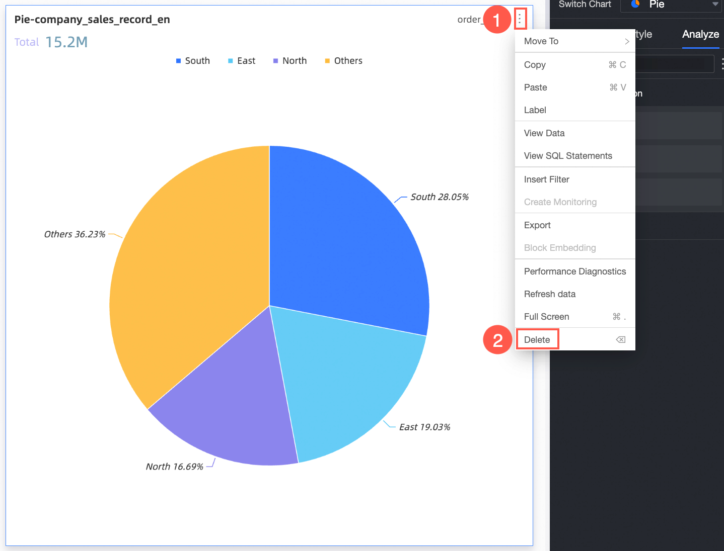
To delete the chart, follow the steps shown in the figure.
What to do next
You can share a dashboard with specific users if they want to view the dashboard. For more information, see Share a dashboard.
For complex, menu-driven thematic analysis, integrate your dashboard into a BI portal. For more information, see Create a BI portal.