This topic answers frequently asked questions (FAQs) about creating dashboards in Quick BI.
- Chart configuration
- How do I change the display format for a measure in a chart?
- How do I show or hide a legend?
- How do I display chart labels?
- How do I change the alias of a measure field in a line or column chart?
- How do I change the color of a measure field in a line or column chart?
- When a chart has dual Y-axes, how do I set the primary and secondary axes?
- How do I change the chart type to a bubble map?
- How do I change the chart type to a funnel chart?
- How much data can a dashboard display?
- How do I configure a dashboard to display only the top 10 rows of data?
- Can the data in a dashboard refresh automatically?
- Can I change the color of an axis title?
- Does Quick BI support adding a pivot table?
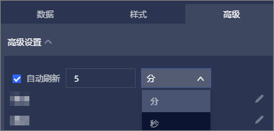
- What does auto-refresh mean in a dashboard?
- What is the carousel setting for a full-screen dashboard in the Professional Edition?
- Does Quick BI support adding trajectory charts?
- Do chart remarks support line breaks?
- Can I upload images directly from a local device by using the image control?
- Why is the data in a dataset different from the data displayed in a line chart on a dashboard?
- What is the maximum number of charts per dashboard?
- Dashboard operations
- Are there browser requirements for development or viewing modes?
- How do I publish or share a dashboard with others?
- Why can't I share or publish a dashboard?
- Can a dashboard be exported as a PDF file or an image?
- Can a chart on a dashboard be copied?
- Do dashboards support scheduled tasks?
- Can I set a password for a published dashboard?
- How do I download a dashboard as a PDF file?
- Can I set an "OR" relationship between multiple filters?
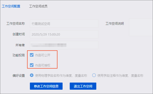
- Can I move items from a personal space to a group space?
- Are spreadsheets supported as a data source?
- Are ECharts plug-ins supported?
- What factors affect dashboard performance?
- Why does the UI lag when a dashboard with more than five charts loads a large volume of data, such as 10,000 rows?
- Do charts automatically adapt to displays with different resolutions and sizes?
- Visual analytics
- How do I use drill down?
- Can I create interactions between charts?
- Does Quick BI support cross-source joins for MaxCompute tables?
- How do I show the last 30 days of data with automatic daily updates?
- Do dashboards support interactions between charts from different datasets?
- Do charts in the Personal Edition support drillthrough?
- Do dashboards support interaction and drillthrough?
- Can YoY or MoM comparisons use a baseline from three or more years ago?
- Besides using SQL, can I configure a "Last 7 Days" or "Last 30 Days" view in a dashboard?
- How do I prevent a date field from being split?
- How do I add multiple tabs?
- Can an indicator card interact with a tab?
- Can the maximum value of a progress bar be a measure?
- If a dataset is a partitioned table, can I use a drop-down list (filter by enumeration) for filter conditions?
- Why does a date in yyyy-MM-dd format in my database appear as yyyymmdd in the dashboard?
- When a crosstab is paginated, how can I display the total for each page?
- I created a calculated field with an aggregate function in a dataset. Why doesn't this field appear in the preview?
- Can global parameters pass time values?
- Can I hide multiple unnecessary fields from a dataset in bulk?
- Can I query by entering a value instead of selecting from a list?
- After setting the format to "Auto-adapt", how do I set the number of decimal places?
- How do I sort the fields returned by a query?
- In a report, can I switch between different dimensions (for example, from monthly to quarterly) to view a measure?
- What is the calculation logic for year-on-year and month-on-month comparisons in a dashboard, and can this logic be modified?
- Can a crosstab column remember its sort order?
- Can I apply different query conditions to different charts by using the same search box?
- Can I hide the field name on the horizontal axis?
- Is custom sorting supported? For example, can I set and save a default sort order for preset values?
- Can I integrate third-party video surveillance? For example, can an external video feed be embedded into a Quick BI display page?
- A leaderboard displays a maximum of 10 characters for dimension value names by default. Can I change this character limit?
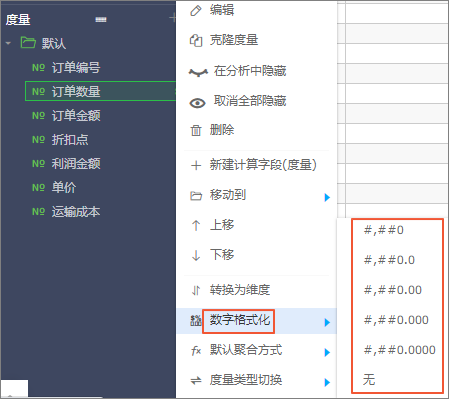
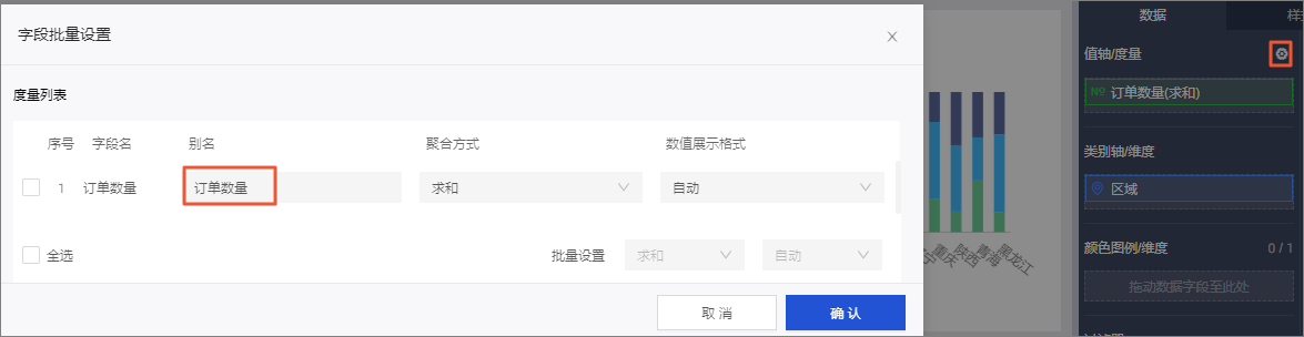
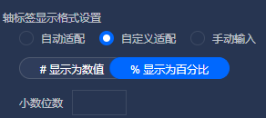
Change the display format for a measure
- On the dashboard editing page, click the Style tab on the right to set the measure's display format.
For example, you can set the display format for the data on the Left vertical axis of a line chart.Alternatively, in the Chart Design panel, go to the Data tab, click the
 icon next to
Value Axis/Measure, and modify the numeric display format.
icon next to
Value Axis/Measure, and modify the numeric display format.
- On the dataset editing page, find the target field in the Measures section and click the
 icon to its right.
- Select Edit to set the display format of the measure field.
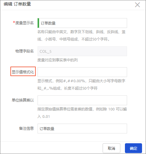
- Select Number Formatting to set the display format of the measure field.
- Select Edit to set the display format of the measure field.
Show or hide a legend
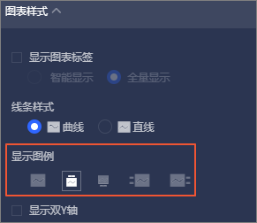
- Click the
 icon to hide the legend.
 - Click any icon in to show the legend.
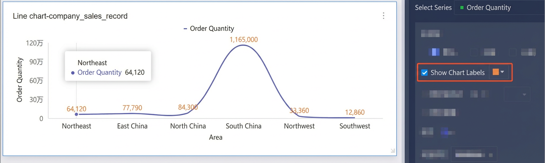
Display chart labels
Change the alias of a measure field
icon next to
Value Axis/Measure and change the field's alias.
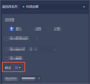
Change the color of a measure field
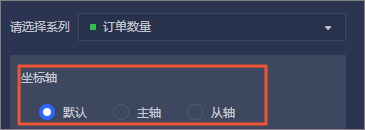
Set primary and secondary axes
Browser requirements
- Viewing mode is compatible with the following browsers:
- Chrome 57 or later
- 360 Extreme Browser 9.5 or later
- QQ Browser 10.0 or later
- Internet Explorer 11 (does not support the Data Entry and Self-Service Data Retrieval features).
- Development mode is compatible with the following browsers:
- Chrome 57 or later
- 360 Extreme Browser 9.5 or later
- QQ Browser 10.0 or later
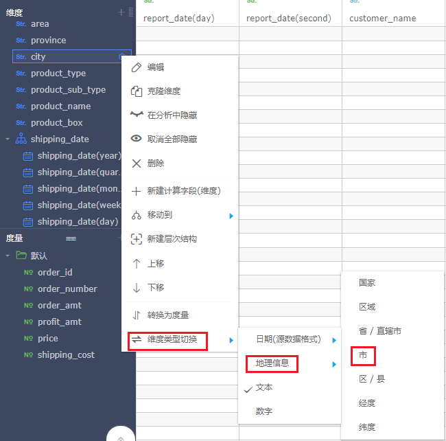
Change chart type to a bubble map
- On the dataset editing page, change a dimension field to a geographic information type.
- On the dashboard editing page, click Change Chart Type in the upper-right corner, then find and click bubble map.
Change chart type to a funnel chart
- On the Data tab of the dataset editing page, ensure your data contains only one dimension and one measure.
- Click Change Chart Type in the upper-right corner, then find and click funnel chart.
Maximum data display
10,000 rows.
Use drill down
For more information about drill down, see Step 3: Configure and display drill-down settings.
Publish or share a dashboard
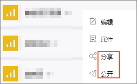
Troubleshoot sharing and publishing
Create interactions between charts
Yes. For more information, see Drill down.
Cross-source joins for MaxCompute tables
Quick BI Professional Edition supports cross-source joins for MaxCompute, MySQL, Oracle, AnalyticDB for MySQL 3.0, and SQL Server data sources. This feature is not available in other editions.
Show the last 30 days of data
day date field to a filter and set the relative time to T-
30.
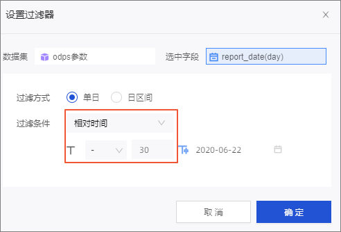
- Exact Time: Sets a specific date and time, for example, December 12, 2020.
- Relative Time: Sets a dynamic time range relative to the current time. For example, if the current date is June 4, 2020, setting the relative time to T-30 displays data for the 30-day period from May 5, 2020, to June 4, 2020.
Display only the top 10 rows
Set the number of preview rows to 10 and sort the data by a measure or dimension.
Automatic data refresh
Export dashboards to PDF or image
Yes. For more information, see Manage charts.
Interactions between charts from different datasets
Yes. For more information, see Drill down.
Support for interaction and drillthrough
| Chart type | Interaction | Drillthrough |
| line chart | Supported | Supported |
| area chart | Supported | Supported |
| stacked area chart | Supported | Supported |
| 100% stacked area chart | Supported | Supported |
| column chart | Supported | Supported |
| stacked column chart | Supported | Supported |
| 100% stacked column chart | Supported | Supported |
| radial column chart | Supported | Supported |
| bar chart | Supported | Supported |
| stacked bar chart | Supported | Supported |
| 100% stacked bar chart | Supported | Supported |
| waterfall chart | Supported | Supported |
| combo chart | Supported | Supported |
| pie chart | Supported | Supported |
| crosstab | Supported | Supported |
| choropleth map | Supported | Supported |
| bubble map | Supported | Supported |
| LBS bubble map | Supported | Supported |
| indicator card | Supported | Supported |
| scatter plot | Supported | Supported |
| bubble chart | Supported | Supported |
| faceted scatter plot | Supported | Supported |
| funnel chart | Supported | Supported |
| comparison funnel chart | Supported | Supported |
| radar chart | Supported | Not supported |
| rose chart | Supported | Supported |
| treemap | Supported | Supported |
| word cloud | Supported | Not supported |
| leaderboard | Supported | Supported |
Drillthrough support in Personal Edition
The Personal Edition supports drillthrough to external links but not drillthrough with global parameters.
Copy a chart on a dashboard
Yes. For more information, see Manage charts.
Scheduled tasks support
The Advanced and Professional editions support the subscription feature, which allows you to schedule tasks. For more information, see Create a subscription task.
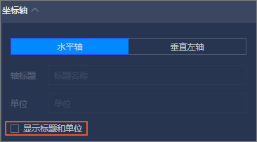
Change the color of an axis title
No, this is not supported.
Add a pivot table
Yes, you can add a pivot table in a group space in the Professional Edition.
Auto-refresh in dashboards
This feature periodically refreshes charts by reading the latest data from the database.
Set a password for a published dashboard
No, this is not supported.
Download a dashboard as a PDF
For more information, see Manage charts.
Set an OR relationship between filters
No. As a workaround, you can create a calculated field in the dataset that combines the two fields with an OR condition. Then, use this new calculated field in a filter.
Carousel setting for full-screen dashboards
When a dashboard contains multiple chart components, the carousel setting rotates through them at a specified interval.
Move items from personal to group space
No, this is not supported.
Add trajectory charts
No, this is not supported.
ECharts plug-in support
No, this is not supported.
Spreadsheets as a data source
No. You can only use datasets as data sources.
UI lag with large dashboards
This lag is likely caused by your local machine's performance. Try opening the dashboard on a different computer to see if the performance improves.
Line breaks in chart remarks
No, this is not supported.
Chart adaptation to different displays
Quick BI charts adapt to different screen sizes but not to different resolutions. For best results, view charts on displays with the same resolution.
Upload local images with the image control
No, you cannot select or upload images directly from your local device. To use a local image, generate a URL for it with an image conversion tool and then add the URL to the image control.
Copy data from the report interface
You cannot copy data directly from the chart display. You can click the  icon, select View Data, then copy the data.
Data discrepancy between dataset and chart
The dataset preview displays the first 100 rows of raw data, whereas the line chart displays aggregated data.
Factors affecting dashboard performance
Chart loading speed depends on the amount of data in the chart.
Loading multiple charts with large volumes of data may cause lag. Lag may also be related to the performance of your local machine.
Maximum number of charts per dashboard
The total number of components on a dashboard, including charts, tabs, rich text boxes, and query controls, cannot exceed 200.
YoY or MoM comparisons with long-term baselines
Quick BI does not support direct comparisons with data from three or more years ago. As a workaround, perform this calculation in a spreadsheet.
Configure "Last 7/30 Days" view without SQL
Yes. You can add a query control and set a quick date range. For more information, see Create a query control.
Prevent date fields from splitting
Scenario: A field stores a timestamp in yyyy-mm-dd hh:mm:ss format.
You can convert this field to the text format and then click Save. For more information, see Edit dimensions.
Add multiple tabs
You can add a new tab by clicking the  icon on the canvas. For more information, see Tab.
Interaction between indicator cards and tabs
No, this is not supported.
Use a measure as the maximum value for a progress bar
Yes.
Use a drop-down list for partitioned tables
Yes, you can use a drop-down list for query conditions on any text field.
Date format discrepancy between database and dashboard
Quick BI converts date formats in a dataset to a standard date type. Dashboards then display dates in yyyymmdd format. Other display formats are not supported. For more information, see Edit date dimensions.
Display page totals for a paginated crosstab
You can only display the grand total for all columns. Quick BI does not support page-specific totals. For more information, see Legacy crosstab.
Calculated field not appearing in preview
The dataset preview shows raw data. Aggregated fields do not appear in the preview pane on the right, but the field is available in the list on the left and can be used on the dashboard editing page to display data correctly.
Pass time values with global parameters
No. You can work around this by converting the field to text format before passing it.
Bulk-hide fields in a dataset
No, this is not supported.
Query by entering a value
Scenario: A drop-down list contains tens of thousands of items, which makes it difficult to use. What should I do?
Use conditional filtering instead of filtering by enumeration.
Set decimal places for the "Auto-adapt" format
Sort fields returned by a query
Switch dimensions to view a measure
No. After you create a report, you cannot change its dimensions in viewing mode.
YoY and MoM calculation logic
month-on-month (MoM) = (Current period - Previous period) / Previous period × 100%, year-on-year (YoY) = (Current period - Same period last year) / |Same period last year| × 100%. This logic cannot be modified.
Remember crosstab column sort order
Yes. On the dashboard editing page, find the target field and select a sort order. After you save the dashboard, the chart retains the specified sort order in viewing mode.
Apply different conditions to different charts
Scenario: A filter has conditions for Host and Project. Can I have a map that is filtered by both Host and Project, but a line chart that is filtered only by Host?
Yes. In the query control settings, do not associate the Project field with the line chart.
Hide the horizontal axis field name
Custom sorting support
For numeric fields, you can click the sort button on the field to set the order. For text fields, you need to add a query condition or filter, select the "Sort by fixed value" option, then select the field values in the desired order.
Integrate third-party video surveillance
You can embed external links, such as a video surveillance feed, on a data portal.
Change character limit for leaderboard dimension names
No, this is not supported.