Vertical bar chart
A vertical bar chart displays trends over time and compares data across categories. For example, you can use a vertical bar chart to compare traffic volume at an intersection during different time periods. This topic describes how to add data and configure styles for a vertical bar chart.
Prerequisites
You have created a dashboard. For more information, see Create a dashboard.
Chart overview
Use cases
Vertical bar charts are intuitive. The length of each bar represents its value, making it easy to compare data and identify trends across different groups.
Benefits
Powerful analytics: Configure period-over-period, year-over-year, and cumulative calculations with a single click. Add smart reference lines and trend lines.
Rich visualizations: Supports vertical bar, stacked vertical bar, and 100% stacked vertical bar charts. You can configure elements like data labels, legends, and an overview axis.
Data comparison and annotation: Supports period-over-period data comparison and value annotations.
Example
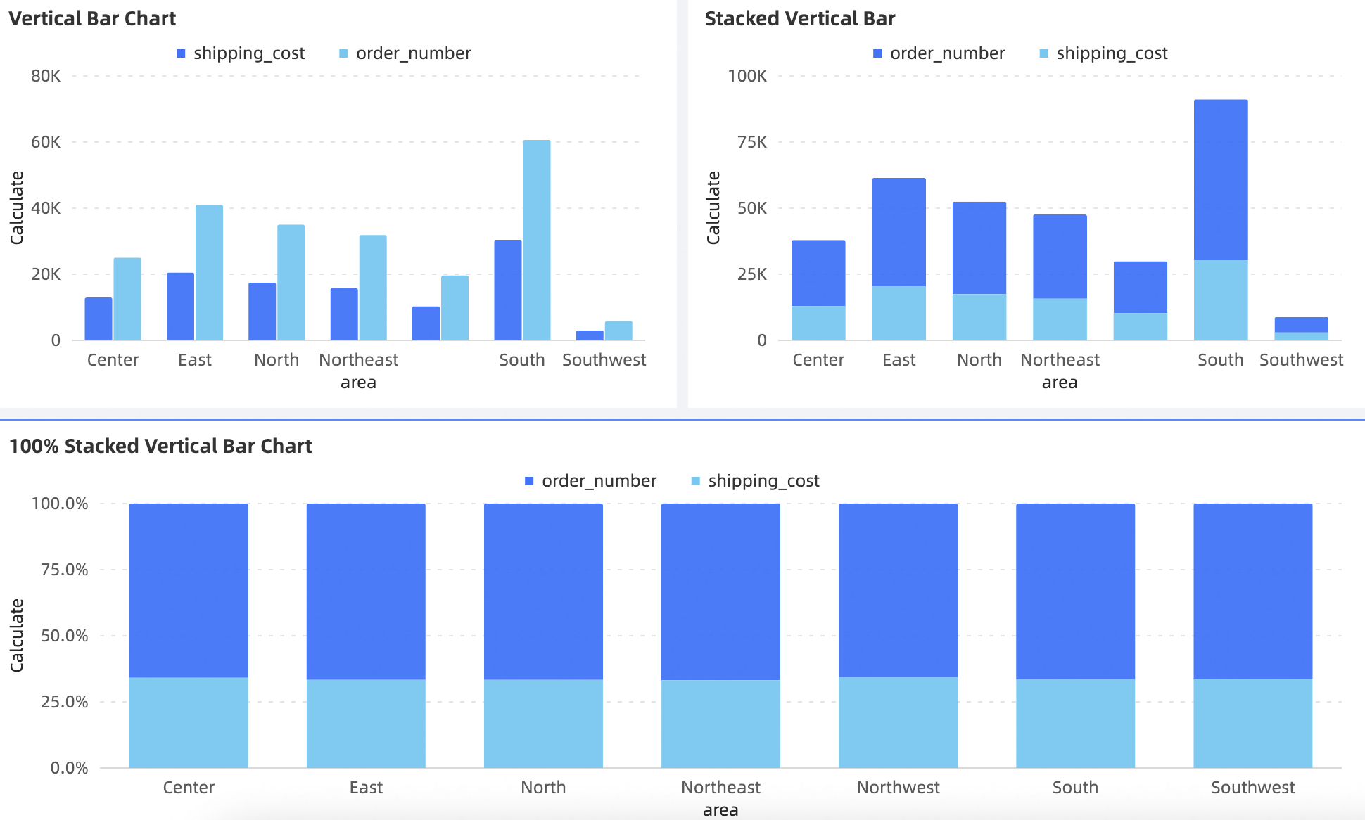
Limitations
A vertical bar chart is configured using the following fields: a value axis / measure, a category axis / dimension, and a color legend / dimension.
The category axis / dimension requires at least one dimension, such as date, province, or product type.
The value axis / measure requires at least one measure, such as order quantity.
The color legend / dimension requires a single dimension, such as shipping method.
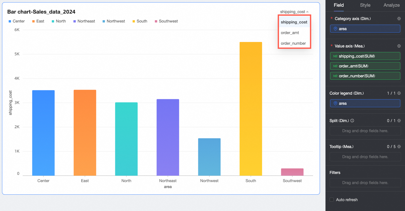
NoteIf the value axis contains multiple measure fields and you add a dimension field to the color legend, you must enable the in-chart metric filter to switch between metrics.
The Split / dimension field requires a single dimension, such as product type.
Configure chart fields
On the Data tab, select the required dimension and measure fields:
In the Dimension list, find province, then double-click it or drag it to the category axis / dimension area.
In the Dimension list, find product type, then double-click it or drag it to the color legend / dimension area.
In the Measure list, find transportation cost, then double-click it or drag it to the value axis / measure area.
NoteYou can drag the same field into both the category axis and color legend areas to assign distinct colors to different dimension values. The rendering effect varies depending on the configuration:
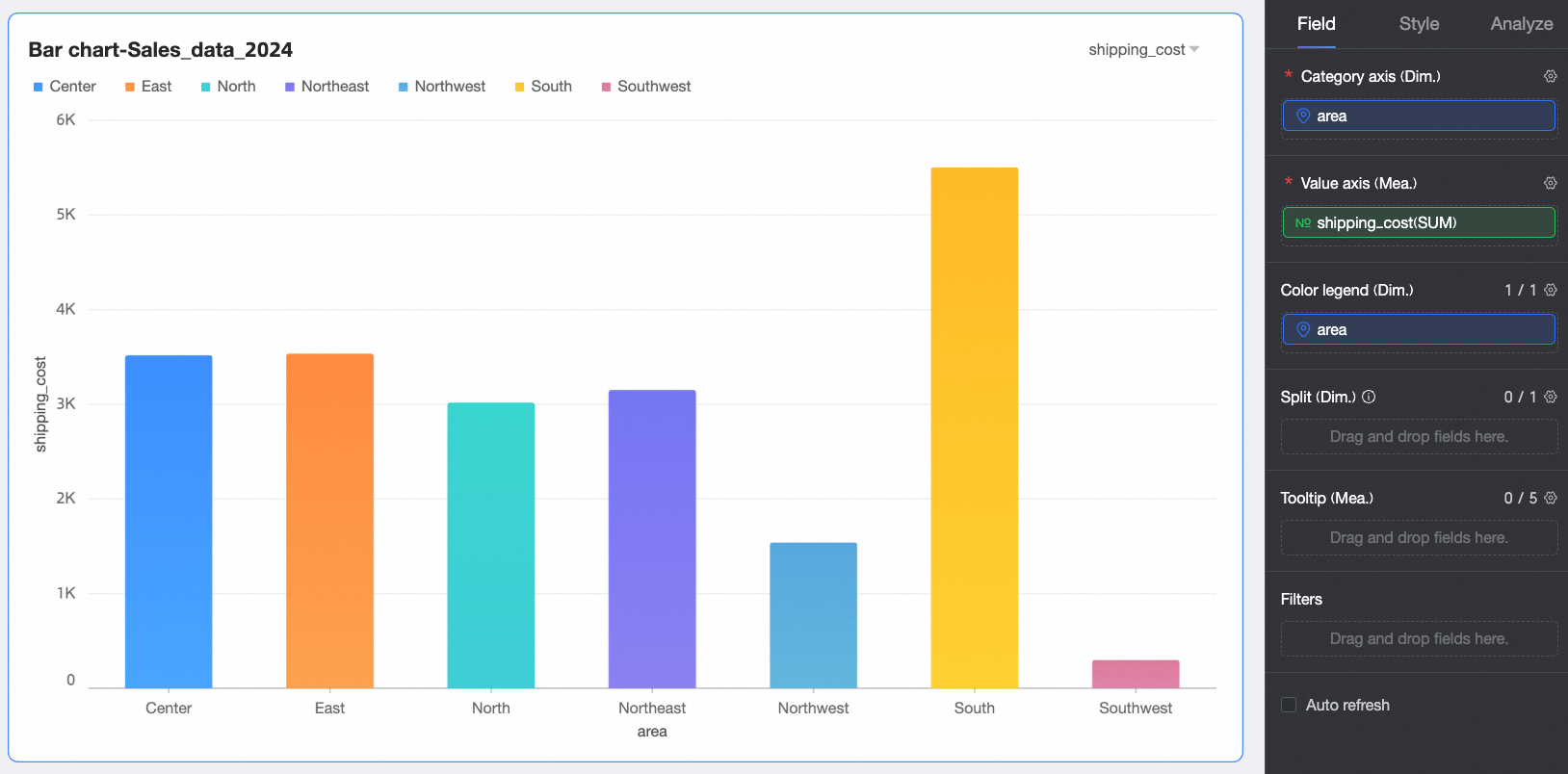
If the category axis and value axis each contain a single field, the number of bars equals the number of dimension values on the category axis.
If the value axis contains multiple measure fields, the chart displays the first measure by default. You must open the field filter panel to switch to other measures.
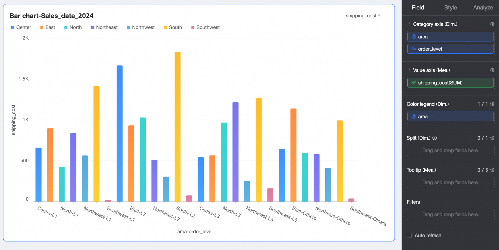
If the category axis contains multiple dimension fields, the number of bars is the product of the number of values in each dimension. For example, in the following figure, the number of bars equals the number of region values multiplied by the number of order level values.
Click Update. The chart updates automatically.
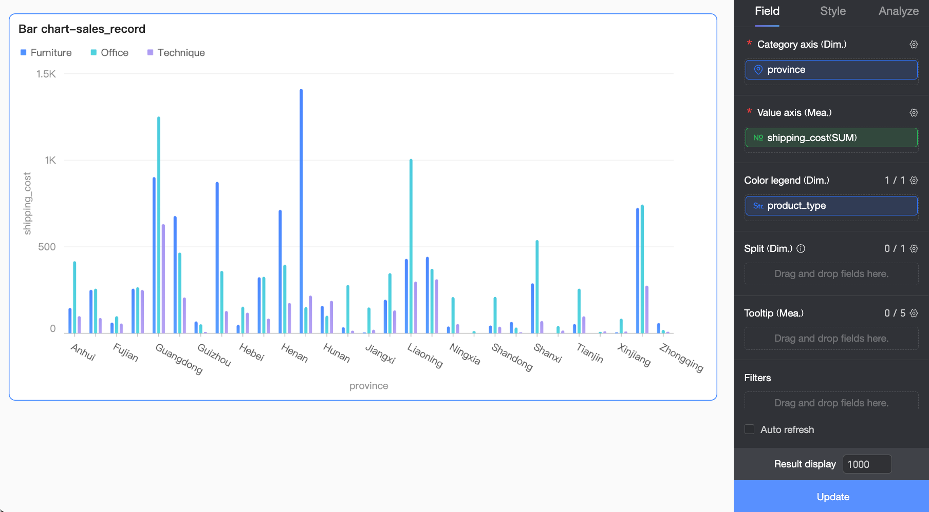
To view data for a specific region, you can set a filter to display only the required data.

(Optional) Auto refresh
If you enable this option, the chart data refreshes automatically. For example, if you enable this option, set the duration to 5, and select Minutes as the unit, the chart data will refresh every 5 minutes.
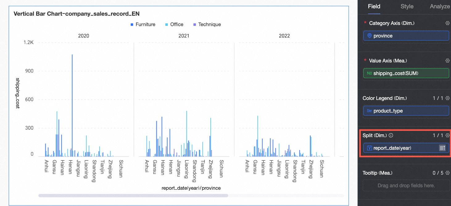
(Optional) You can add a dimension field to Split / dimension to display data trends across different dimension values more intuitively using facet mode.
NoteYou can add only one dimension to the Split field. Facet mode has the following limitations:
Fields: For the field in Split / dimension, the advanced calculation function only supports configuring TopN and None.
Style: The axis does not support enabling a dual Y-axis. The auxiliary display does not support an overview axis.
Analysis: Only data interaction is supported. Advanced settings, analysis and alerting, annotations, and smart insights are not supported.
Too many facets may cause the page to slow down. To ensure performance, we recommend using no more than 500 facets.

Configure chart styles
This section describes how to configure the styles for a vertical bar chart. For general chart style configurations, see Configure the chart title area.
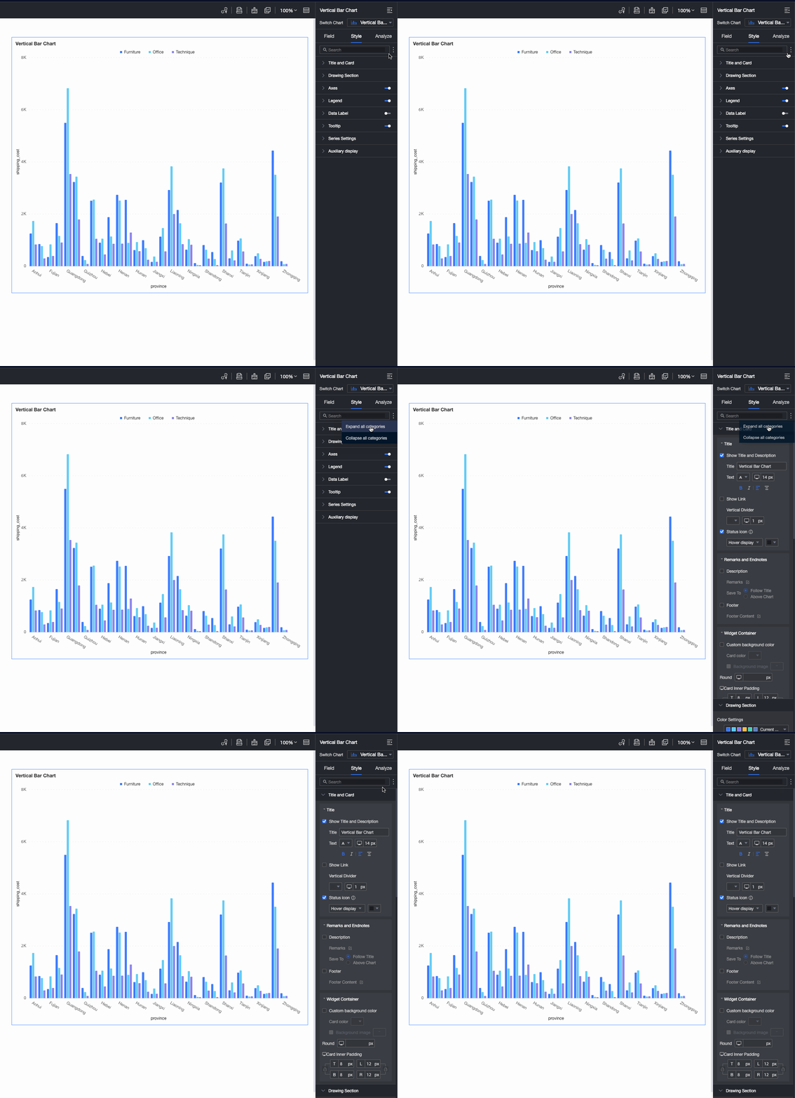
You can enter a keyword in the Search box at the top of the configuration pane to quickly find a configuration item. You can also click the  icon on the right to Expand/Collapse All Categories.
Drawing area
In the Drawing area section, configure the vertical bar chart style.
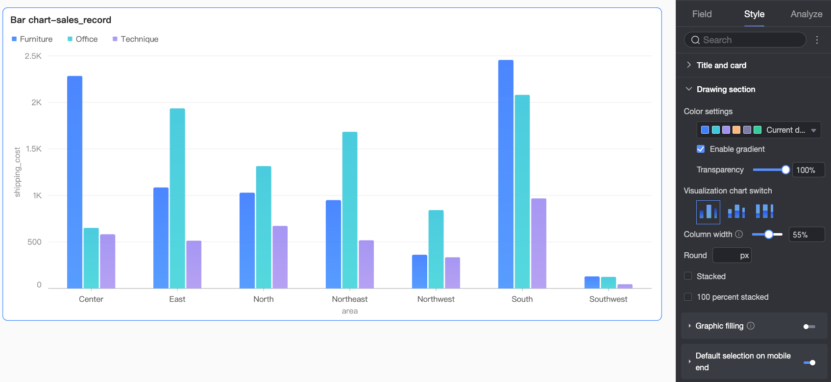
Parameter | Description |
Color settings | You can set a color scheme for the bars, enable gradient effects, and set the bar opacity. |
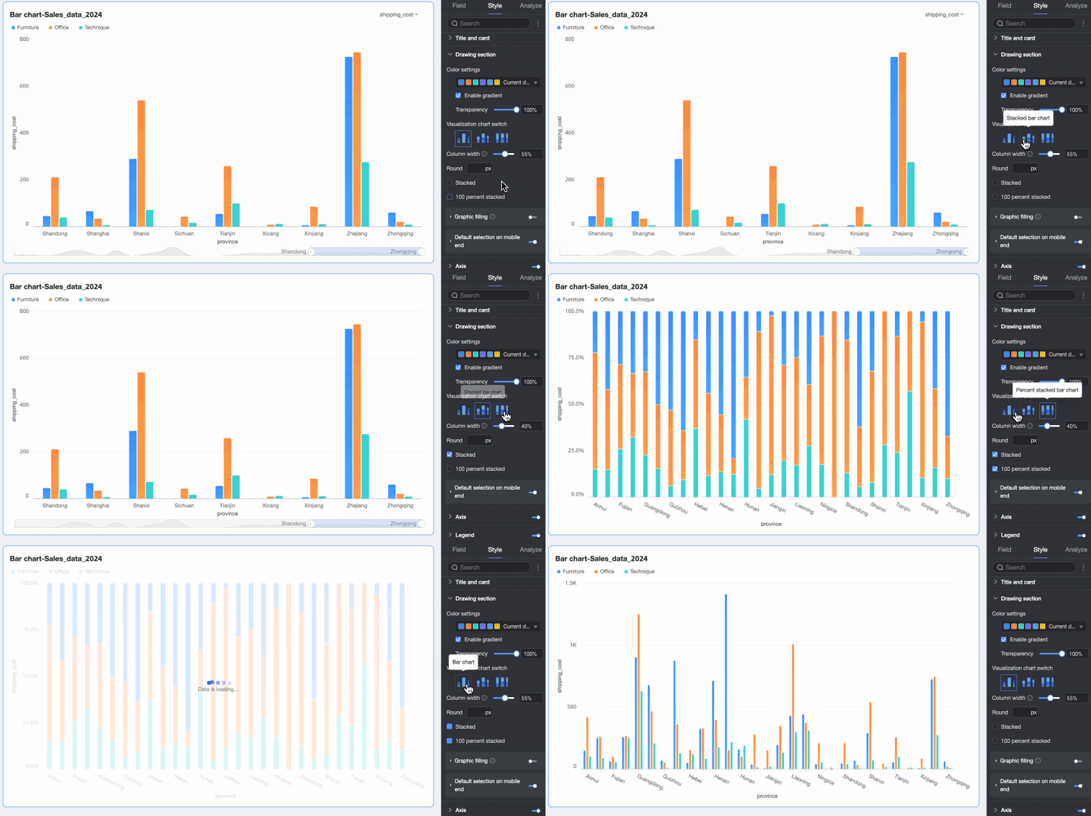
Visualization chart switcher | Set the chart type. Supports vertical bar chart, stacked vertical bar chart, and 100% stacked vertical bar chart. |
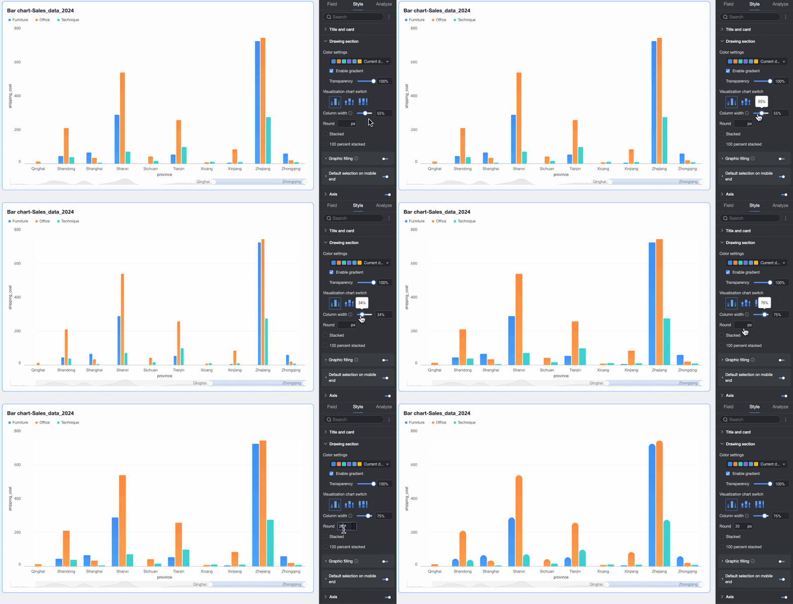
Bar width and corner radius | You can set the width and corner radius of the bars. |
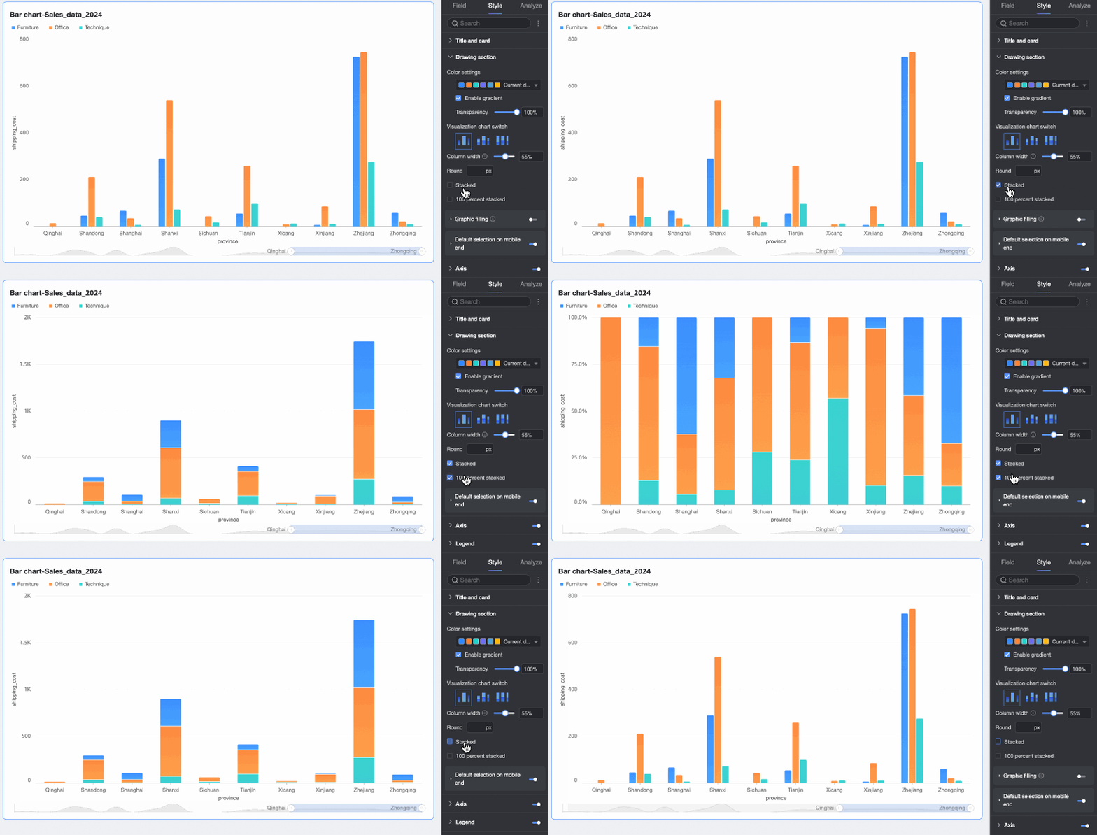
Stacked, 100% Stacked | Switch between vertical bar, stacked vertical bar, and 100% stacked vertical bar charts.
|
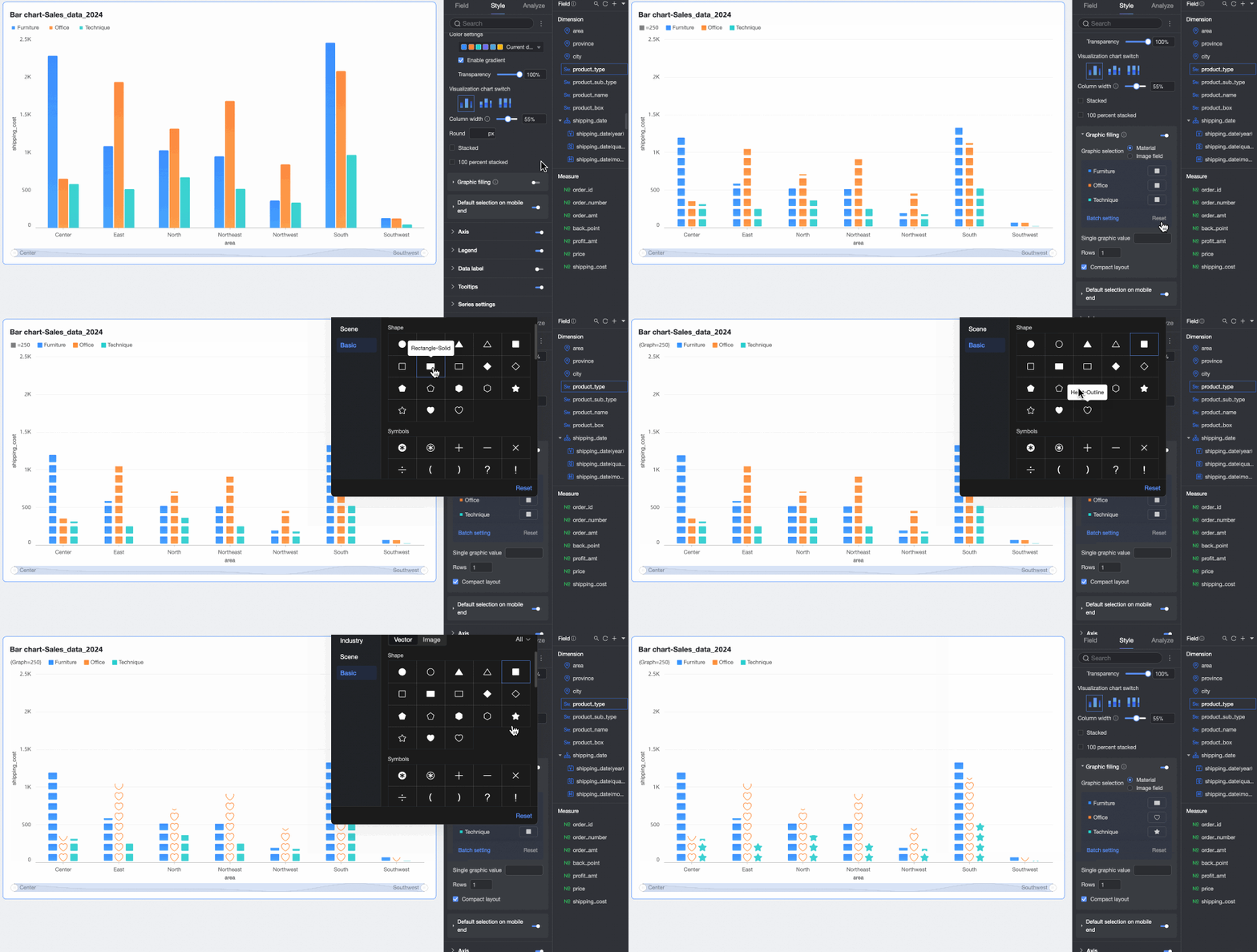
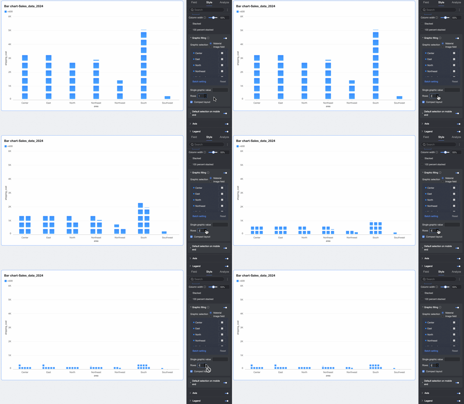
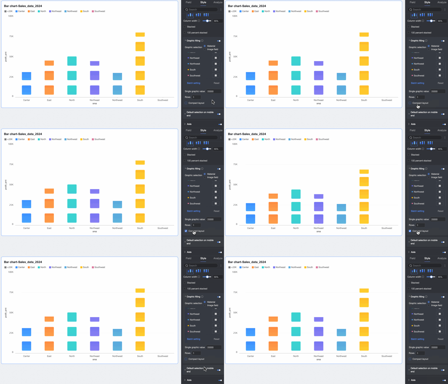
Icon fill | When the Visualization chart switcher is set to vertical bar chart, you can fill the bar area with icons that represent numerical values. In this case, hiding the value axis is recommended. You can fill with Assets or an Image field.
You can also set the Value per icon, Number of rows, and whether to use a Compressed layout.
|
Default selection on mobile | After enabling this setting, you can set the Default Selection to either the Last dimension value globally or the Last dimension value of a specified series. |
 ). For more information, see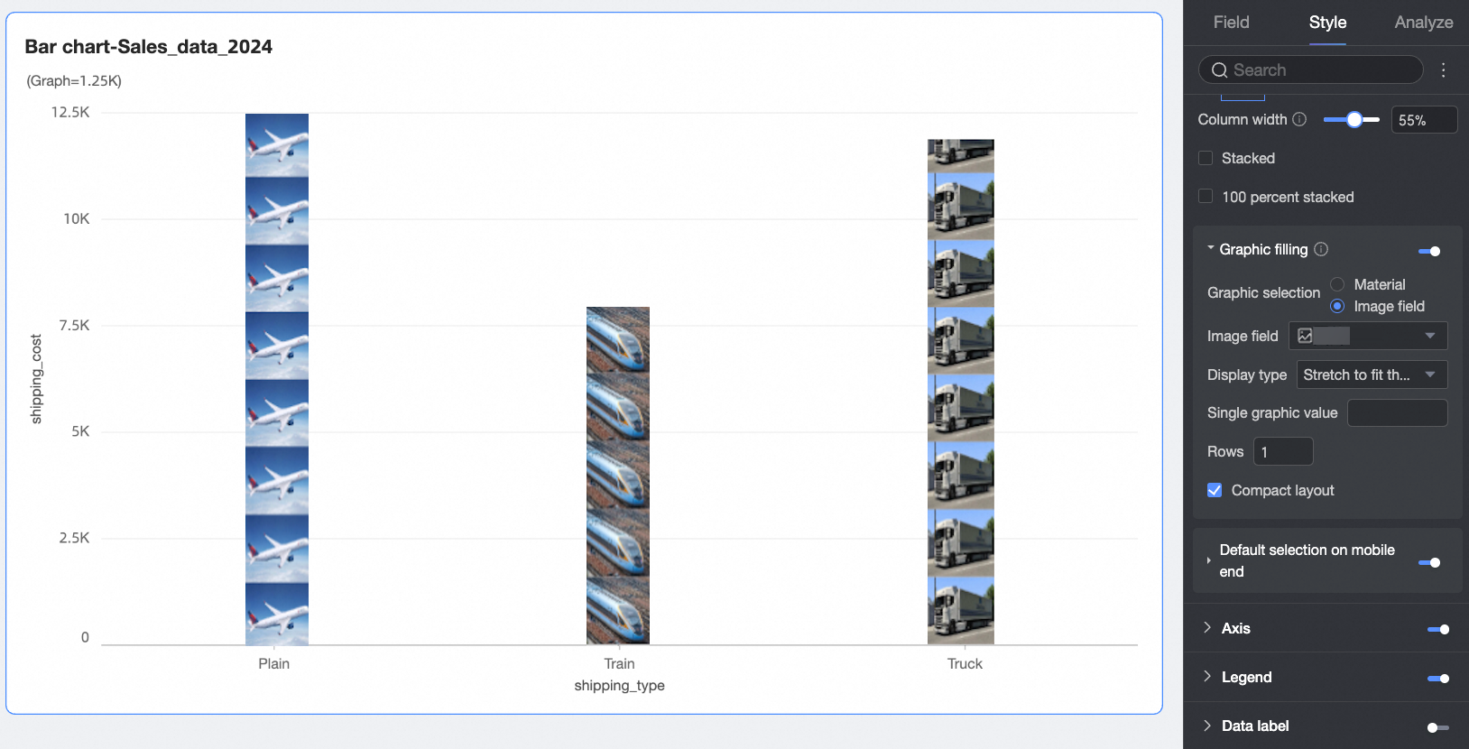
Facet
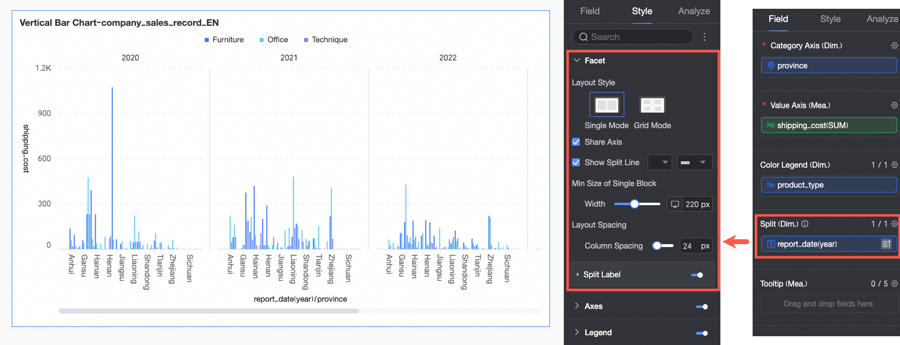
In facet mode, configure the layout and style of the chart arrangement in the Facet section.
Facet mode is enabled only when a field is configured in Split / dimension.
Parameter | Description | |
Layout style | Sets the chart arrangement. Options are Single Column Comparison and Grid Distribution. | |
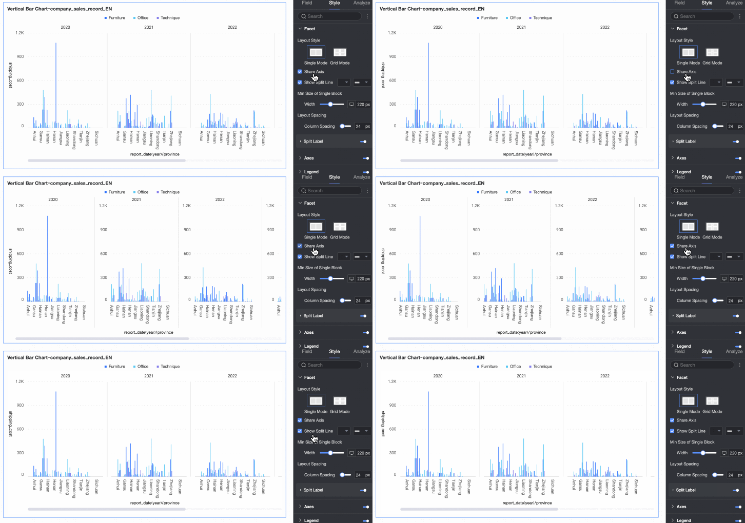
Shared axis | Toggles whether the faceted charts share a common axis.
| |
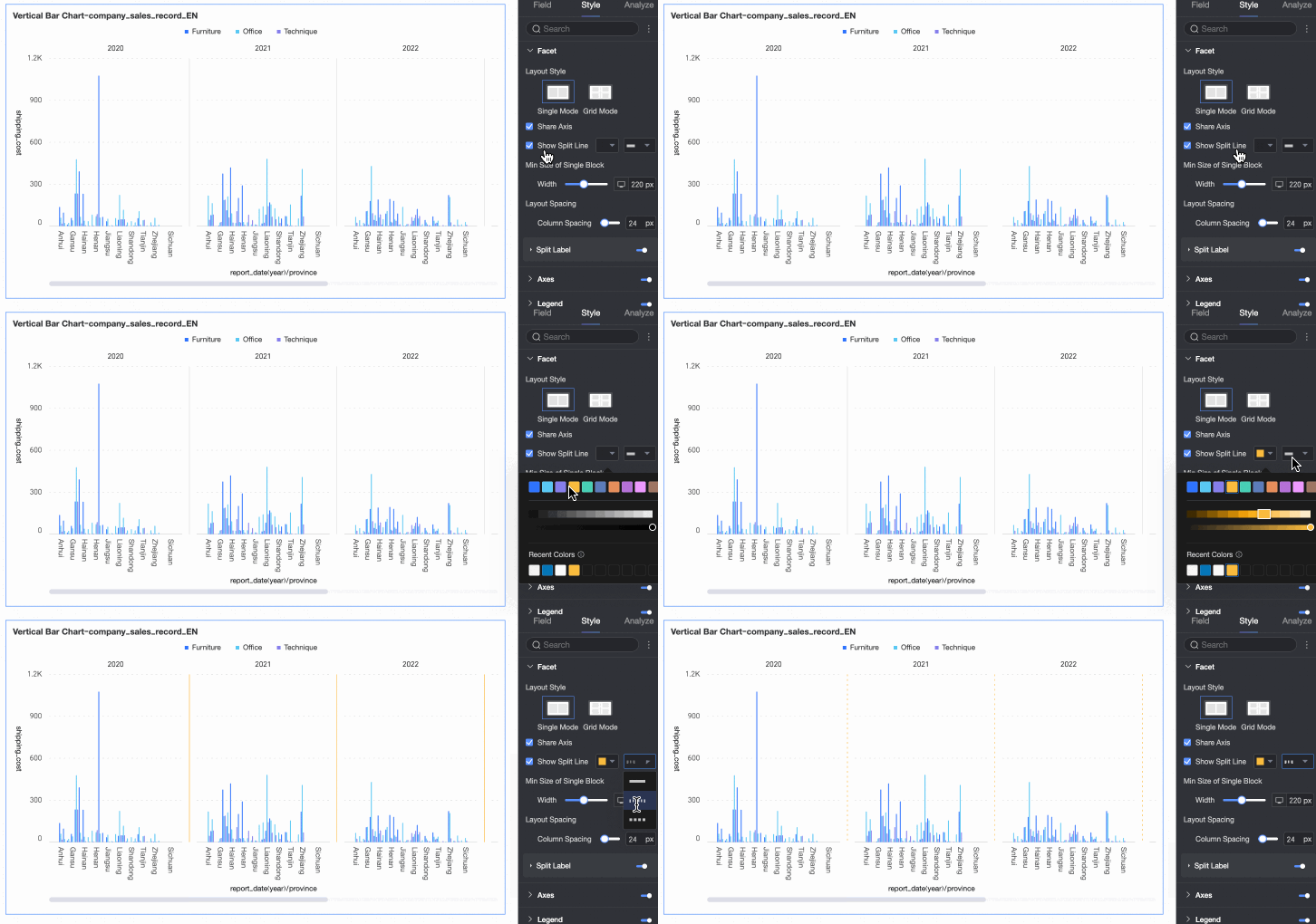
Show separator line | Shows or hides a separator line between charts. When enabled, you can configure the color and style of the separator line. | |
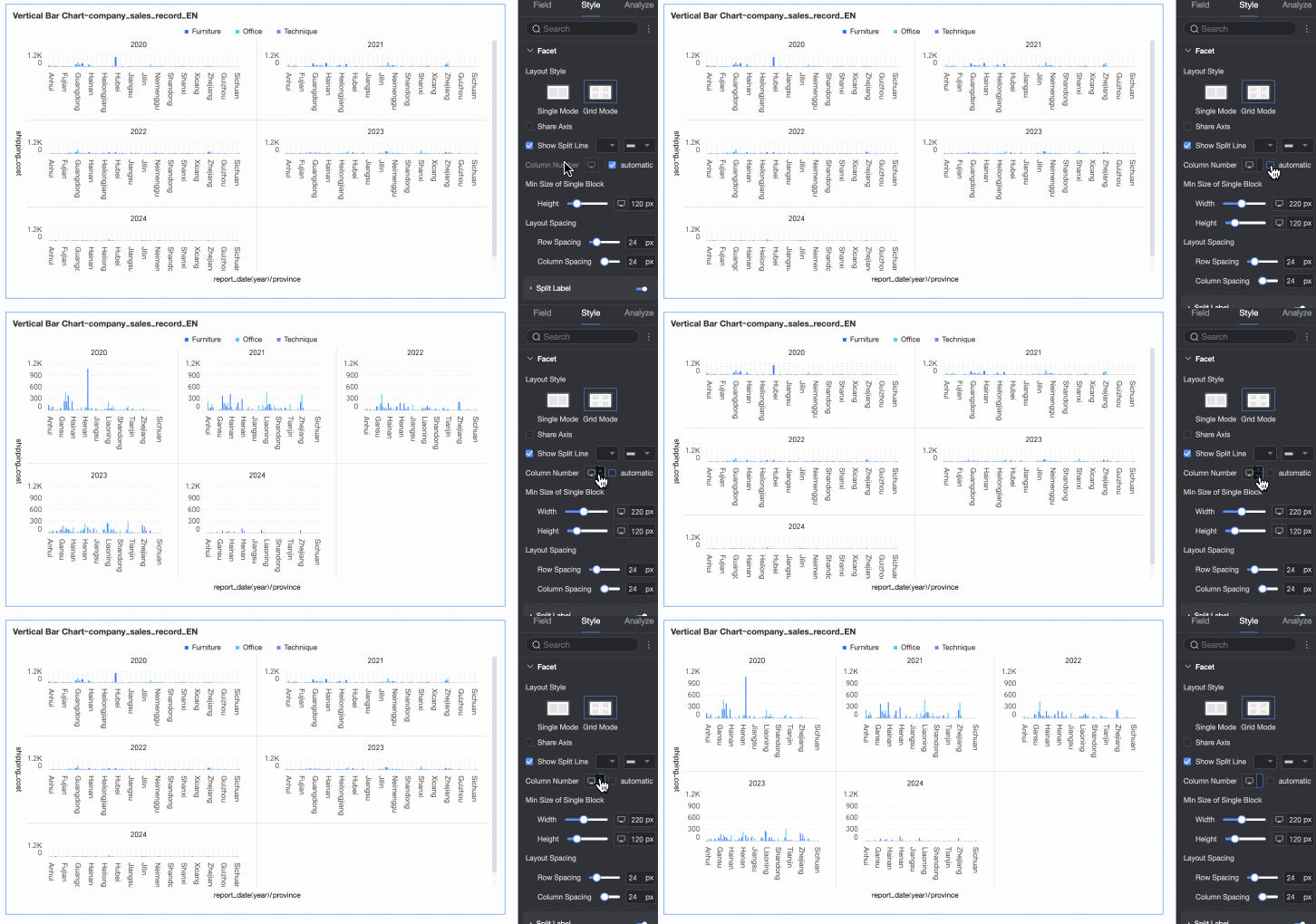
Number of columns | When the layout style is set to Grid Distribution, you can set the number of columns for the chart arrangement. The default is automatic, but you can customize the number of columns. Note
| |
Min facet block size | Sets the minimum width and height for each chart. The available options vary by layout style.
| |
Row/column spacing | Set the row and column spacing between charts. The available options vary by layout style.
| |
Split label | Position | Set the display position of the dimension value label. Options are Above Chart or Below Chart. |
Text | Set the font color and style of the dimension value label. | |
Alignment | Set the alignment of the dimension value label. | |
 icon at the top of the page.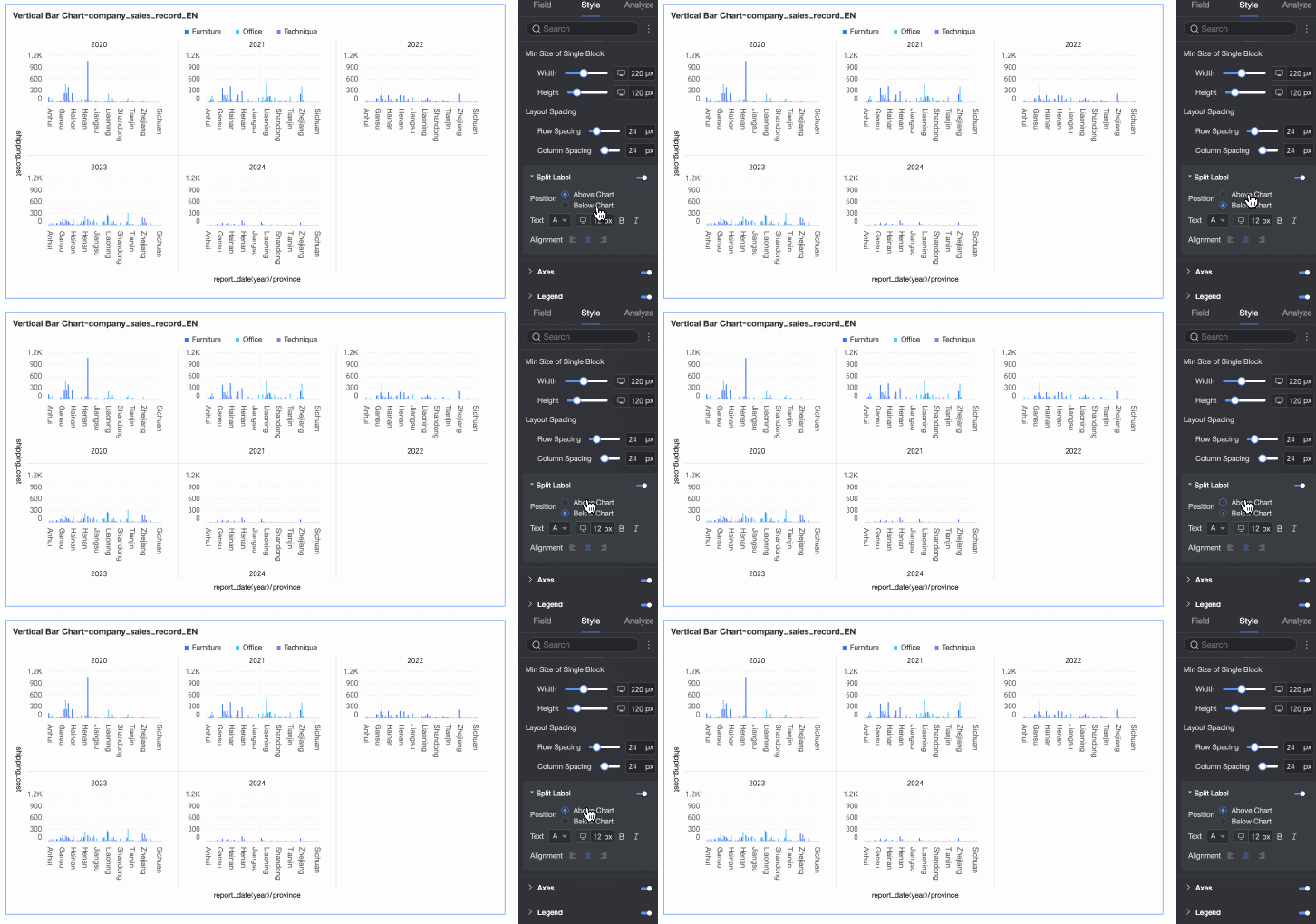
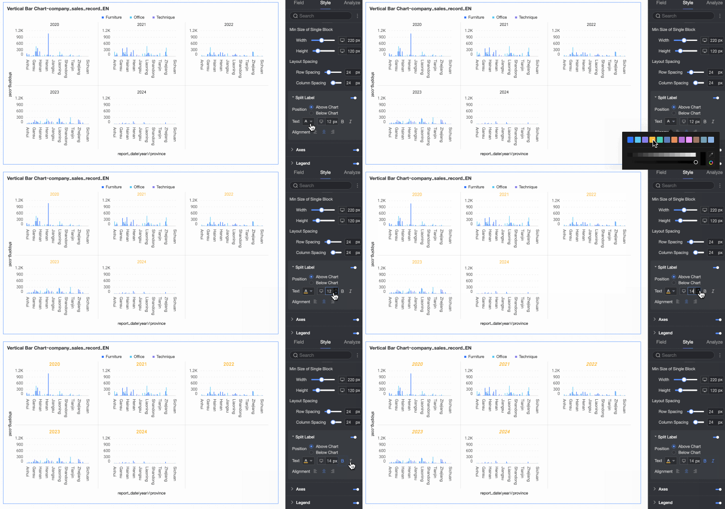
Axis
In the Axis section, configure the axis style. By default, the axis is shown.
You can select Show dual Y-axis. This setting takes effect only when two or more measures are added. If you select this option, a right Y-axis section appears in the Axis area.
The right Y-axis must be configured only if you select Show dual Y-axis. The parameters are the same as for the left Y-axis.
The dual Y-axis feature is not supported in facet mode.
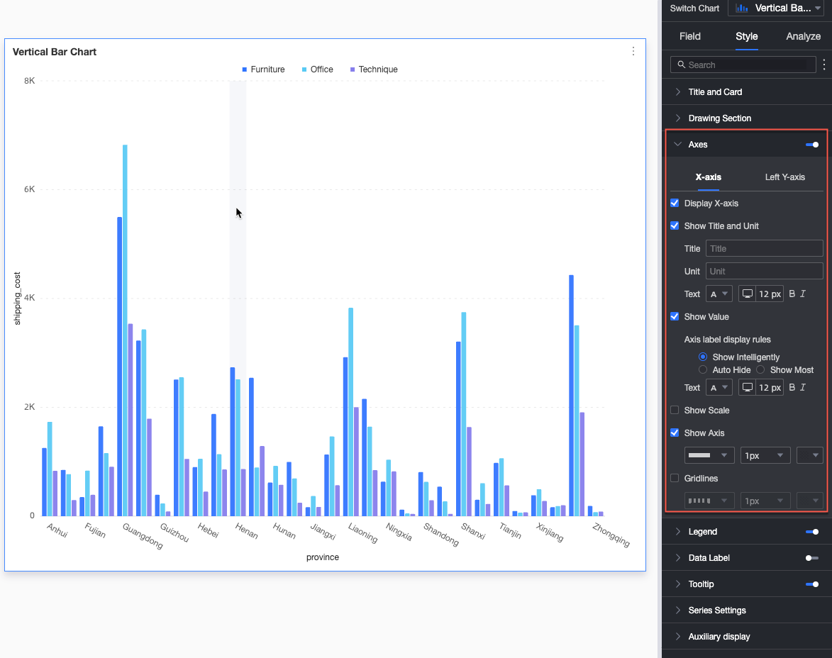
Name | Parameter | Description |
X-axis | Show X-axis | Shows or hides the X-axis. |
Show title and unit | Shows or hides the axis title and unit on the X-axis. | |
Show axis label | Shows or hides labels on the X-axis, and configures the axis label display rules and text style. | |
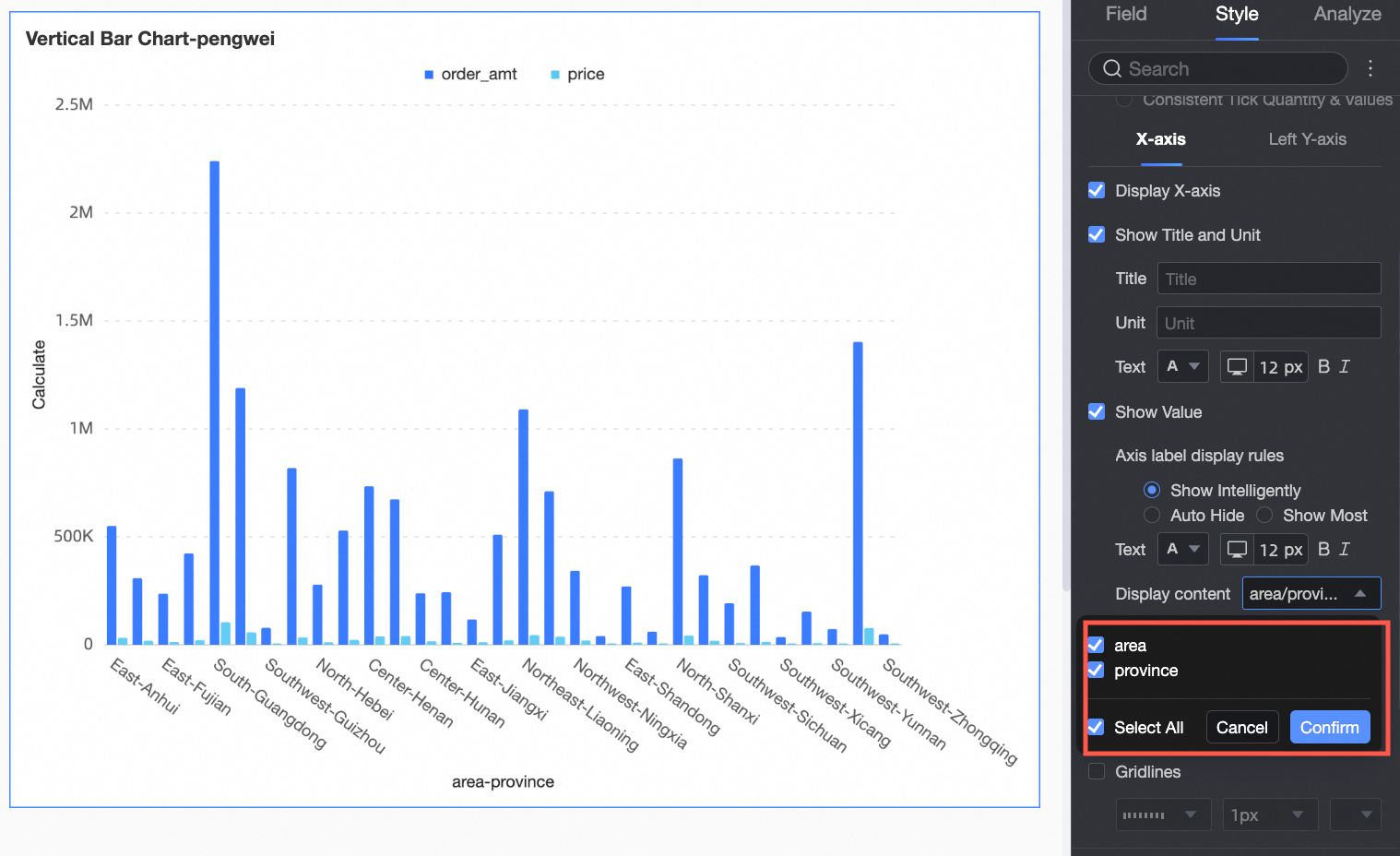
Content to display | Set the content to display for some or all dimensions.
| |
Show tick marks | Shows or hides tick marks on the X-axis. | |
Show axis line | Shows or hides the X-axis line, including its type, width, and color. | |
Show gridline | Shows or hides gridlines for the X-axis, including their type, width, and color. | |
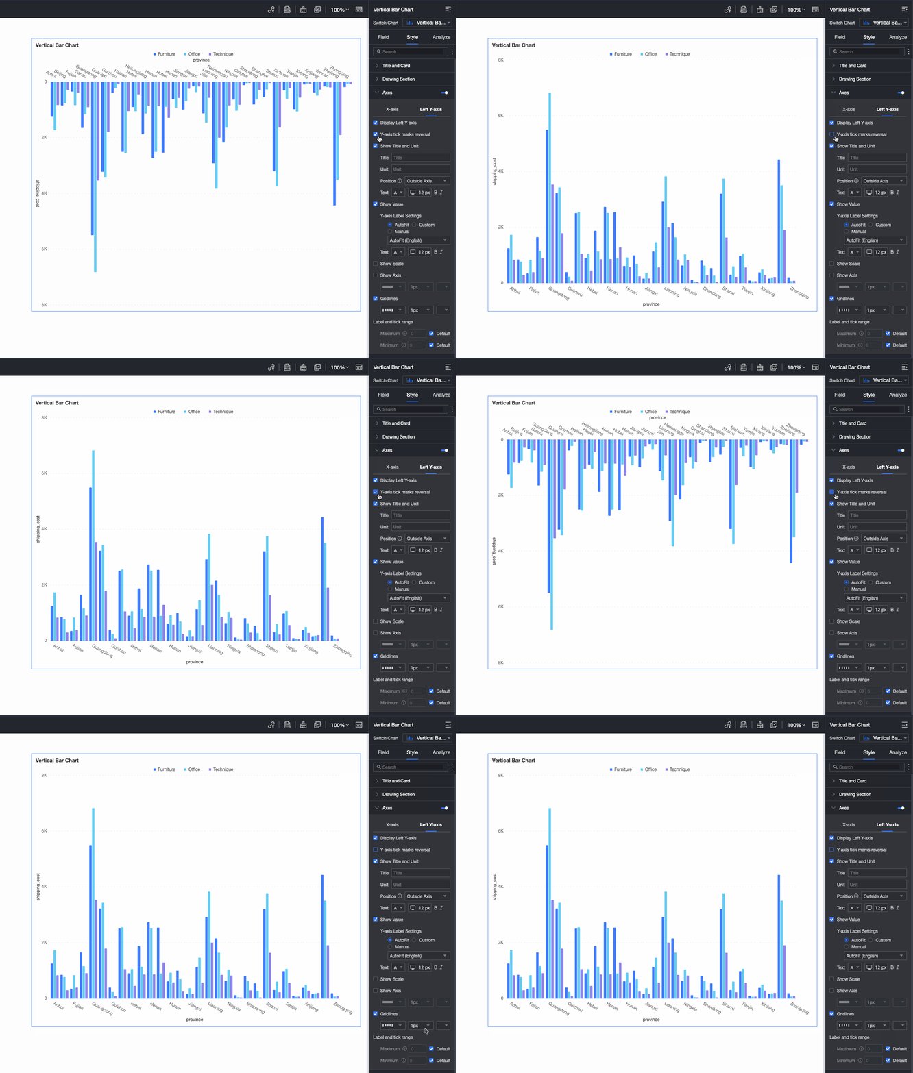
Left Y-axis | Invert Y-axis scale | You can invert the Y-axis scale values.
|
Show left Y-axis | Shows or hides the left Y-axis. | |
Show title and unit | Shows or hides the axis title and unit. | |
Show axis label | Shows or hides labels on the Y-axis. If enabled, you can set the axis label display format and text style. The axis label display format can be Automatic or Custom.
| |
Show tick marks | Shows or hides tick marks on the left Y-axis. | |
Show axis line | Shows or hides the left Y-axis line, including its type, width, and color. | |
Show gridline | Shows or hides gridlines for the left Y-axis, including their type, width, and color. | |
Axis value range and interval |
|
 icon to configure the data format in the Data Display Format Settings dialog box. For information about the configuration items in the dialog box, see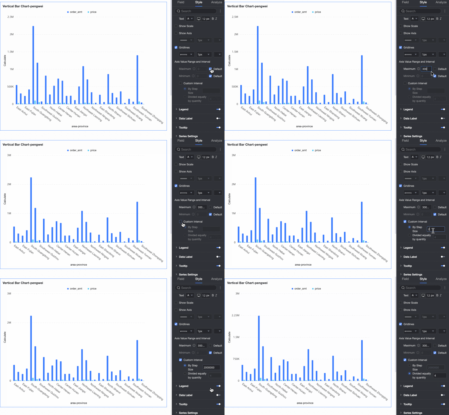
Legend
In Legend, click the  icon to enable the chart legend and configure its style.
PC
Parameter
Description
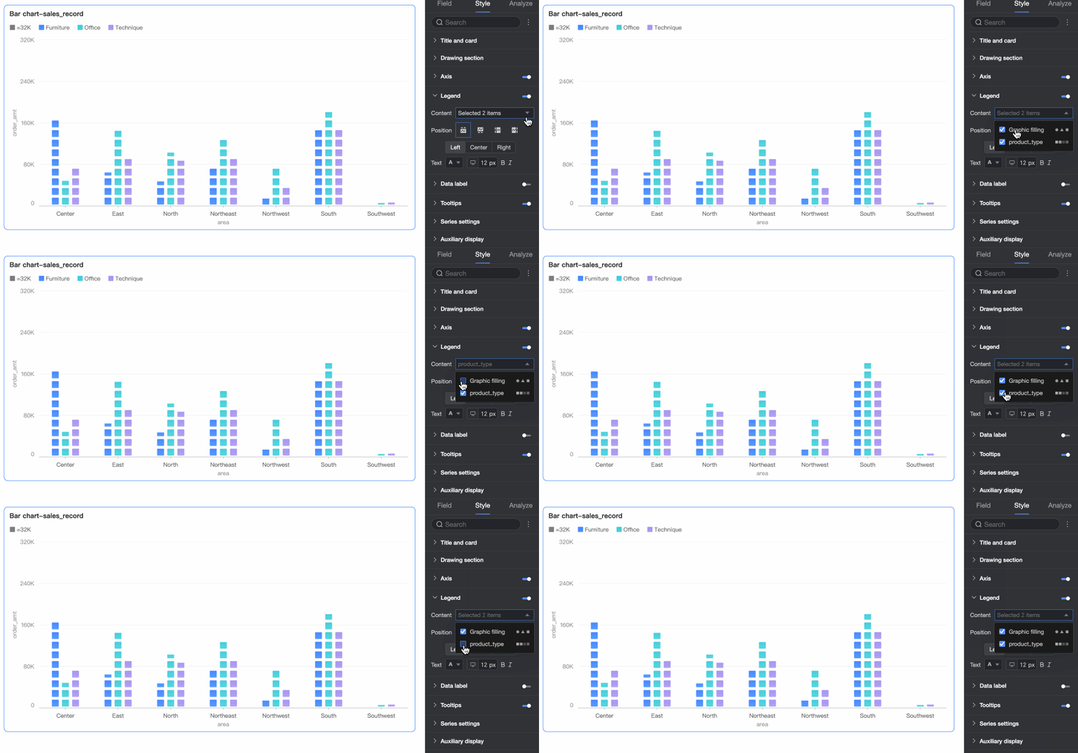
Content
When the field in the category axis area is the same as in the color legend area, and icon fill is enabled in the Drawing area, the chart contains multiple legends. You can select the content to be displayed in the legend here.
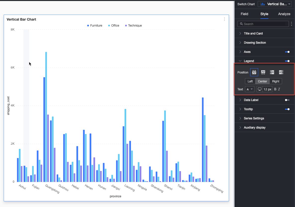
Position
Set the display position and alignment of the legend on a PC.
When the display position is Top or Bottom, supports left, center, and right alignment.
When the display position is Left or Right, supports top, center, and bottom alignment. You can also set the distance between the legend and the chart content.
Text
Set the text style for the legend on a PC, including font color, size, weight, and italicization.
Mobile
Parameter
Description
Position
Set the display position and alignment of the legend on a mobile device.
When the display position is Top or Bottom, supports left, center, and right alignment.
When the display position is Left or Right, supports top, center, and bottom alignment. You can also set the distance between the legend and the chart content.
NoteWhen the position is Top, you can enable labels under the legend, but custom alignment is not supported.
Text
Set the text style for the measure names in the mobile legend, including font color, size, weight, and italicization.
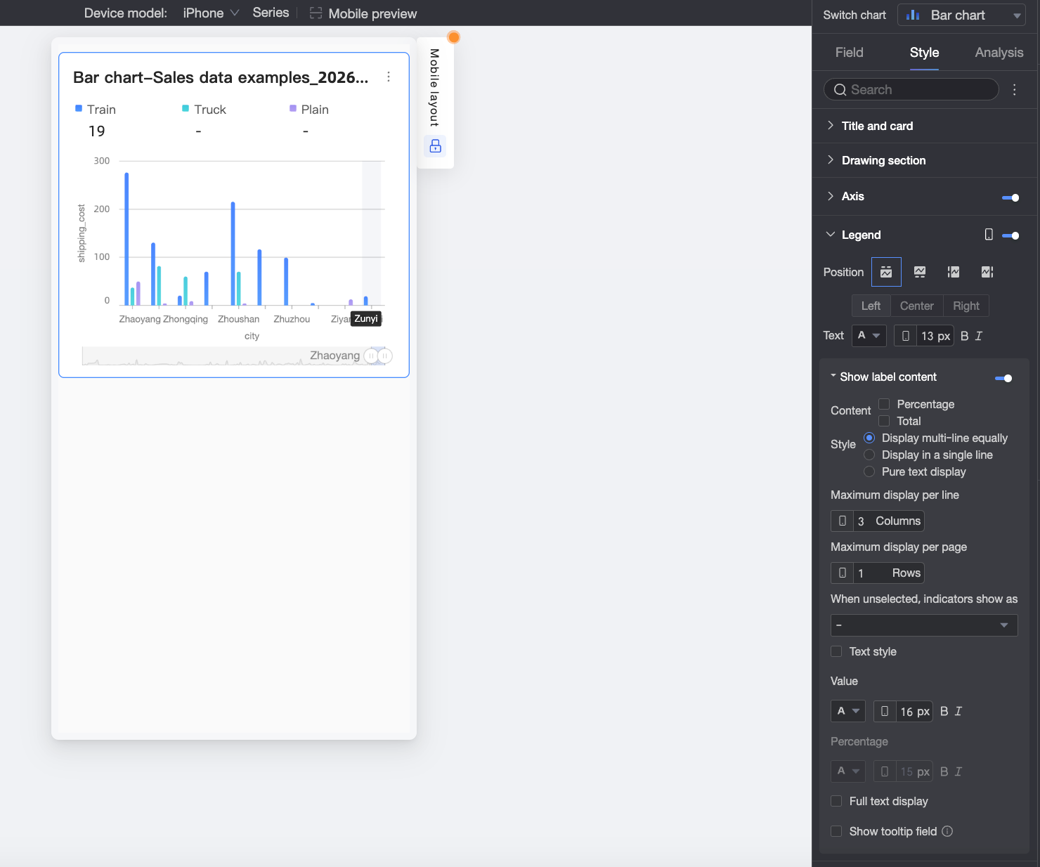
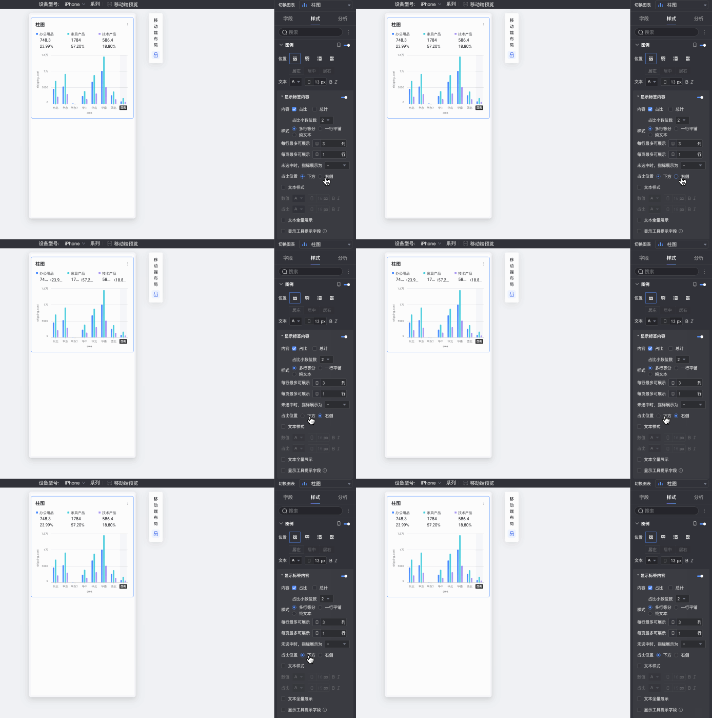
Show label content
When Position is set to Top, click the
icon to enable labels under the legend.Content
Set the data content to display in the labels under the legend. Supports Percentage and Total.
Percentage: The percentage of a data point within the total for the current dimension. For example, the percentage of profit amount from the total revenue for office supplies. When displaying percentage data, you can set the Percentage decimal places to 0, 1, or 2.
Total: The sum of all measures for the current dimension. For example, the total sales amount for all regions in 2025.
Style
Set the layout style for the labels under the legend. The following options are supported:
Multi-line Equal Distribution: Automatically arranges labels in equal columns based on the number of columns set in Max Displayable per Row and the number of rows set in Max Displayable per Page.
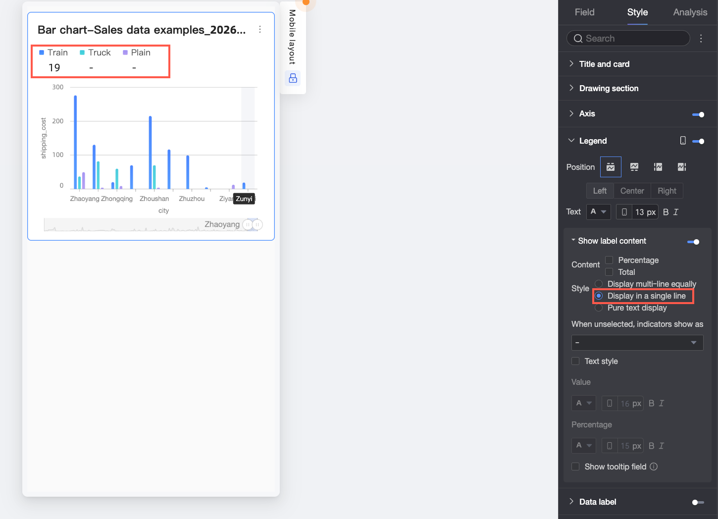
Single-line Tiling: All label content is displayed on a single line.
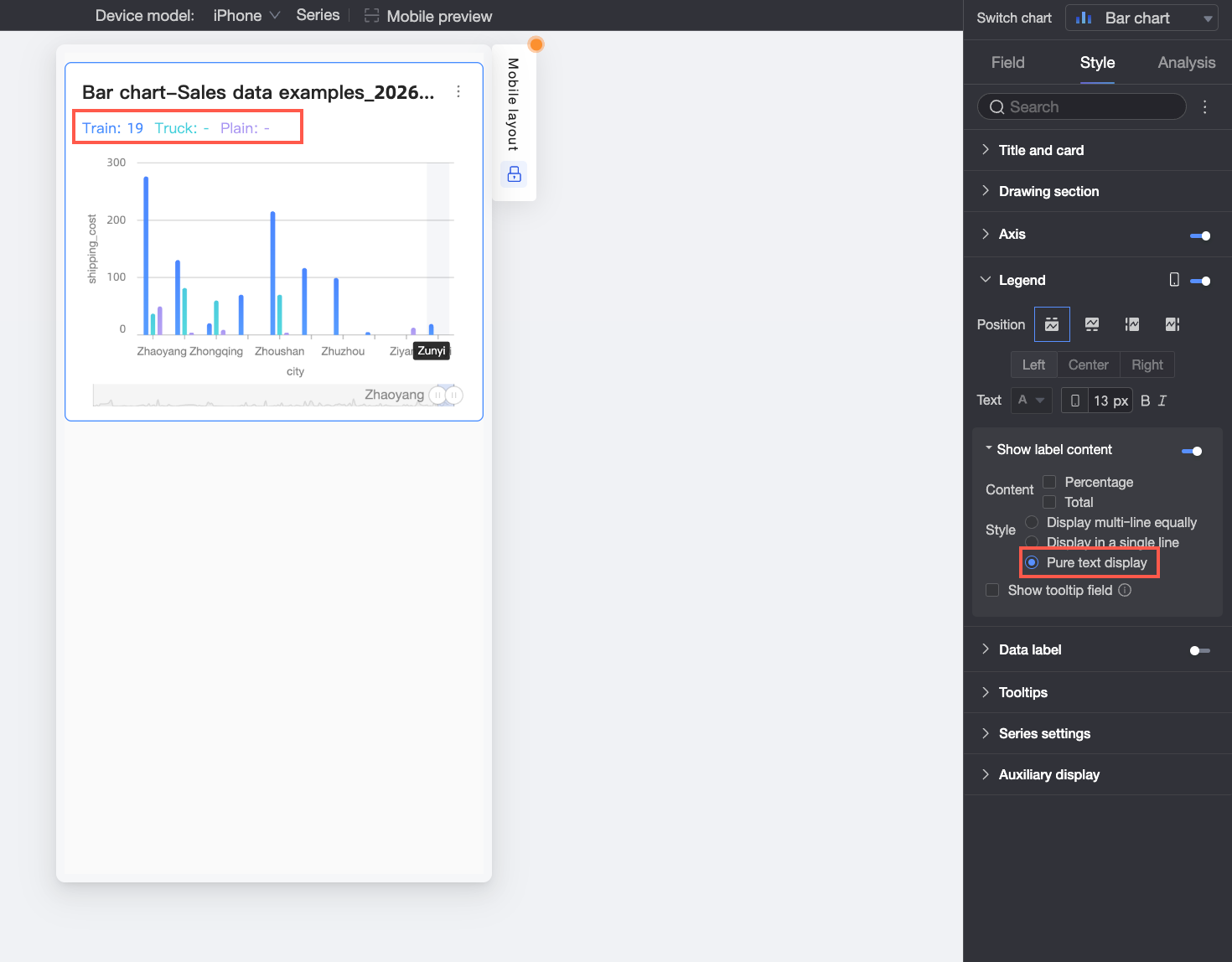
Plain Text: Displays only text content without icons. The text color will match the corresponding measure's line color in the chart.
When not selected, metric is displayed as
When Style is set to Multi-line Equal Distribution or Single-line Tiling, you can configure how to display the metric when the legend item is not selected by the viewer. Options are to display as "-" or Empty.
Percentage position
When Percentage is selected in Content, and Style is set to Multi-line Equal Distribution or Single-line Tiling, you can set the position of the percentage data. Options are Below or to the Right of the value label.
Text style
When Style is set to Multi-line Equal Distribution or Single-line Tiling, you can set the style of the Value text.
If the content is set to display Percentage data, you can format the text of the percentage data to distinguish it from the Value label content, enhancing the visual difference between data types.
Percentage decimal places
When Content is set to display Percentage data, you can adjust the number of decimal places for the percentage as needed.
Display full text
When Style is set to Multi-line Equal Distribution or Single-line Tiling, long measure names might be truncated. If you need to display the full measure name, you can select Display Full Text.
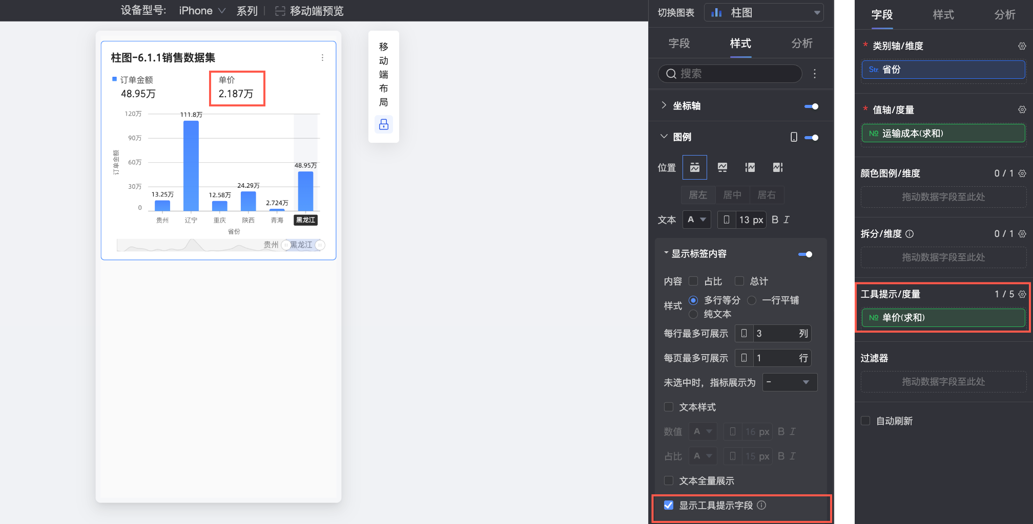
Show tooltip field
When selected, the fields you configure in the tooltip / measure field pane will be displayed in the legend area.
NoteDisplaying tooltip fields is not supported in scenarios where data is split by dimension values (i.e., when a dimension is used in the color legend).
 icon to enable labels under the legend.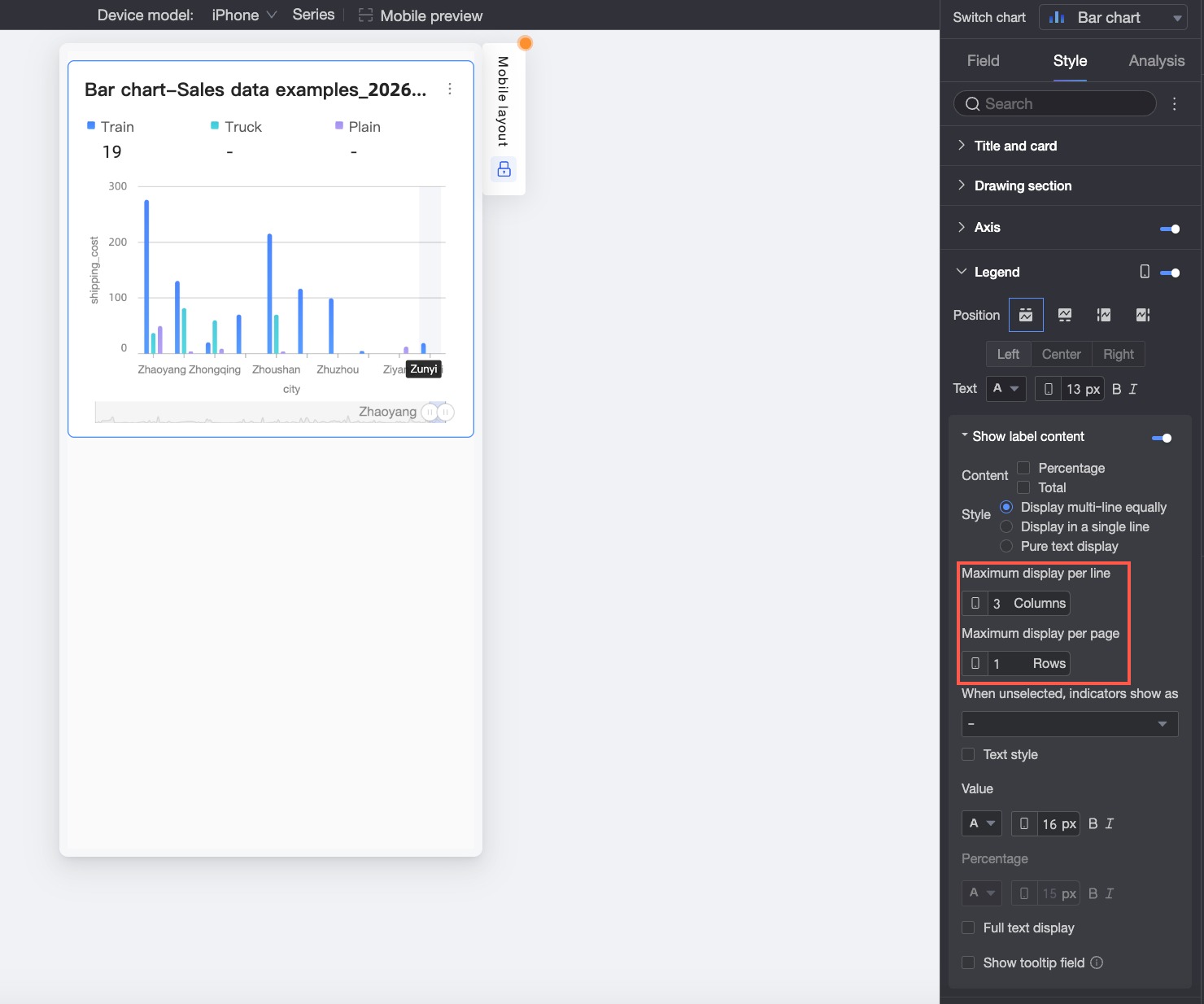

Data labels
In the Data labels section, configure whether to show data labels and their style.
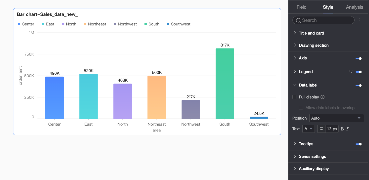
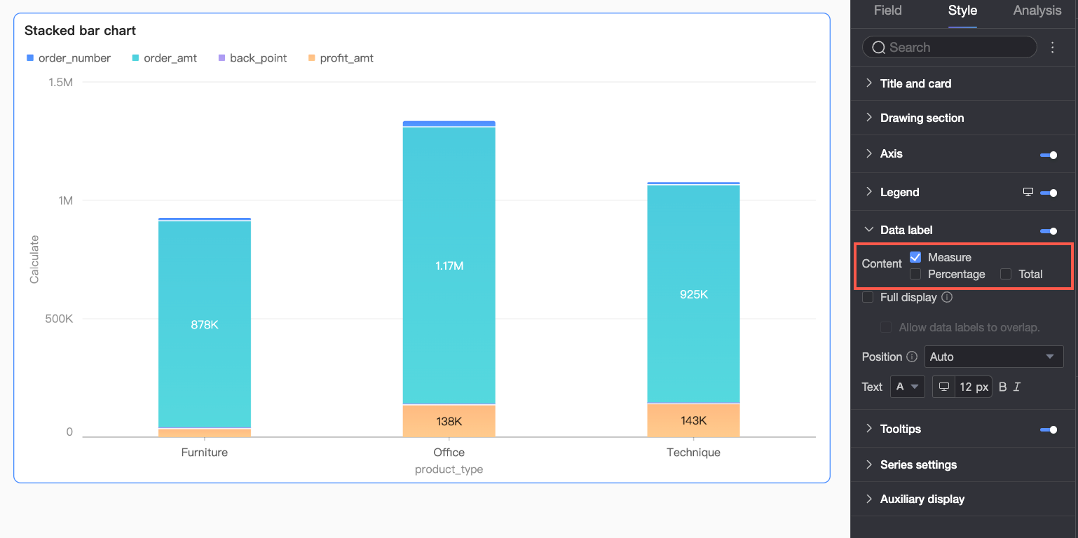
Parameter | Description |
Content | When the Visualization chart type in the Drawing area is set to stacked vertical bar chart or 100% stacked vertical bar chart, you can select the data content to display in the data labels. Options include measure, Percentage, and Total. When displaying Percentage data, you can also set the Percentage decimal places to 0, 1, or 2. |
Display all | When you enable displaying all data labels, the system intelligently adjusts label positions to prevent them from overlapping. If there are too many data labels, some may not be displayed because they exceed the axis area. You can also choose to Allow Data Labels to Overlap. |
Position | Set the label display position. When icon fill is enabled in the Drawing area, only Outside Icon is supported. |
Text | Set the label text style. |
Tooltip
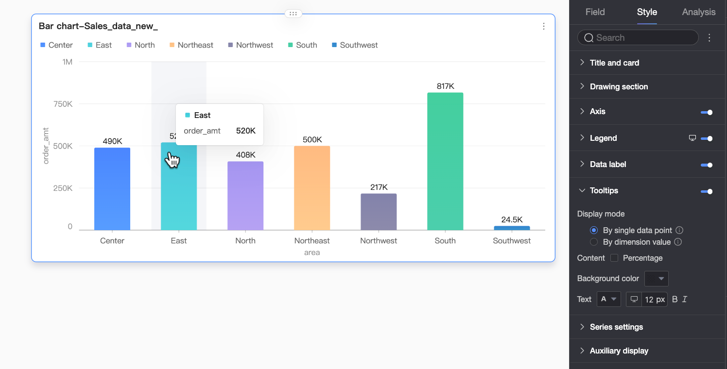
In the Tooltip section, click the icon to enable tooltips and configure their style.
PC
Parameter
Description
Display mode
Sets the tooltip display mode. Options are By Single Data Point and By Dimension Value.
Content
Select the data content to display in the tooltip. The available options vary based on the configuration:
When the display mode is By Single Data Point, Percentage is supported. When the display mode is By Dimension Value, Total and Percentage are supported.
Percentage: The percentage of a data point within the total for the current dimension. For example, the percentage of profit amount from the total revenue for office supplies. When displaying percentage data, you can set the Percentage decimal places to 0, 1, or 2.
Total: The sum of all measures for the current dimension. For example, the total sales amount for all regions in 2025.
Background color
Set the background fill color of the tooltip.
Text
Set the style of the text in the tooltip, including font color, size, weight, and italicization.
Mobile
Parameter
Description
Tooltip
Click the
icon to enable the tooltip display (①).Content
Set the data content to display in the tooltip. Supports Percentage and Total.
Percentage: The percentage of a data point within the total for the current dimension. For example, the percentage of profit amount from the total revenue for office supplies. When displaying percentage data, you can set the Percentage decimal places to 0, 1, or 2.
Total: The sum of all measures for the current dimension. For example, the total sales amount for all regions in 2025.
Background color
Set the background fill color of the tooltip.
Text
Set the text style in the tooltip, including font color, size, weight, and italicization.
Display axis dimension
Click the
icon to enable axis dimension display (②).Background color
Set the background fill color of the axis dimension label.
Text
Set the text style of the axis dimension label, including font color, weight, and italicization.
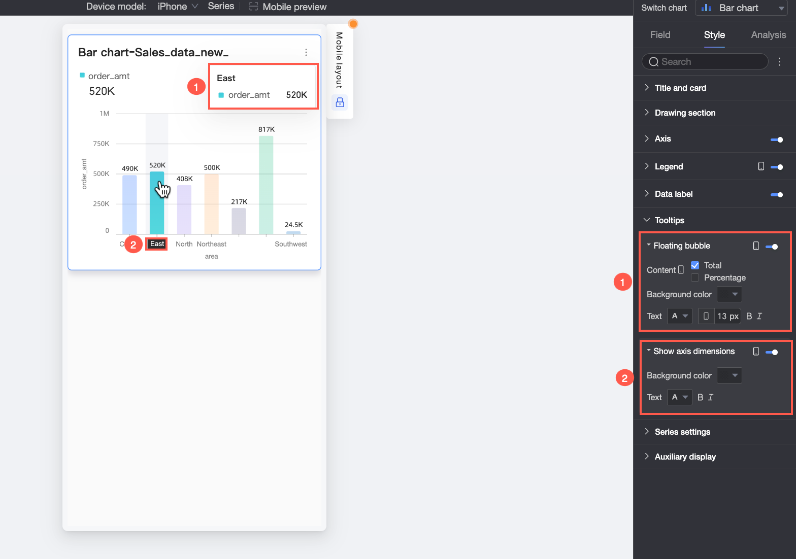
Series
In the Series Settings section, configure the series style.
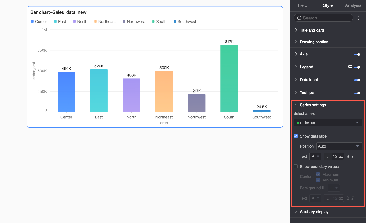
You can configure the alias and series value display format in the series settings section only when the color legend / dimension is enabled in the Fields pane.
Parameter | Description |
Select field | Select a dimension or measure item based on your business scenario. |
Alias | Set a field name that aligns with your business scenario. This item can be configured only when color legend / dimension is configured. |
Show data labels | Select whether to show data labels and set their position and text format. |
Series value display format settings | Configure the display format for series values. Supports Automatic or Custom.
This item can be configured only when color legend / dimension is configured. |
Show max/min values | Displays labels for the maximum and minimum values in the chart. When selected, you can set the position of the labels, the content to display (Maximum/Minimum), the label background fill color, and the label text style. Note This feature is not supported for stacked and 100% stacked charts. |
Auxiliary display
In the Auxiliary display section, configure the metric filter and view controls.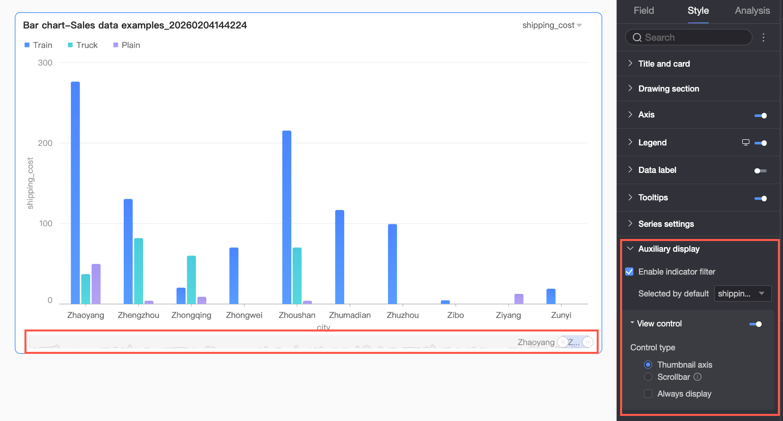
Parameter | Description |
Enable metric filter | Enables an in-chart metric filter. When enabled, you can set the default selected metric field. |
View controls | When the data on the chart axis is dense and cannot be fully displayed within the current container size, you can click the The visible range of the chart axis can be controlled by the following two control types: overview axis and scroll bar.
Note If a chart is too small for its data and has no view controls configured, the system automatically enables and selects overview axis, which will only be displayed when the amount of data exceeds the chart container's display width. |
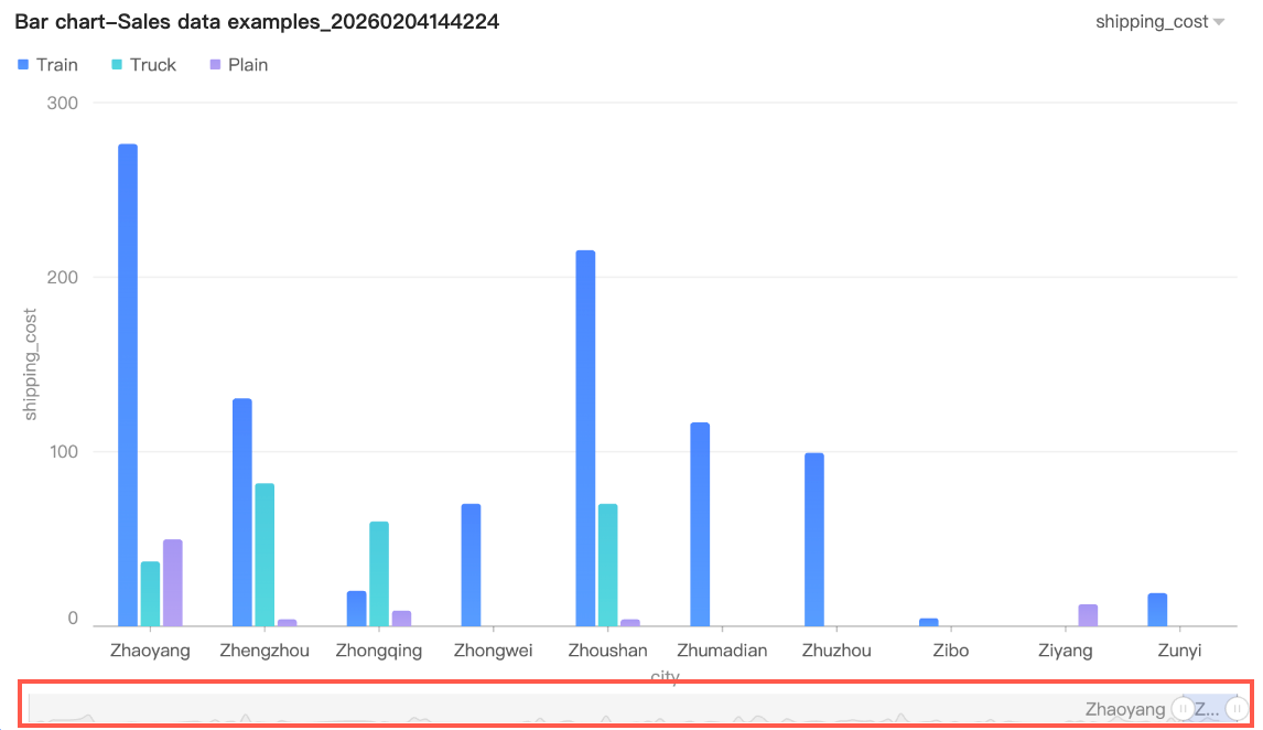 By default, the overview axis is displayed only when the amount of data exceeds the chart container's display width. If you need the overview axis to be always visible, you can select Always Show. After selection, the overview axis will be displayed even if the chart data does not fill the screen.
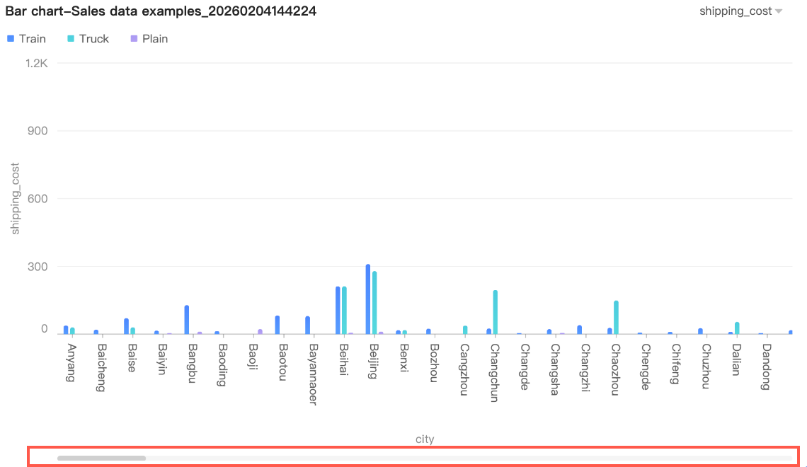 You can further set the minimum category width for the scroll bar to limit the amount of data in the current window. This ensures that the chart content is clearly scaled and avoids visual clutter from overlapping data labels or overly dense data points. The default minimum category width is 32px, with a range of 16-100px.
Chart analysis
Category | Parameter | Description |
Data interaction | Drill-down | If drill-down fields are configured, this sets the display style for drill-down levels. |
Interaction | If the data you want to analyze exists in different charts, you can link multiple charts together for interactive data analysis. For more information, see Configure and display interactions. | |
Hyperlink | If the data you want to analyze exists in multiple dashboards, you can link them together for data analysis. Hyperlinks can be Parameter-based or an External Link. For more information, see Configure and display hyperlinks. | |
Analysis and alerting | Reference line | Use a reference line to see the difference between the current measure value and a set reference value. The reference value can be a fixed value or a calculated value (average, maximum, minimum, or median). For more information, see Reference line. |
Trend line | Use a trend line to show the overall trend of the current data. Six types are available: intelligent recommendation, linear, logarithmic, exponential, polynomial, and power function. For more information, see Trend line. | |
Smart insights | Enable auto insights | When enabled, this feature provides intelligent interpretation of chart information. |
Forecast | Use forecasting to view the development trend of current data and perform predictive analysis. For more information, see Forecast. | |
Anomaly detection | Use anomaly detection to identify abnormal data points in the current data. For more information, see Anomaly detection. | |
Fluctuation analysis | Fluctuation analysis uses intelligent algorithms to automatically break down and analyze the reasons for fluctuations in core metrics. You can analyze by dimension or measure to find the root causes of fluctuations. For more information, see Fluctuation analysis. Note The fluctuation analysis feature is currently in beta. | |
Annotation | - | Lets you annotate data points with highlights, icons, or comments to flag anomalies or add notes. For more information, see Annotation. |
Next steps
You can share the dashboard with specific people who need to view it. For more information, see Share a dashboard.
To create a complex navigation menu for thematic analysis, you can integrate the created dashboard into a BI portal. For more information, see Create a PC BI portal.