
CSS 属性将模糊或颜色偏移等图形效果应用于元素。滤镜(filter)通常用于调整图像,背景和边框的渲染。
支持的函数
函数 | 含义 | 默认值 | 取值范围 |
grayscale() | 图像灰度。 值为 100% 表示完全转为灰度图像。 | 0 | 0%~100% |
opacity() | 图像的透明程度。 | 1 | 0%~100% |
invert() | 反转图像。 值为 100% 表示完全反转。 | 0 | 0%~100% |
sepia() | 将图像转换为深褐色。 值为 100% 表示完全为深褐色。 | 0 | 0%~100% |
saturate() | 图像饱和度。 值为 0% 表示完全不饱和;值为 100% 表示图像无变化;其他值是效果的线性乘数;超过 100% 表示有更高的饱和度。 | 1 | 0%~﹢∞ |
contrast() | 图像的对比度。 值为 0% 表示图像会全黑;值为 100% 表示图像不变。值可以超过 100%,意味着会运用更低的对比。 | 1 | 0%~﹢∞ |
brightness() | 将线性乘法器应用于图像,使其看起来或多或少地变得明亮。 值为 0% 表示将创建全黑图像;值为 100% 表示会使输入保持不变;其他值是效果的线性乘数;如果值大于 100% 则表示提供更明亮的结果。 | 1 | 0%~﹢∞ |
不支持的函数
不支持复合函数,不支持 blur、drop-shadow、hue-rotate、url。
示例
<template>
  <div class="root">
    <text>normal</text>
    <image
      class="image-normal"
      src="https://pic49.photophoto.cn/20181202/0021033888940147_b.jpg"
    ></image>

    <text>grayscale:100%</text>
    <image
      class="image-gray"
      style="bg"
      src="https://pic49.photophoto.cn/20181202/0021033888940147_b.jpg"
    ></image>
  </div>
</template>
<script>
export default {
  data: {},
  methods: {},
};
</script>
<style>
.root {
  display: flex;
  align-items: center;
  justify-content: center;
}
.image-normal {
  flex-direction: column;
  flex-shrink: 0;
  align-content: auto;
  width: 350rpx;
  height: 350rpx;
}
.image-gray {
  flex-direction: column;
  flex-shrink: 0;
  align-content: auto;
  width: 350rpx;
  height: 350rpx;
  filter: grayscale(100%);
}
</style>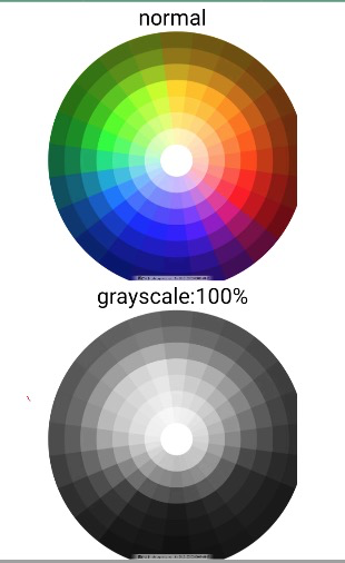
单击此处 detailImageFilter.zip 获取完整示例代码。
该文章对您有帮助吗?