
蚂蚁动态卡片支持动画属性,包括尺寸大小、旋转、平移和颜色等,可以逐渐从一个值变化到另一个值。
Transition
属性值 | 值类型 | 默认值 | 可选值 | 写法 |
transition-property | string | 空 | background-color,opacity, transform,all | transition-property: all; |
transition-property: background-color, opacity; | ||||
transition-property: background-color, opacity, transform; | ||||
transition-duration | number | 0 | transition-duration: 200; | |
transition-delay | number | 0 | transition-delay: 200; | |
transition-timing-function | string | ease | ease,ease-in,ease-out,ease-in-out,linear,cubic-bezier(x1,y1,x2,y2) | transition-timing-function: ease-in; |
transition-timing-function: cubic-bezier(0.3, 0.3, 0.9, 0.9); |
Transition 用法示例
.panel {
    margin: 10px;
    top:10px;
    align-items: center;
    justify-content: center;
    transition-property: background-color;
    transition-duration: 0.3s;
    transition-delay: 0s;
    transition-timing-function: cubic-bezier(0.25, 0.1, 0.25, 1.0);
  }
Transform
属性 | 值类型 | 默认值 | 可选值 | 备注 |
transform | string | translateX({<length/percentage>}) |translateY({<length/percentage>}) |translateZ({<length>}) |translate({<length/percentage>} {<length/percentage>}) |translate3D({<length>},{<length>},{<length>}) {<length/percentage>}) |scaleX(<number>) |scaleY(<number>) |scale(<number>) |rotate(<angle/degree>) |rotateX(<angle/degree>) |rotateY(<angle/degree>) |rotateZ(<angle/degree>) |rotate3D(<angle/degree>, <number>, <number>,<number>) |transform-origin (center) |matrix(n,n,n,n,n,n) | translateX({<length/percentage>}):X 轴方向平移,支持长度单位或百分比。 translateY({<length/percentage>}):Y 轴方向平移,支持长度单位或百分比。 translate({<length/percentage>} {<length/percentage>}):X 轴和 Y 轴方向同时平移,translateX + translateY 简写。 scaleX(<number>):X 轴方向缩放,值为数值,表示缩放比例,不支持百分比。 scaleY(<number>):Y 轴方向缩放,值为数值,表示缩放比例,不支持百分比。 scale(<number>):X 轴和 Y 轴方向同时缩放,scaleX + scaleY 简写。 rotate(<degree>):将元素围绕一个定点(由 transform-origin 属性指定)旋转而不变形的转换。指定的角度定义了旋转的量度。若角度为正,则顺时针方向旋转,否则逆时针方向旋转。 transform-origin:设置一个元素变形的原点,只支持 center 。 matrix:2D 转换矩阵 translateZ/rotateZ 仅在 transform-style 值为 preserve-3d 时生效,translateZ 不支持 percent 写法。 | |
transform-origin | string | center | left、right、top、bottom、center、数值(支持单值和双值两种写法) | |
transform-style | string | flat | preserve-3d, flat | |
perspective | length | none | none | <length> | 须为正值,负值或 0 与none 效果一致。 |
perspective-origin | string | center | left、right、top、bottom、center、数值(支持单值和双值两种写法) |
Transform 用法示例
.transform {
    align-items: center;
    transform: translate(150px, 200px) rotate(20deg);
    transform-origin: 0 -250px;
    border-color:red;
    border-width:2px;
  }
3D 动画示例
完整示例如下:
.div {
    width: 300px;
    height: 300px;
    transform-style: preserve-3d;
    transform: rotateX(45deg) rotateZ(30deg) translateZ(-50px);
    perspective: 600px;
}
3D 动画约束
动画嵌套限制 2 层(即父节点和子节点同时有动画),若父节点、子节点、孙子节点同时有 3D 动画,则最终效果可能会受限。
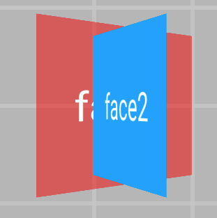
针对 Android 客户端效果,受平台限制,View 不能分割,View 只能显示全部或被遮盖全部。如下图所示:
 Android 效果, 一个 face2 完全压盖 face1
 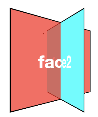 CSS、iOS 可以达到的效果
Animation
属性 | 值类型 | 默认值 | 可选值 | 写法 |
animation-name | string | animation-name: demo; | ||
animation-duration | number | 0 | animation-duration: 100; | |
animation-delay | number | 0 | animation-delay: 200; | |
animation-timing-function | string | ease | ease,ease-in,ease-out,ease-in-out,linear,cubic-bezier(x1,y1,x2,y2) | animation-timing-function: ease-in; |
animation-timing-function: cubic-bezier(0.3, 0.3, 0.9, 0.9); | ||||
animation-iteration-count | number | 数值 ifinite(等价于 9999) | animation-iteration-count: infinite; | |
animation-iteration-count: 10; | ||||
animation-direction | enum | normal | normal,alternate | animation-direction: alternate; |
animation-fill-mode | enum | forwards | forwards,backwards,both,none | animation-fill-mode: backwards; |
Animation 用法示例
.moving-node01 {
  width: 200rpx;
  height: 100rpx;
  background-color: red;
  margin-top: 50rpx;
  animation-name: moving-horizontal;
  animation-duration: 5000ms;
  animation-delay: 2000ms;
  animation-timing-function: ease;
  animation-iteration-count: infinite;
  animation-direction: normal;
  animation-fill-mode: forwards;
}
KeyFrame 动画
<template>
  <div class="root">
    <div class="line">
      <div class="subline"></div>
    </div>
  </div>
</template>

<script>
          const animation = requireModule("animation"); //获取module
    const keyframes = {
        'moving-horizontal': {
            "transform": [
                {
                    "p":0,
                    "v":"translateX(-200px)"
                },
                {
                    "p":0.5,
                    "v":"translateX(-100px)"
                },
                {
                    "p": 1.0,
                    "v": "translateX(0px)"
                }
            ]
        }
    };
    animation.loadKeyframes(keyframes); //加载module
</script>


<style>
    .root {
        display: flex;
        align-items: center;
        justify-content: center;
    }

    .line{
        width:200px;
        height:10px;
        overflow: hidden;
        background-color:gray;
    }
    .subline{
        transform:translate(-200px,0px);
        width:200px;
        height:10px;
        background-color:red;

        animation-name: moving-horizontal;
        animation-duration: 2000ms;
        animation-delay: 000ms;
        animation-timing-function: linear;
    }
</style>
动画结束回调
节点定义事件 @on-animationEnd, 动画结束后会回调相应方法传入参数 {"status":"finish/interrupt"}。finish表示动画正常执行结束,cancel 表示中断或取消。
代码示例:
<template>
  <div class="root">
    <div class="anim_node" @on-animationEnd="onAnimationEnd()"></div>
  </div>
</template>

 <script>
   ...
  methods: {
    onAnimationEnd(param){
      if(param.status == "finish") {
         console.info("动画执行完成");
      } else if (param.status == "interrupt") {
         console.info("动画中断或取消");
      }
    },
  },
};
</script>

<style>
  ...
</style>
注意事项
使用动画属性时,需注意以下几点:
根节点不支持动画。
实体组件和外接组件不支持动画(input、slider 等)。
不支持 skew 动画,效果实现可使用 matrix 代替。
KeyFrame 动画过程中,提交 CSS 动画无效。
iOS 平台在移动过程中不支持手势,结束后才能响应。
示例代码
单击此处 detailTransitionAnimation.zip 获取完整示例代码。