Dashboard interface overview
In the dashboard editor, you can manage your dashboard and components. This topic introduces the editor's layout and features to help you get started with data analysis using components.
Interface layout
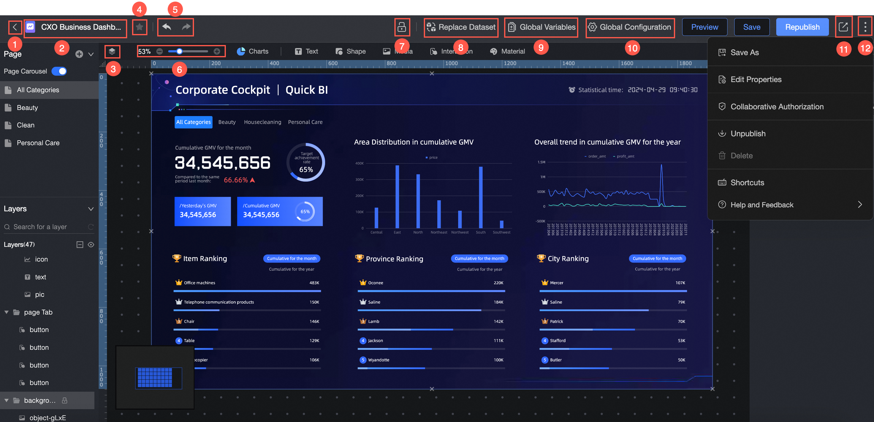
The toolbar allows you to customize the dashboard name, adjust scaling, add the dashboard to your favorites, undo or redo actions, override locks, replace datasets, manage global parameters, configure global settings, and share your work.
The Component Library provides eight types of charts, plus a rich selection of text, shapes, media, interactive controls, and materials for diverse dashboard designs.
The Page Configuration pane lets you add pages, set up a page carousel, and delete pages.
In the Layer Configuration pane, you can manage multiple layers by creating groups and carousels, and by locking or hiding them.
Allows you to adjust the canvas layout and perform actions on components, such as cut, copy, lock, hide, and group.
Lets you add data to components and configure their styles.
Allows you to select datasets, add data, modify data formats, and process data.
Toolbar
The toolbar includes the following options:
Back.
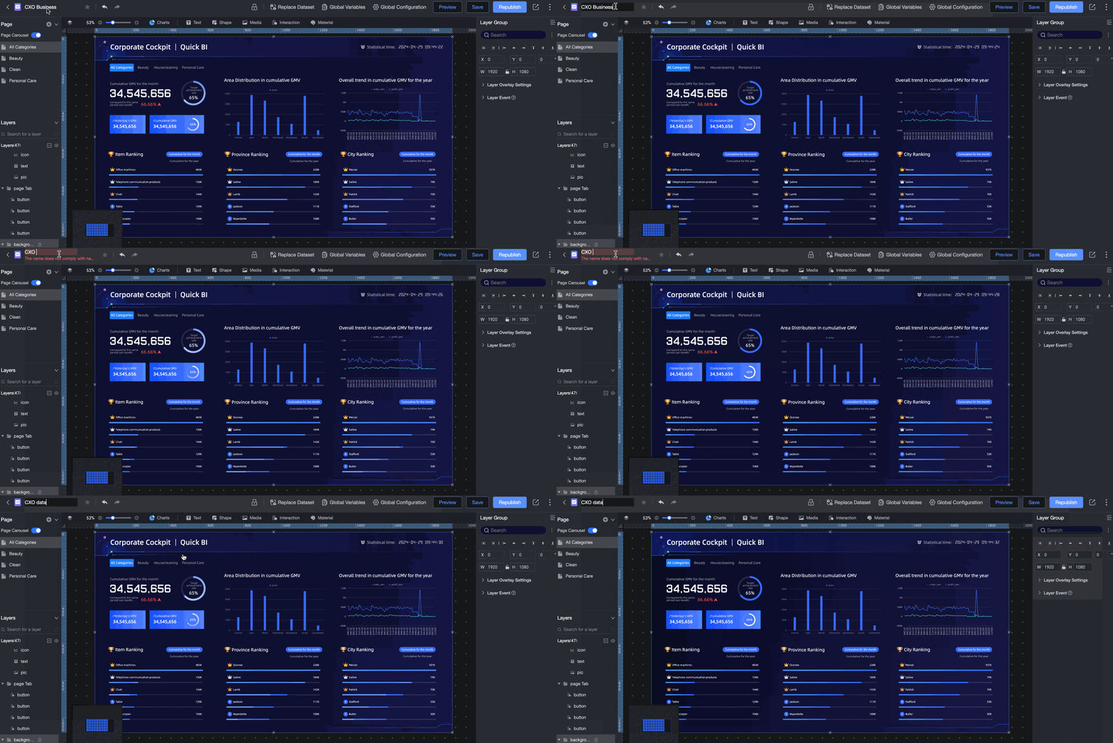
Edit Title.
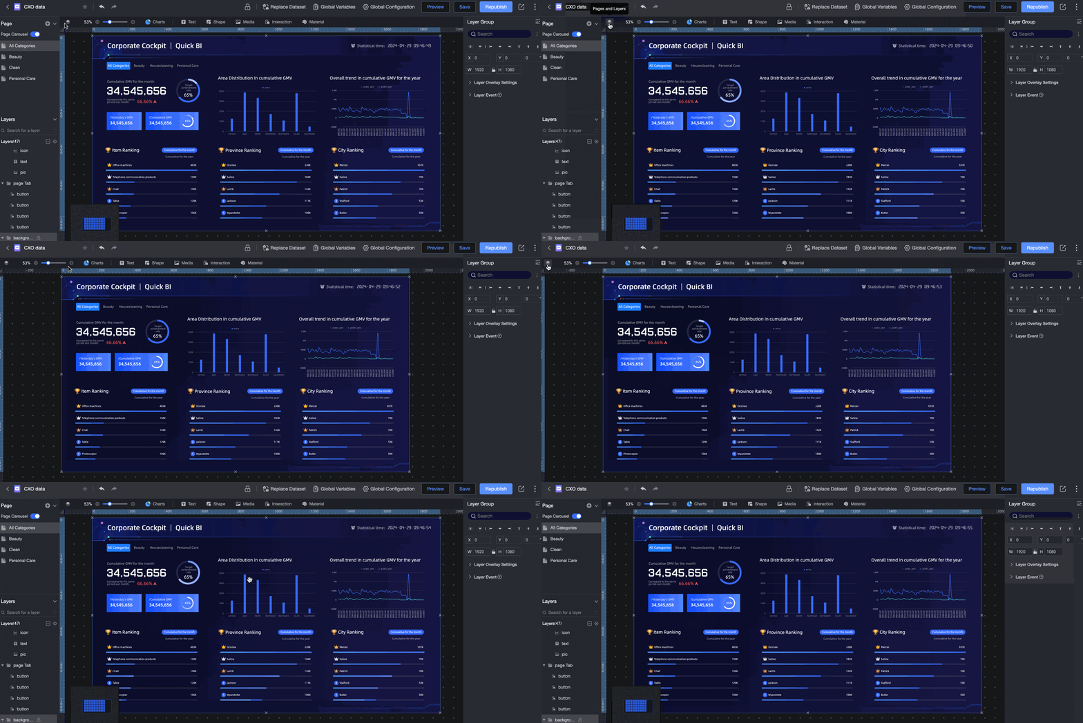
Expand Page and Layer.
Add to Favorites.
Adjust Canvas Scaling.
Undo/Redo.
Override Lock.
Replace Dataset.
Global Parameters.
Global Settings.
Share Link
More editing options.
Edit title
Expand page and layer
Adjust canvas scaling
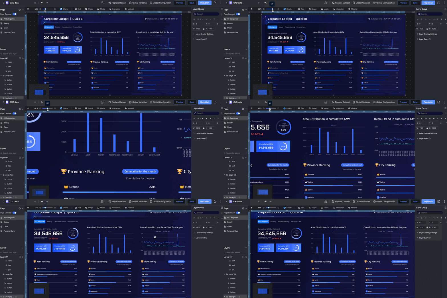
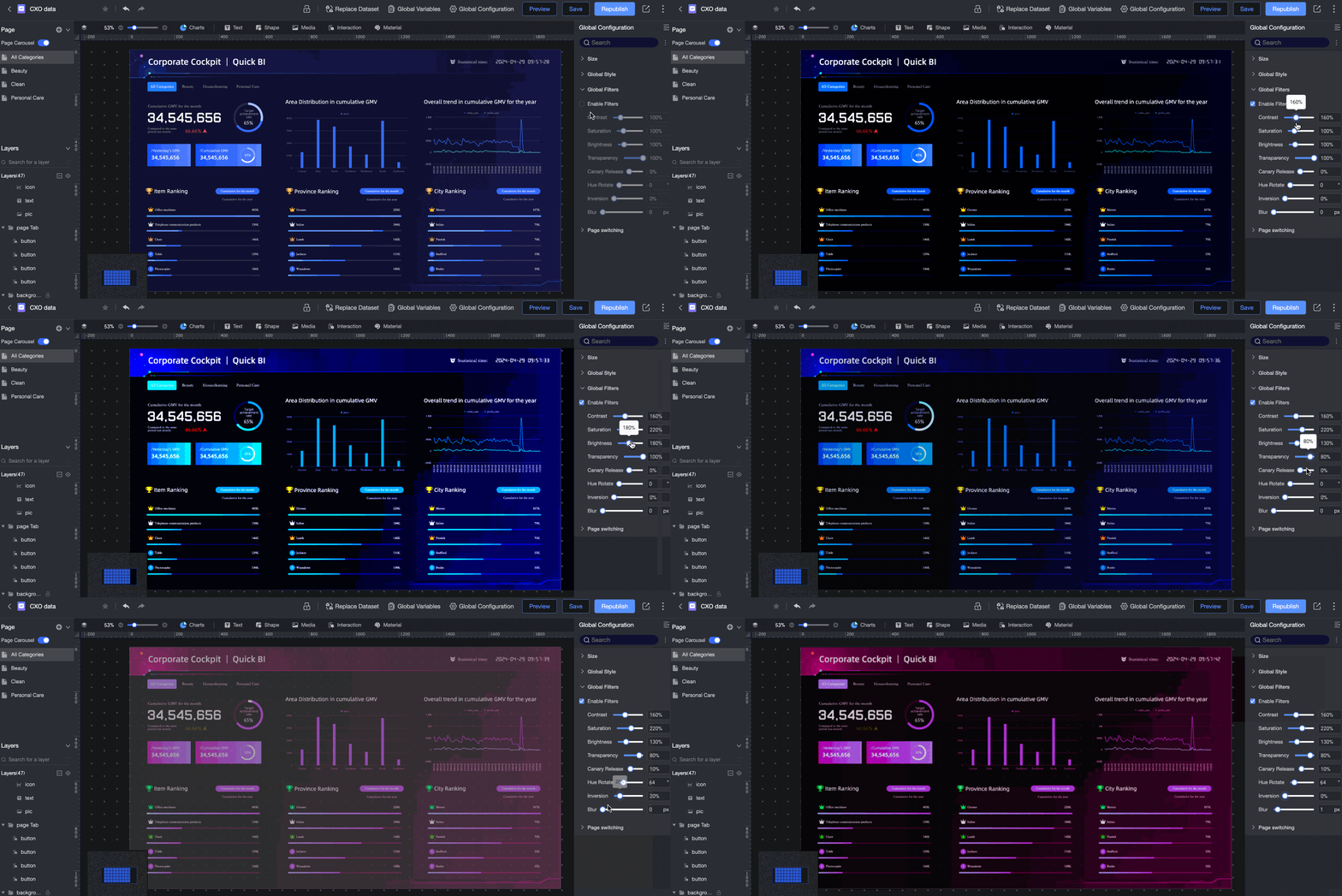
Global settings
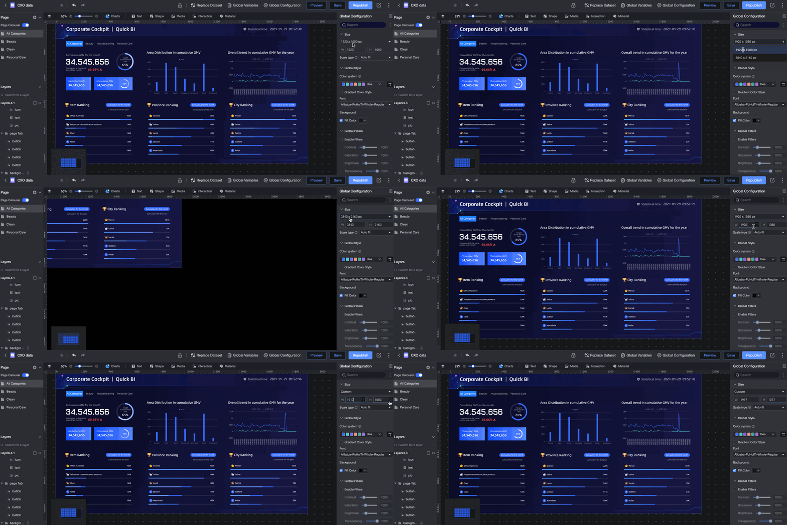
Adjust screen size

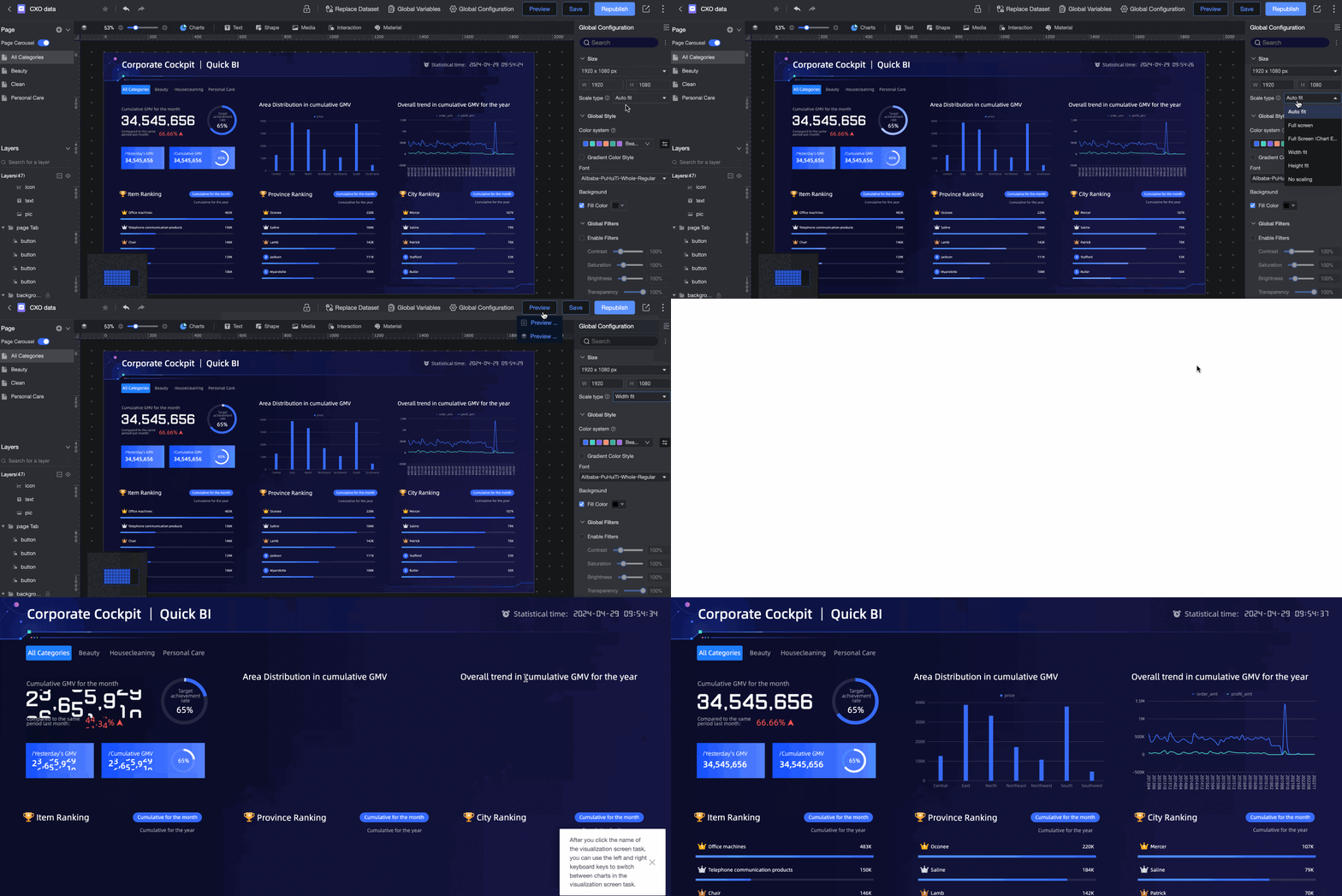
Set scaling mode
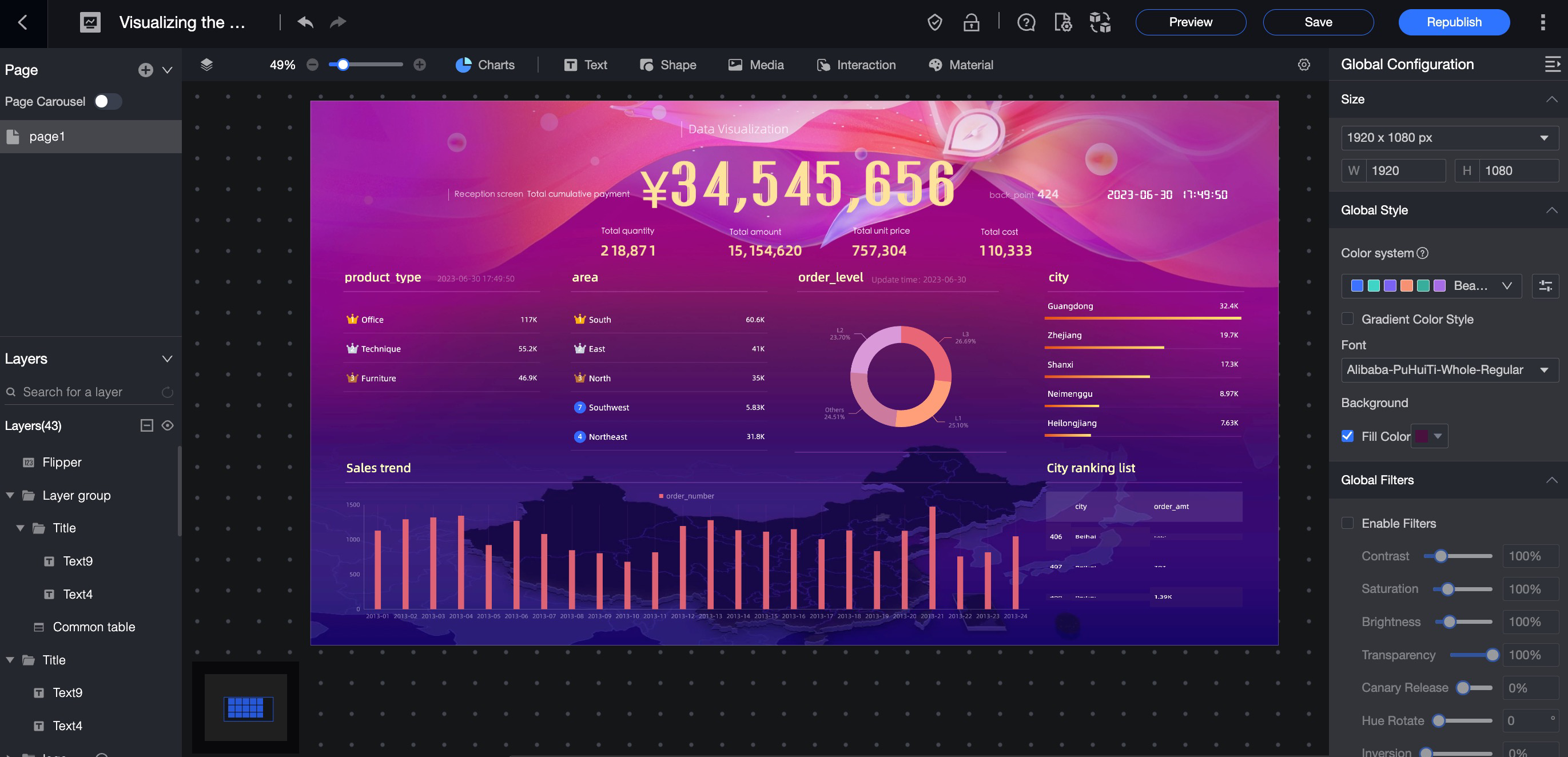
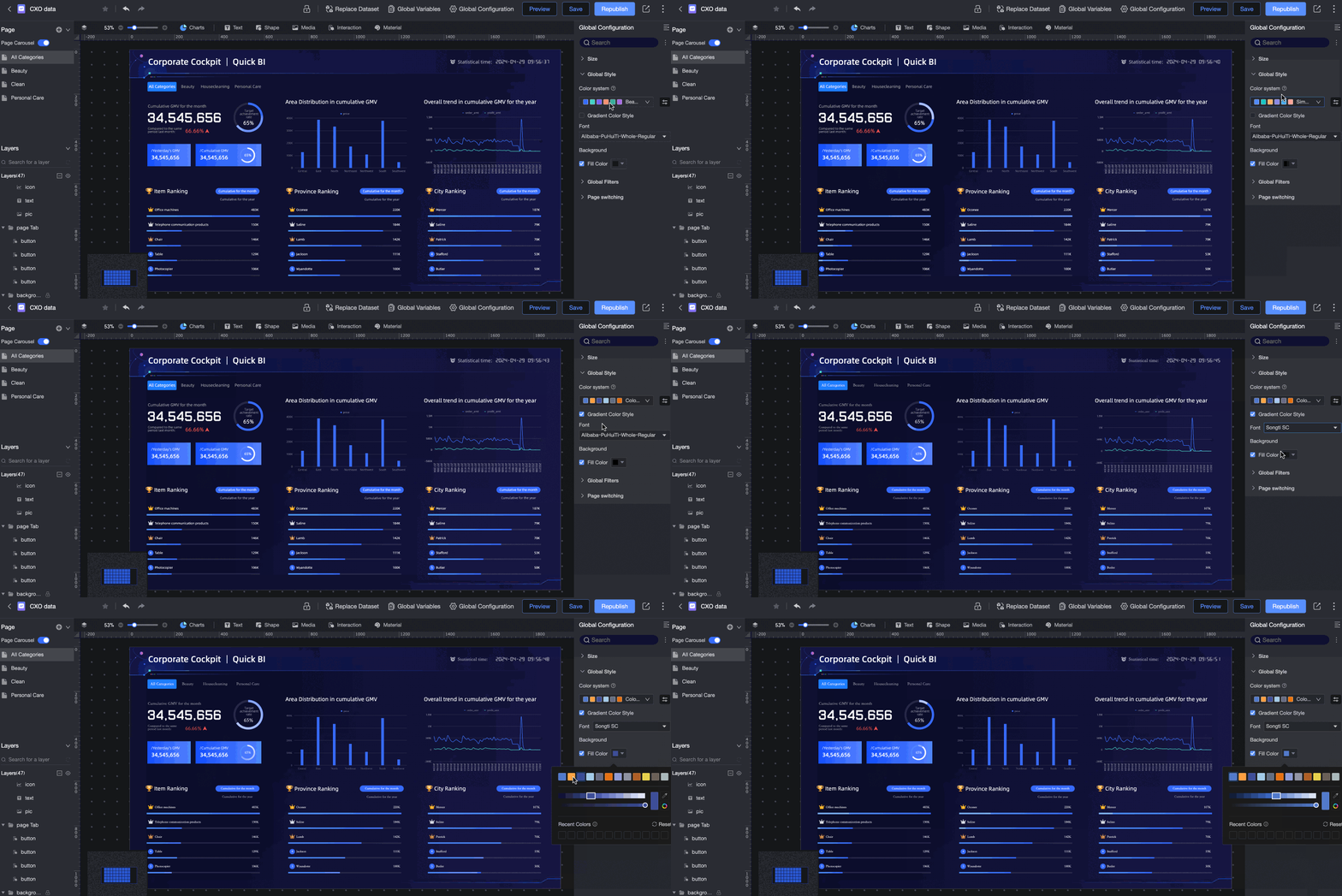
Set global styles
Set global filters
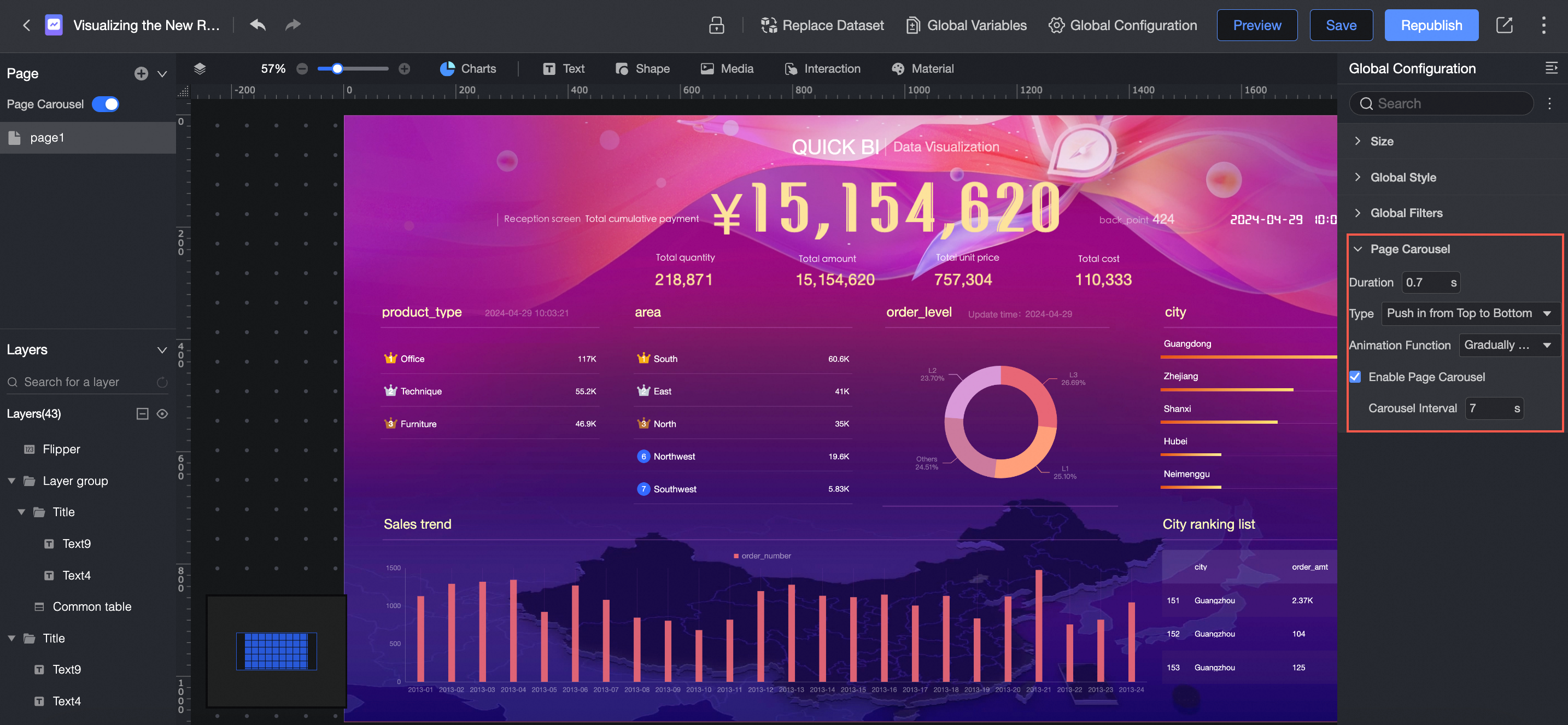
Set page carousel
Replace dataset
In the dashboard editor, click the  icon in the top toolbar to view all datasets used in the dashboard and perform a global dataset replacement.
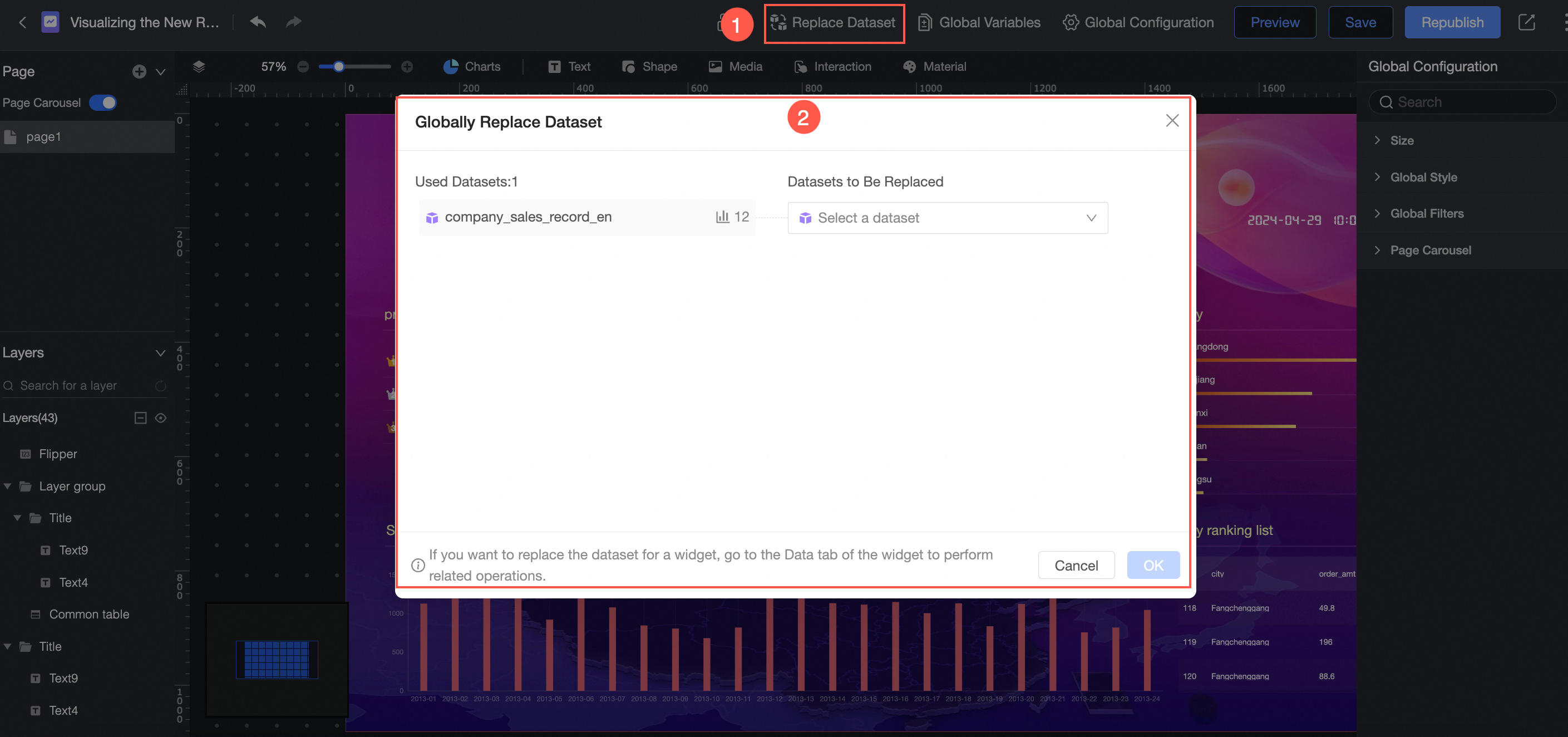
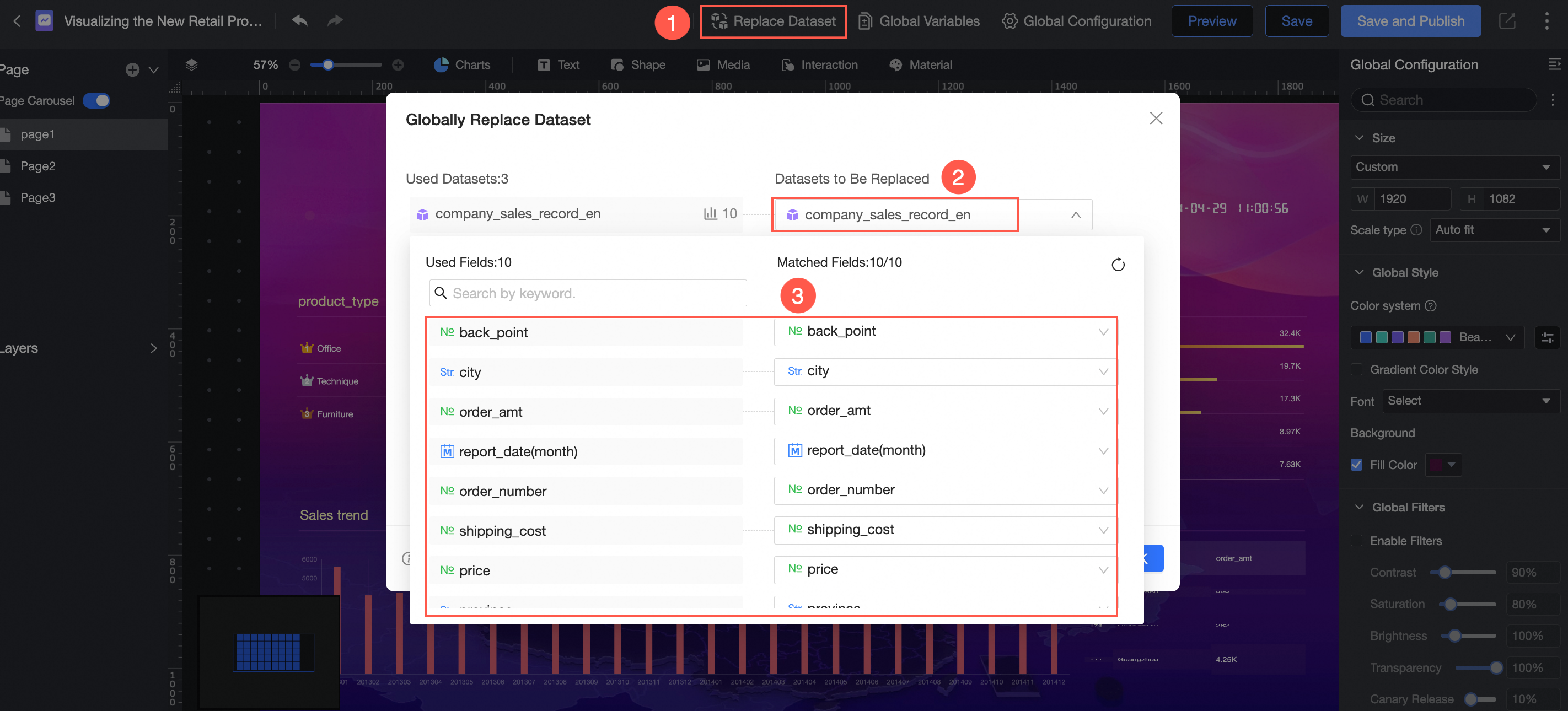
To replace a dataset in the Used Datasets list (①), select an existing dataset from the current workspace in the Replace Dataset section on the right (②). After making the selection, you must match the fields between the two datasets (③).
Matched fields must be of the same type.
Preview dashboard
You can access this feature from the following entry points: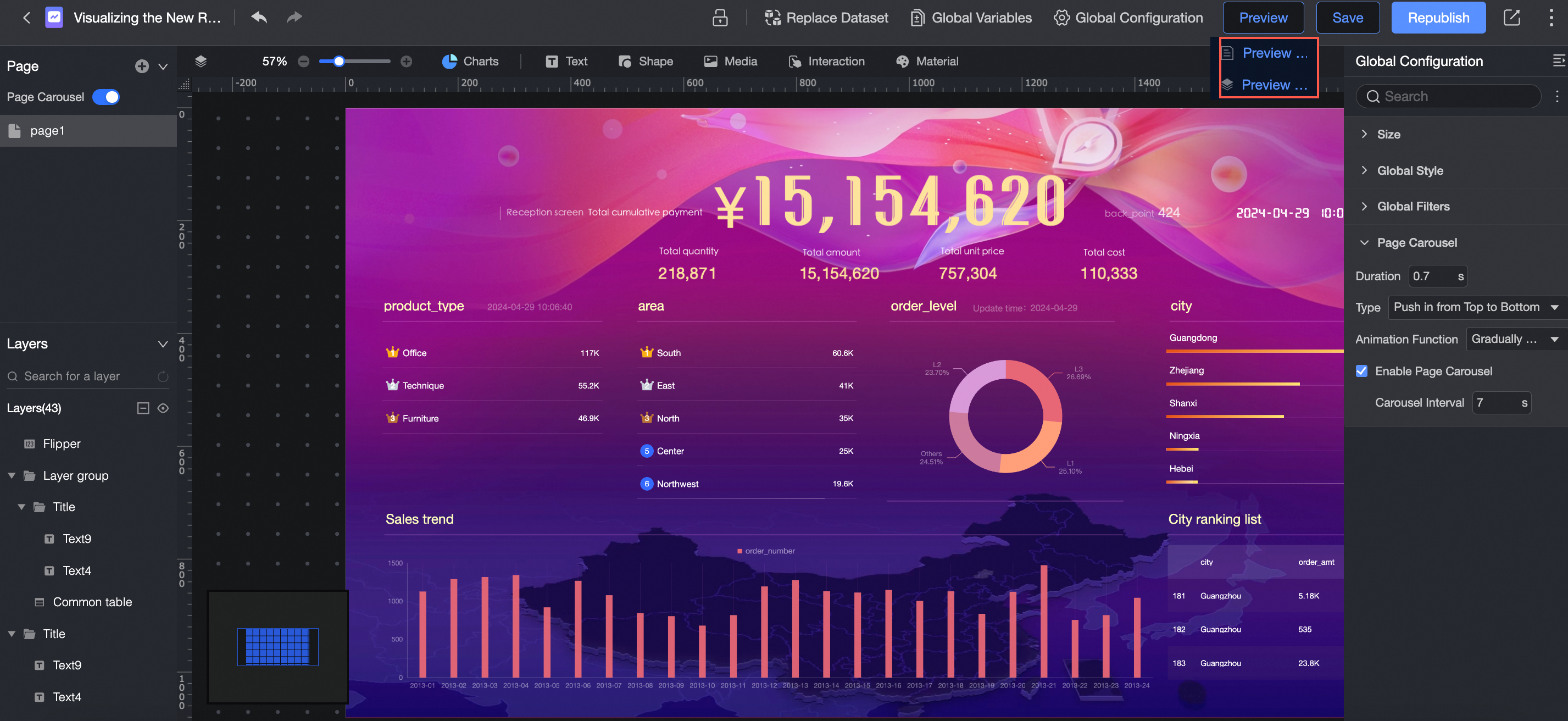
Preview page
This option previews only the current page while keeping the navigation bar visible.
Preview dashboard
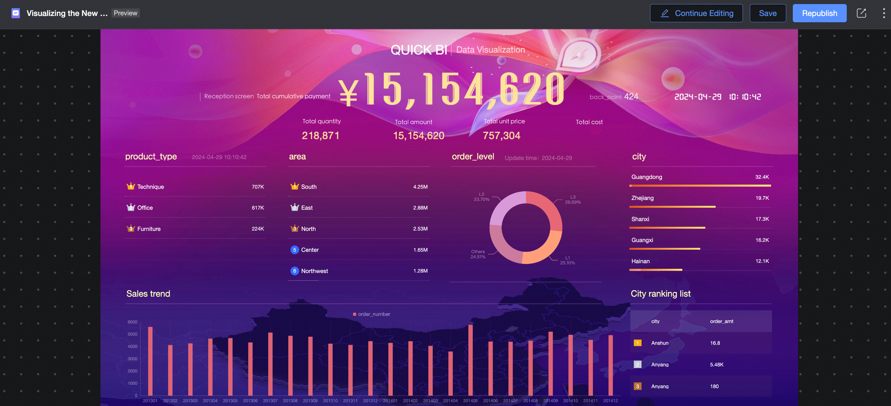
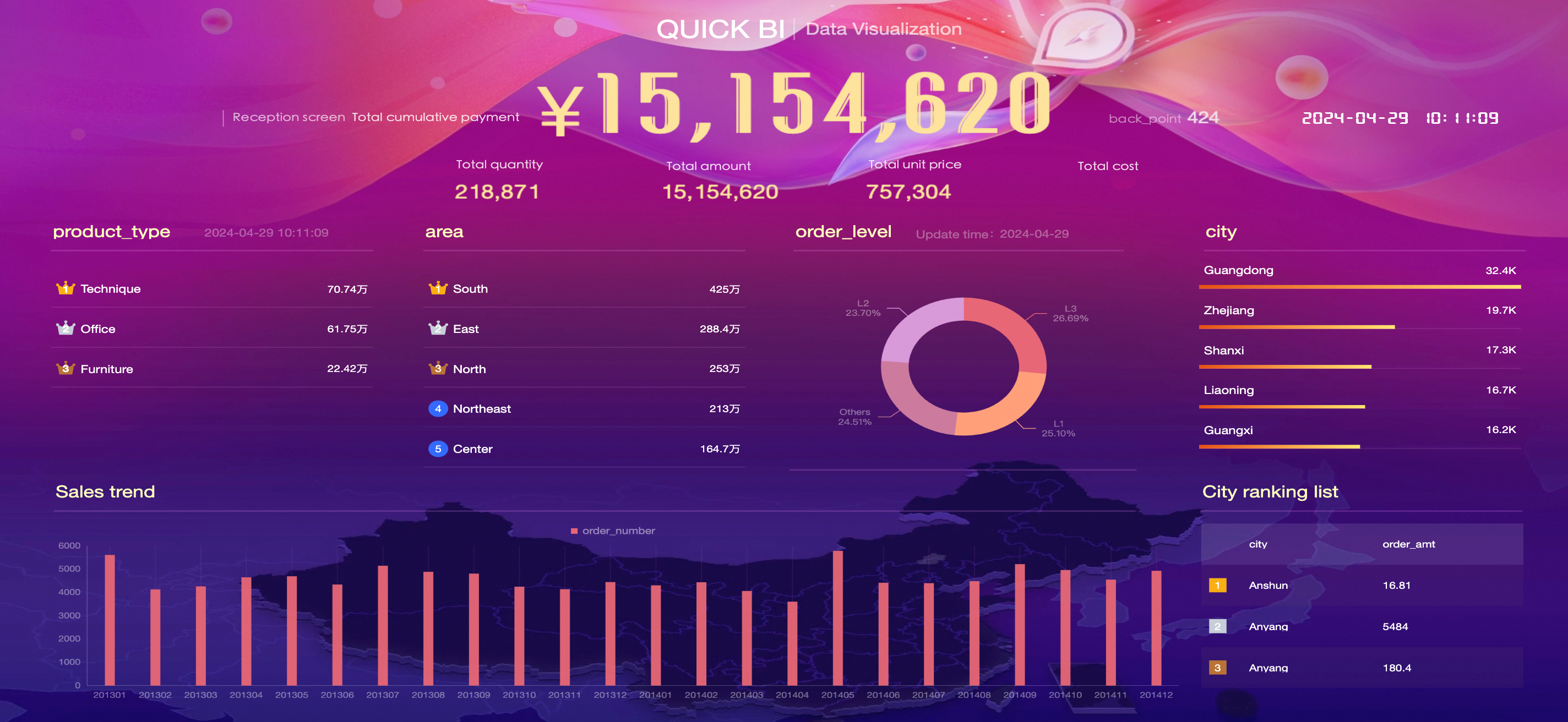
This option previews the entire dashboard, showing its final appearance. This preview includes multi-page effects if configured.
Save
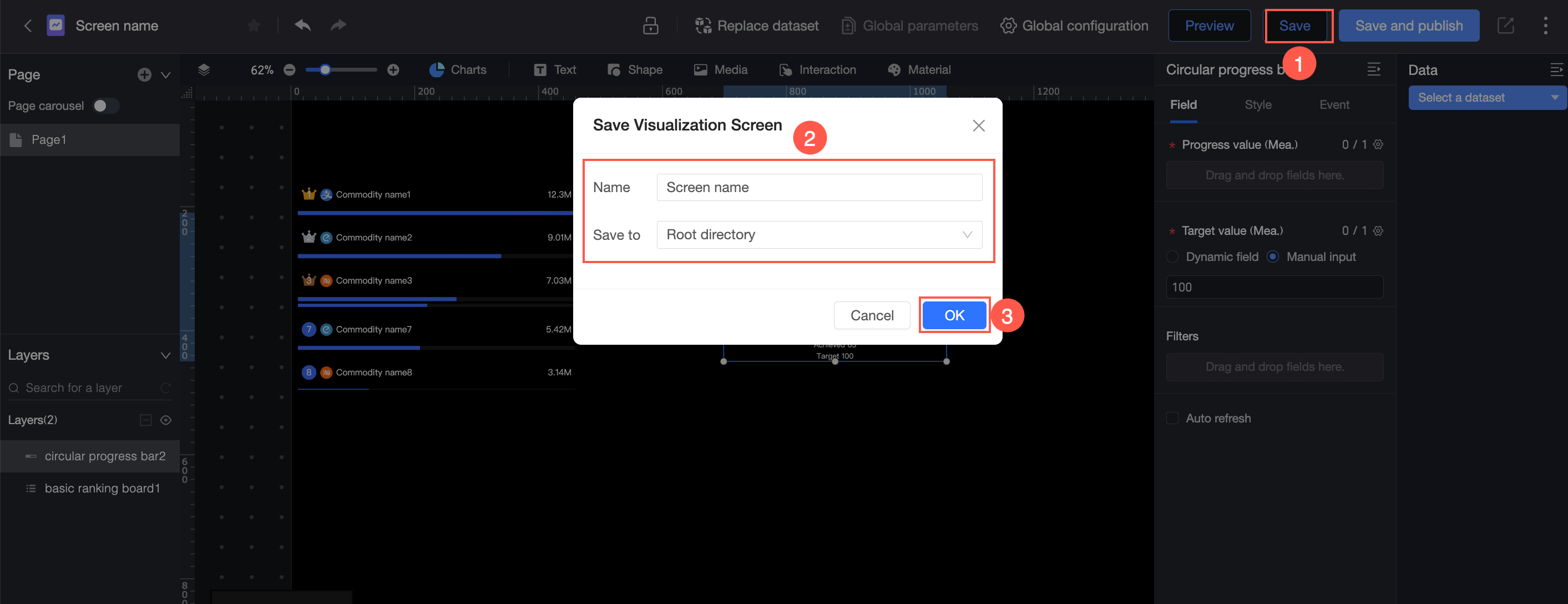
Click the Save button in the upper-right corner (①), edit the report name and select a location (②), and then click OK (③).
Saving a dashboard does not make your updates visible to other users:
When you create a new dashboard, its status is unpublished after saving. You must use the Save and Publish option to publish it.
To make updates to a published dashboard live, you must use the Republish option.
Save and publish
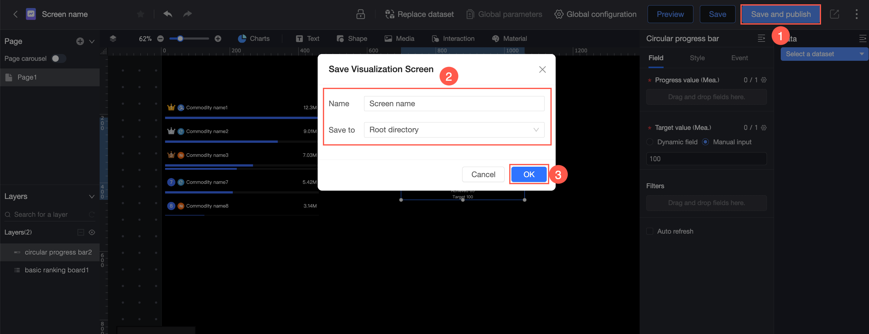
The Save and Publish feature saves your current work and publishes the dashboard. Click the Save and Publish button in the upper-right corner (①), edit the report name and select a location (②), and then click OK (③).
If the dashboard's workspace requires publication approval (that is, Publication is checked in the Approval Settings), you must select an approver and click Submit Application. You can also optionally enter a reason for the request. The dashboard is published only after your request is approved. For more information, see Create and manage a workspace.
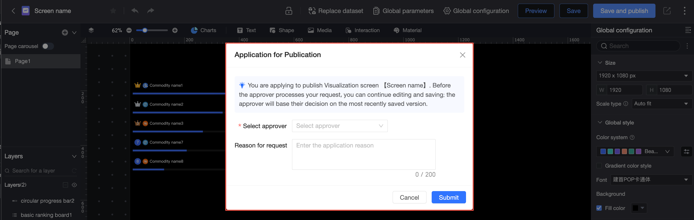
You can continue to edit the dashboard after submitting it for approval. The last saved version is the one that will be reviewed.
Workspace administrators can publish without approval.
Republish
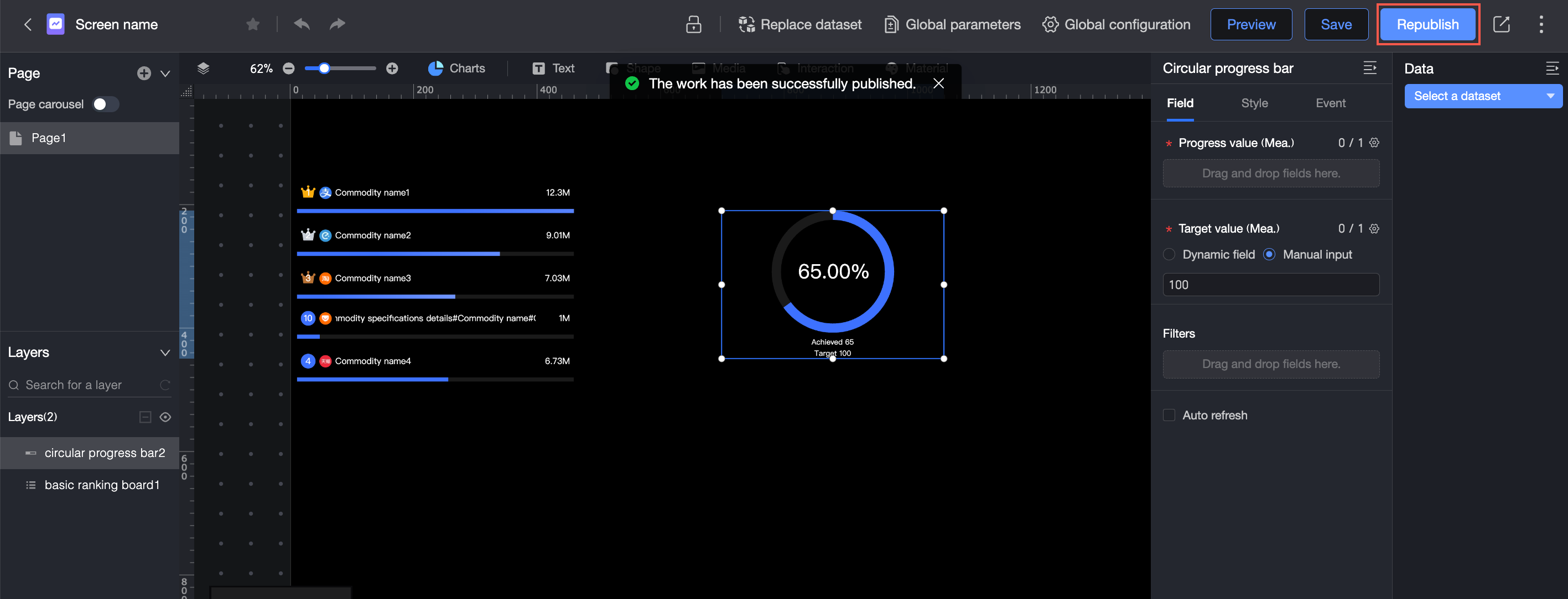
When you update a published dashboard, its status changes to Saved but Not Published, and an update prompt appears in the editor. Use the Republish feature to release the new content to users.
 If the dashboard's workspace requires publication approval (that is, Publication is checked in the Approval Settings), you must submit each republication for approval. The changes go live only after approval. For more information, see Create and manage a workspace.
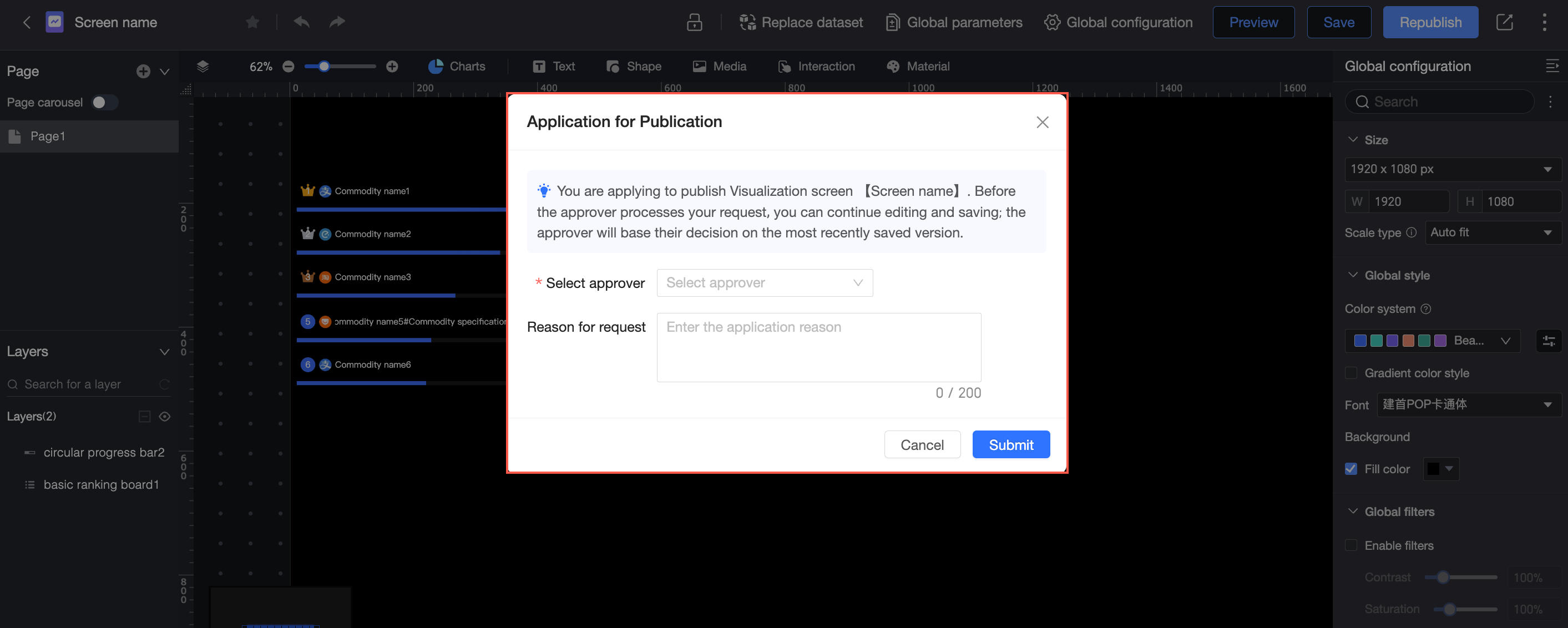
You can continue to edit the dashboard after submitting it for republication. If you save your changes, the last saved version will be the one submitted for approval.
Workspace administrators can republish without approval.
Share and make public
A dashboard must be published before it can be shared or made public.
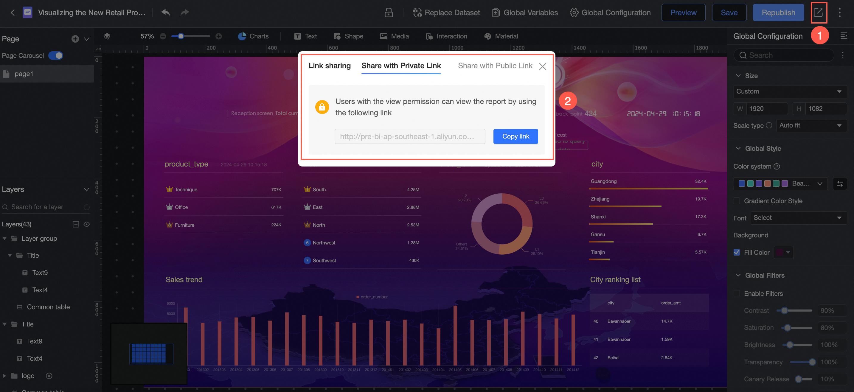
Private link sharing: Generates a link that can be accessed by users with permissions.
Public link sharing: Generates a link that can be accessed by anyone within its validity period, without needing to log in to an Alibaba Cloud account.
Save as
You can change the name and location of the dashboard.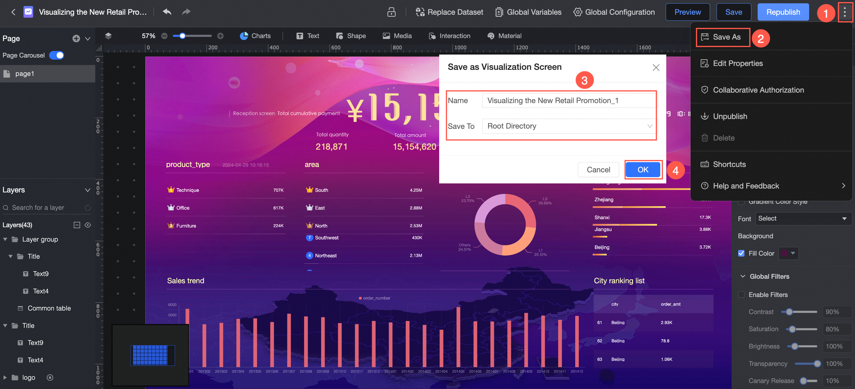
Properties
You can edit the title, change the owner, or add notes to the dashboard.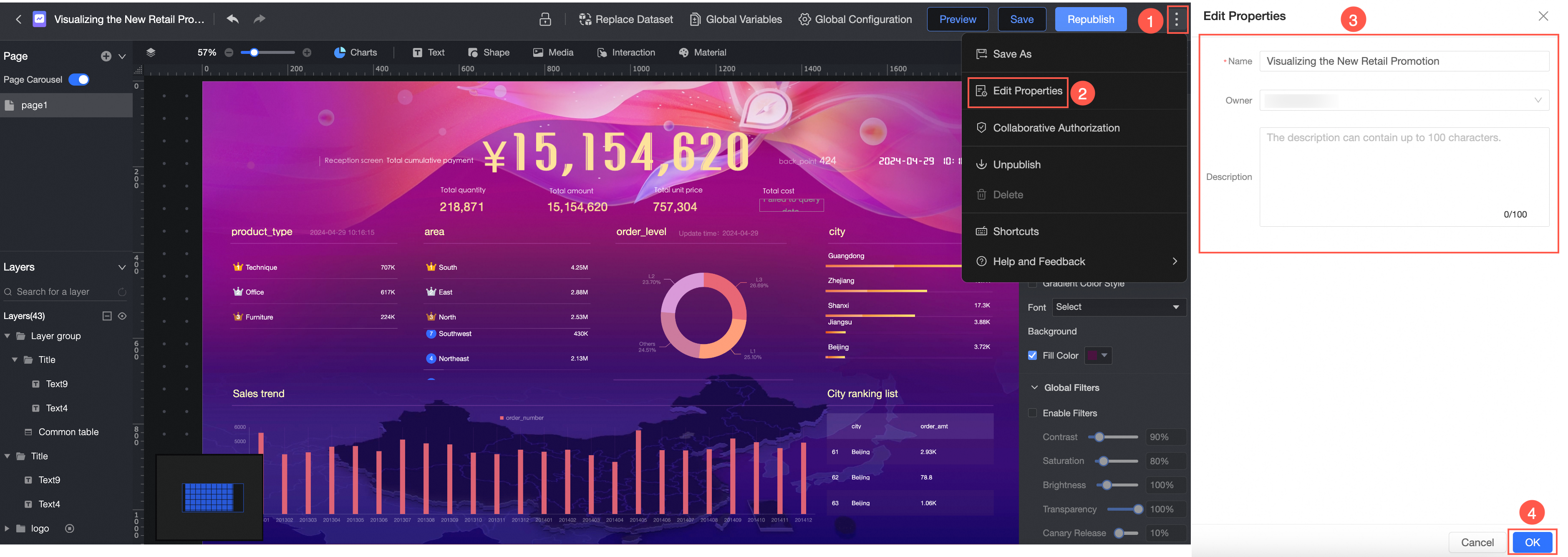
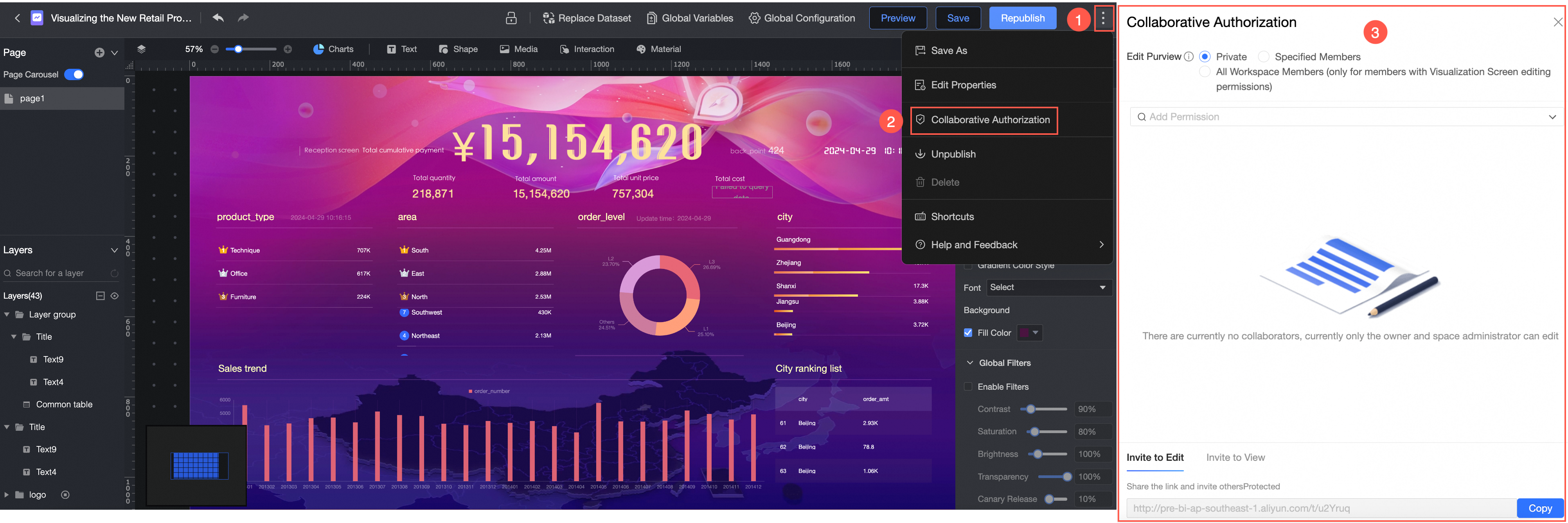
Collaboration permissions
You can customize editing permissions. For details, see Authorization settings.
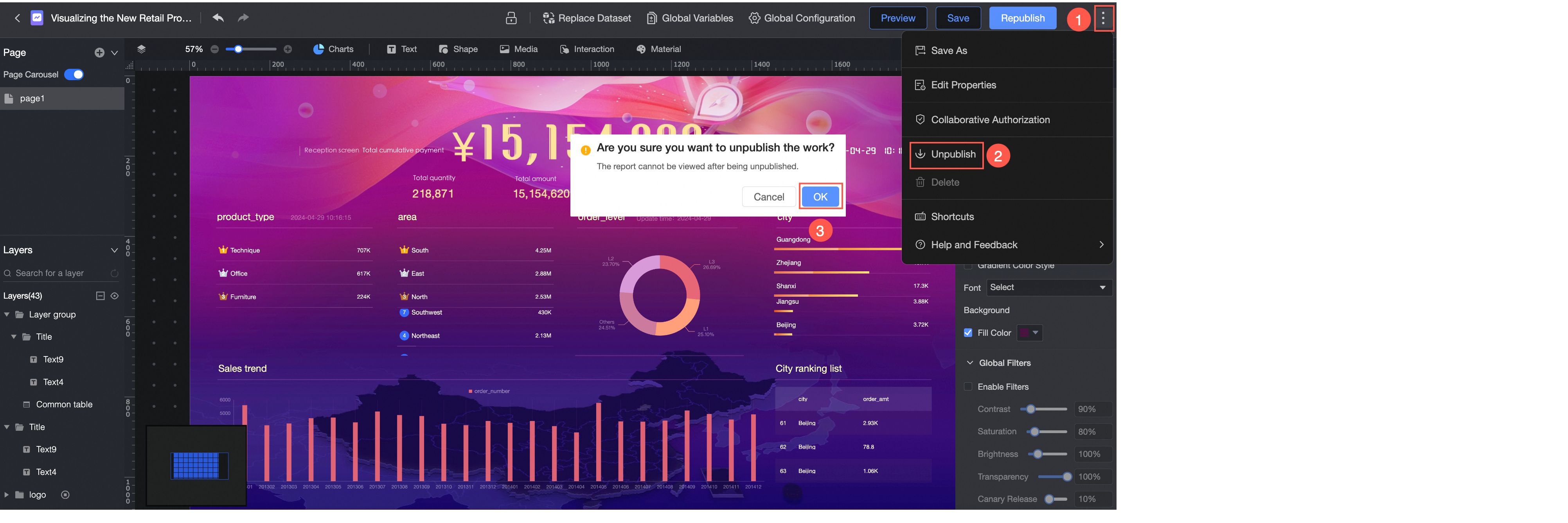
Unpublish
Only published dashboards can be unpublished.
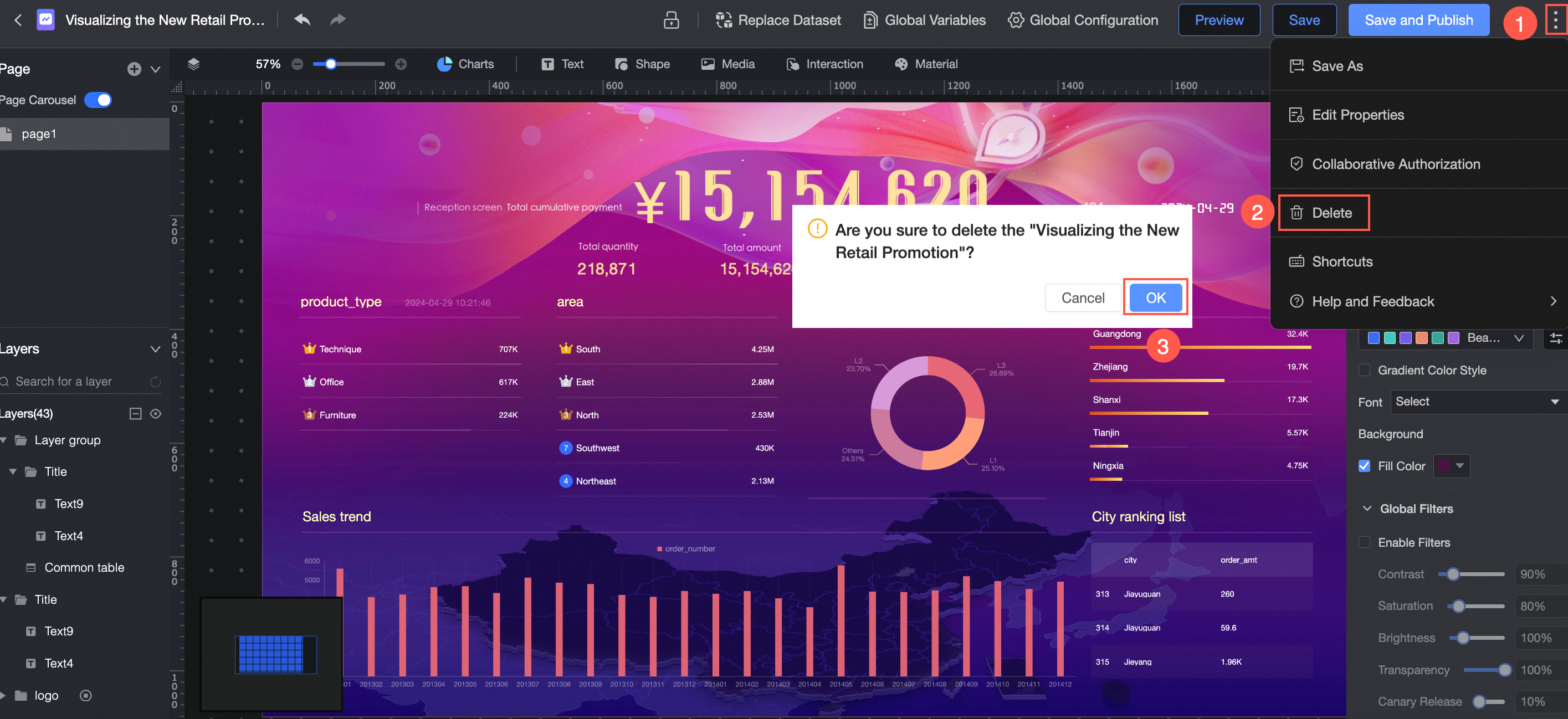
Delete
You can delete a dashboard only if it is unpublished or in the "Saved but Not Published" state.
Shortcuts
Shortcuts may vary depending on the operating system.
Function | Shortcut (Windows) | Shortcut (macOS) |
Multi-select | Ctrl+Left-click | Command (⌘)+Left-click |
Undo | Ctrl+Z | Command (⌘)+Z |
Redo | Ctrl+Shift+Z | Command (⌘)+Shift (⇧)+Z |
Group | Ctrl+G | Command (⌘)+G |
Ungroup | Ctrl+Shift+G | Command (⌘)+Shift (⇧)+G |
Bring Forward | Ctrl+] | Command (⌘)+] |
Send Backward | Ctrl+[ | Command (⌘)+[ |
Bring to Front | Ctrl+Shift+] | Option (⌥)+Command (⌘)+] |
Send to Back | Ctrl+Shift+[ | Option (⌥)+Command (⌘)+[ |
Cut | Ctrl+X | Command (⌘)+X |
Copy | Ctrl+C | Command (⌘)+C |
Paste | Ctrl+V | Command (⌘)+V |
Lock | Ctrl+L | Command (⌘)+L |
Hide | Ctrl+H | Command (⌘)+H |
Delete | Backspace (←) | Delete (⌫) |
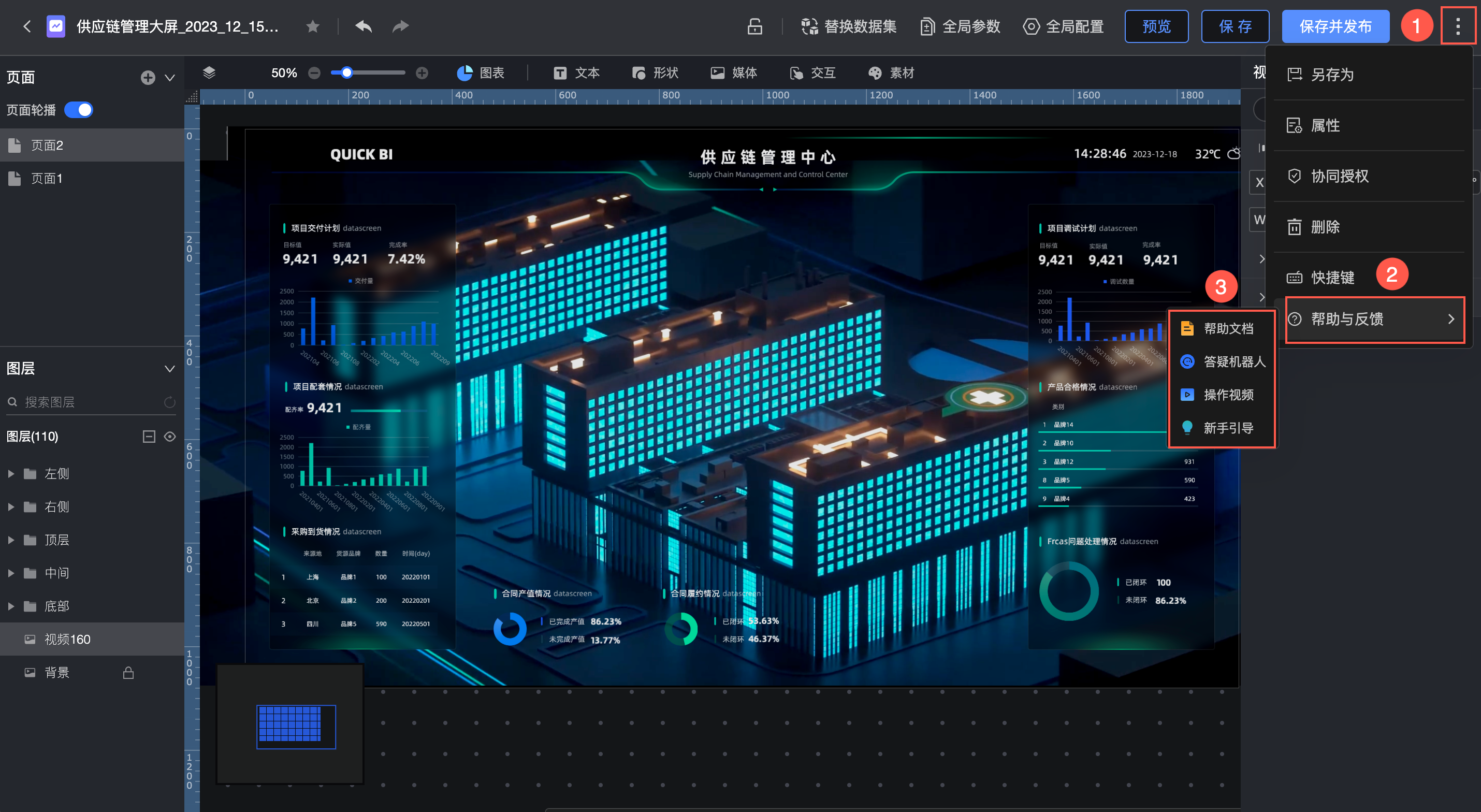
Help and feedback
If you are new to dashboards, you can find introductory tutorials such as Help Documents, the Q&A Bot, Tutorial Videos, and the Newbie Guide within the Help and Feedback section.
Component library
The dashboard component library provides eight types of charts, along with a rich selection of text, shapes, media, interactive controls, and materials for diverse dashboard designs.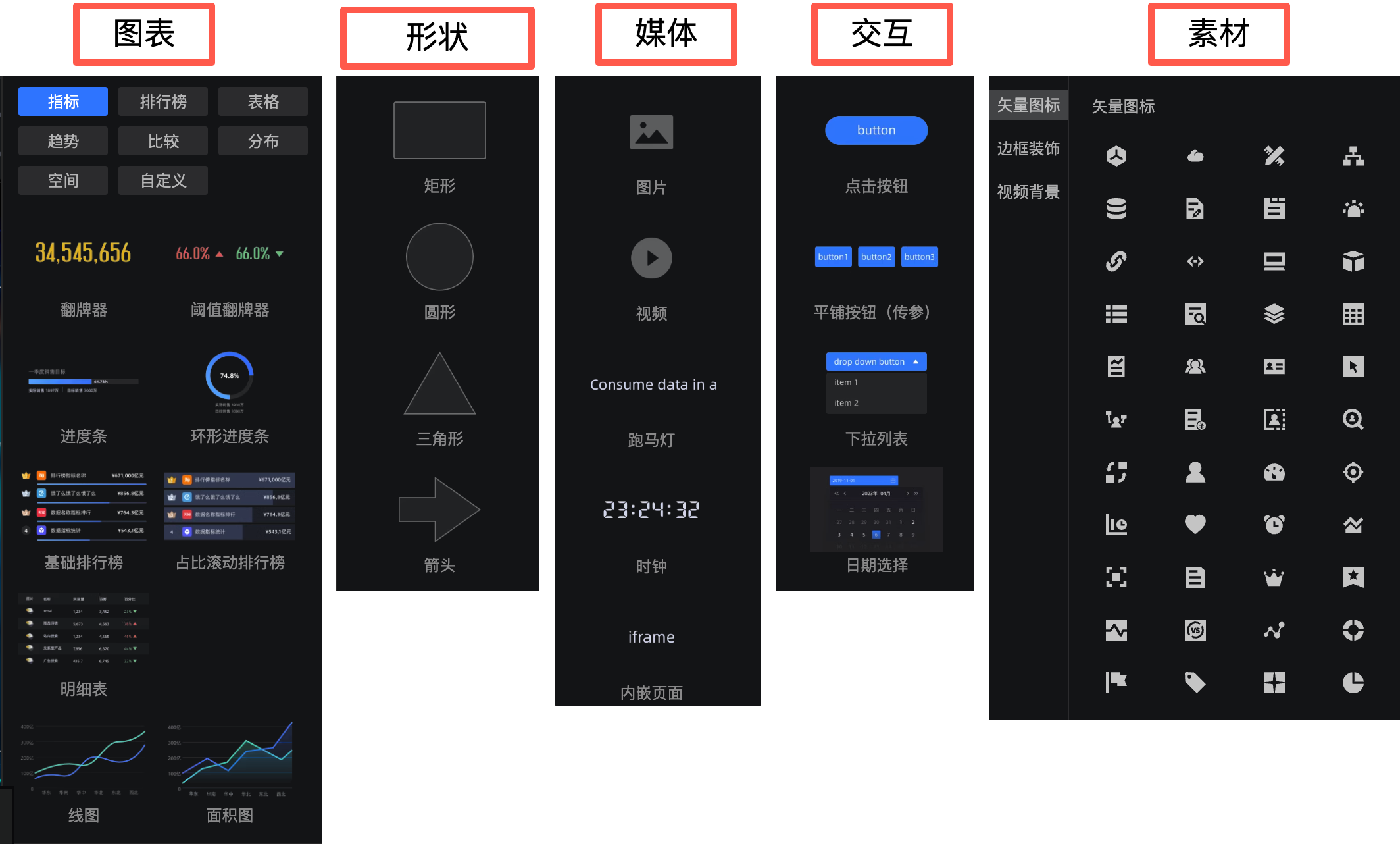
You can access the component library from the panel on the left side of the editor: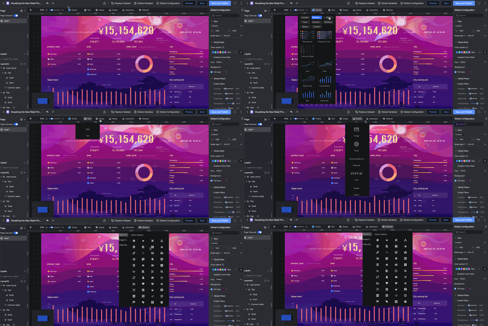
Charts
Indicator
Media
Interaction
Materials
Page configuration pane
You can add a maximum of 10 pages.
Lets you add pages, set up a page carousel, and hide or delete pages.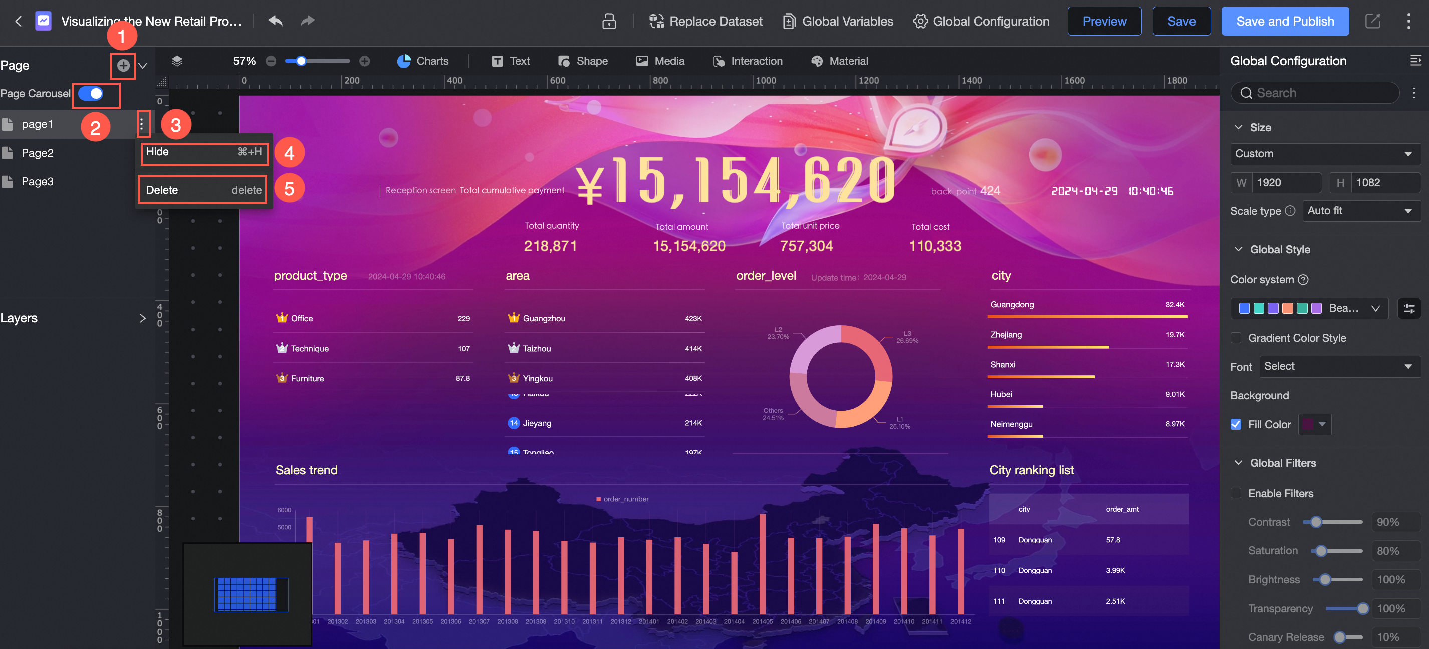
The following figure shows an example.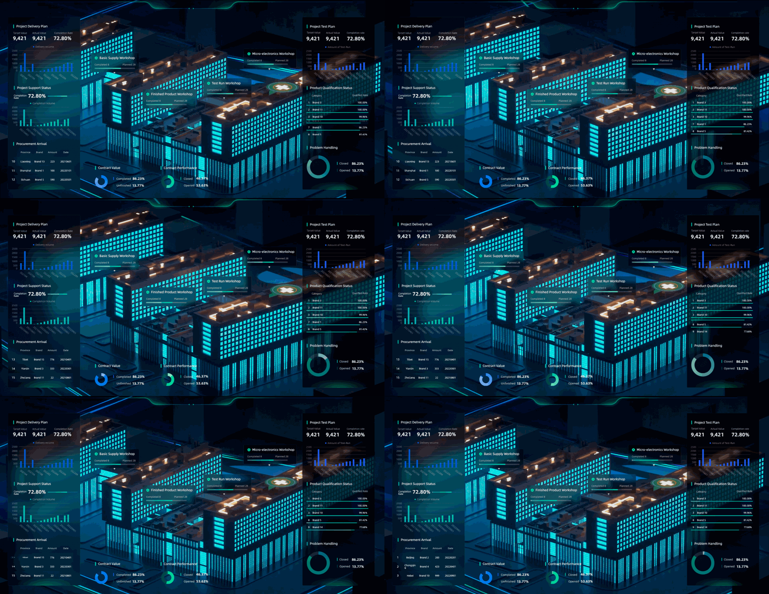
Layer configuration pane
Supports multiple layers. You can configure layer groups, create layer carousels, and lock or hide layers.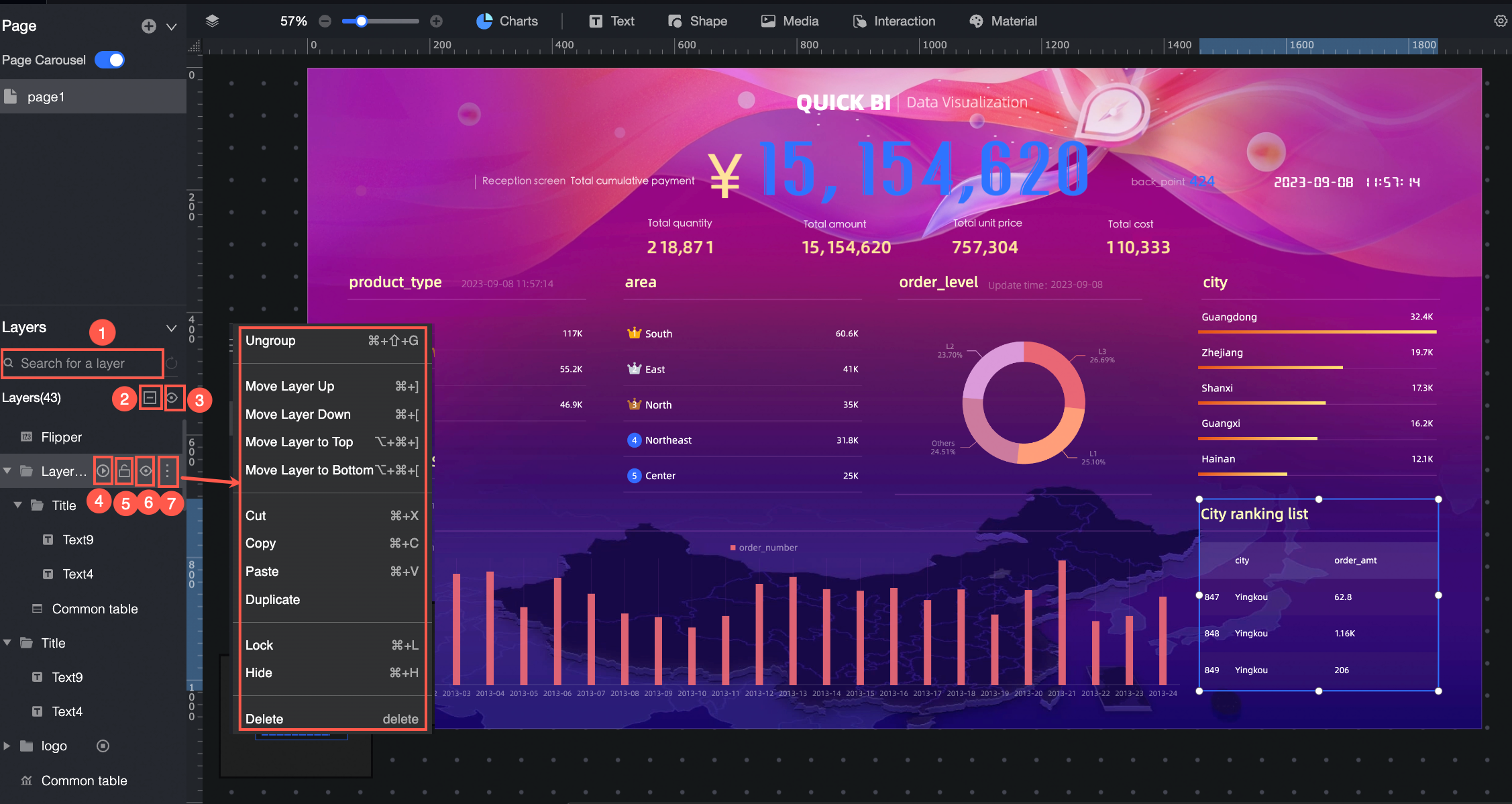
Canvas configuration pane
Drag components from the Component Library onto the canvas.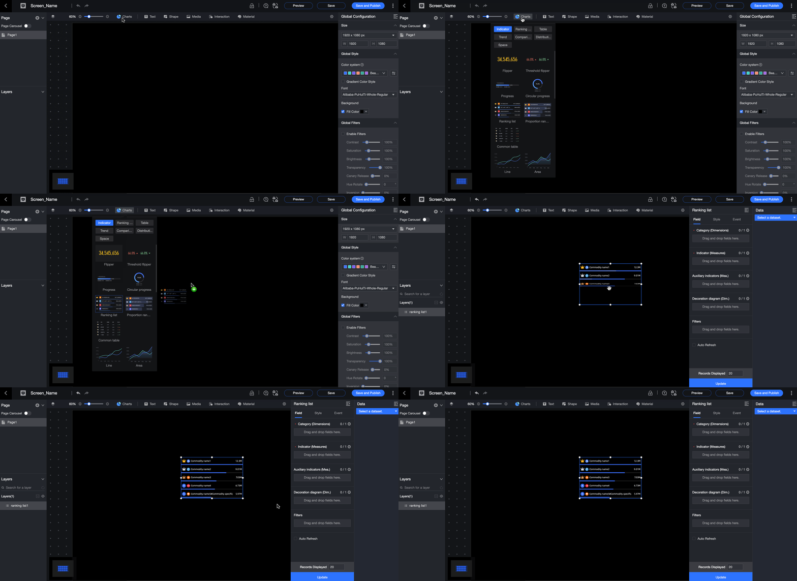
The canvas provides flexible layout options. You can drag components, move them with pixel-level precision, and perform actions such as cut, copy, lock, hide, and group.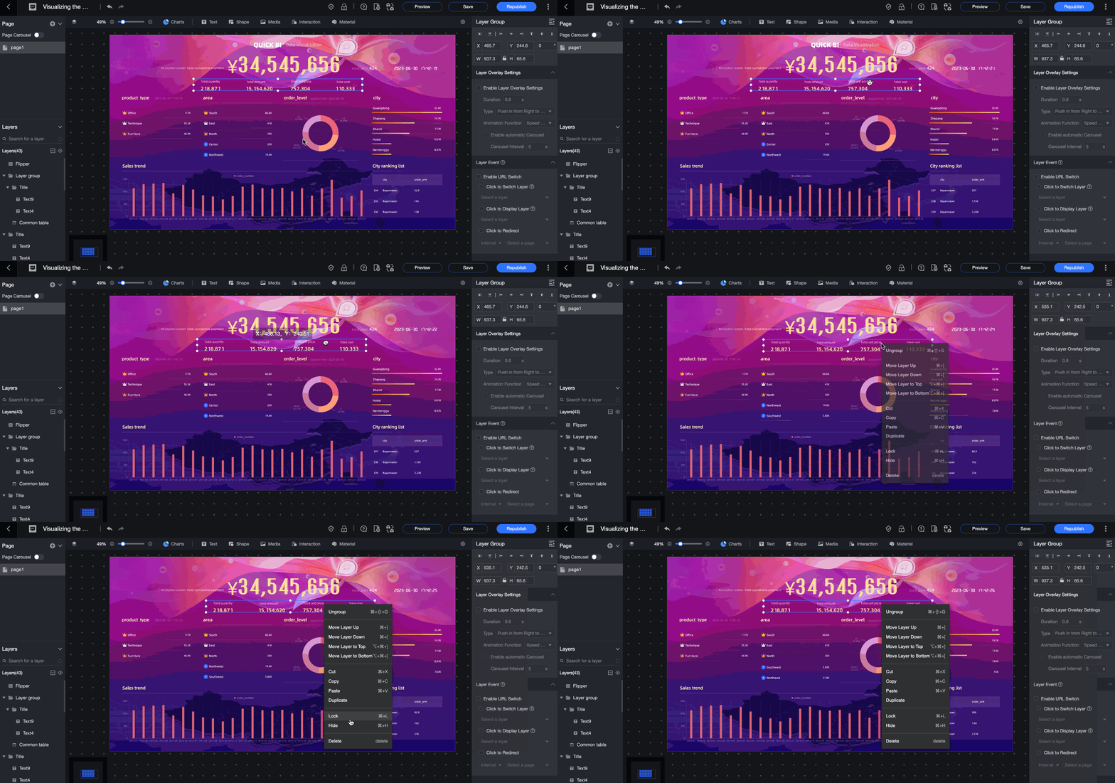
Component configuration pane
Add fields
This example uses a card.
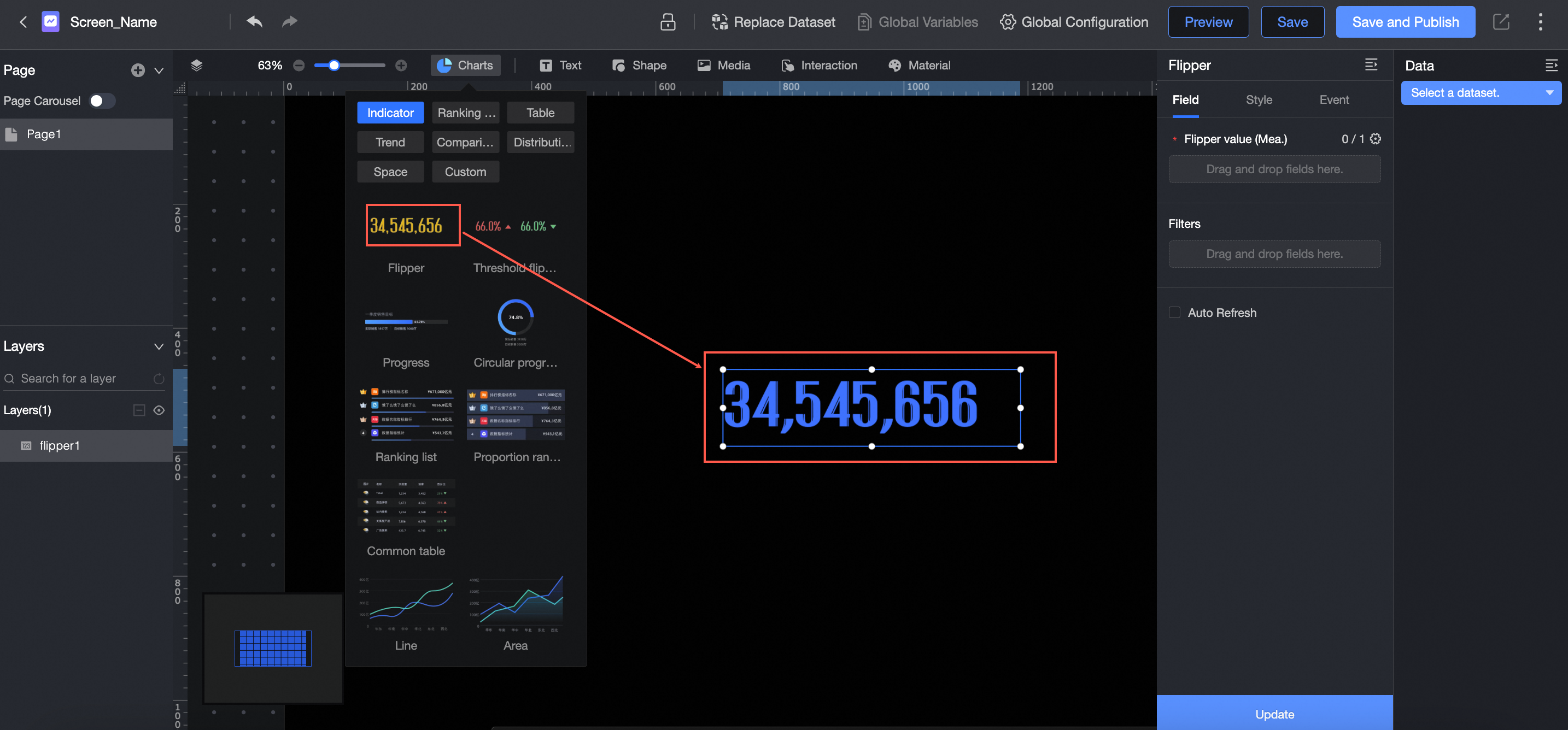
In the Charts section of the Component Library, find the Card component and drag it onto the canvas.
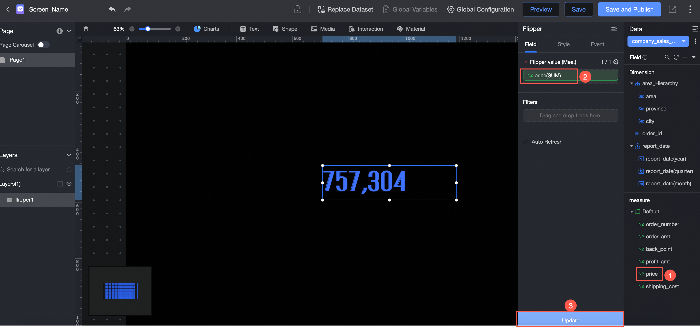
Click Please select a dataset and follow the instructions in the figure below to add data.
Configure styles
Detailed style properties: You can configure styles at the chart element level. Colors, fonts, positions, arrangements, width, height, and opacity are all fully configurable.
Rich animation effects: Supports animations such as streaming light, page turning, and scrolling.
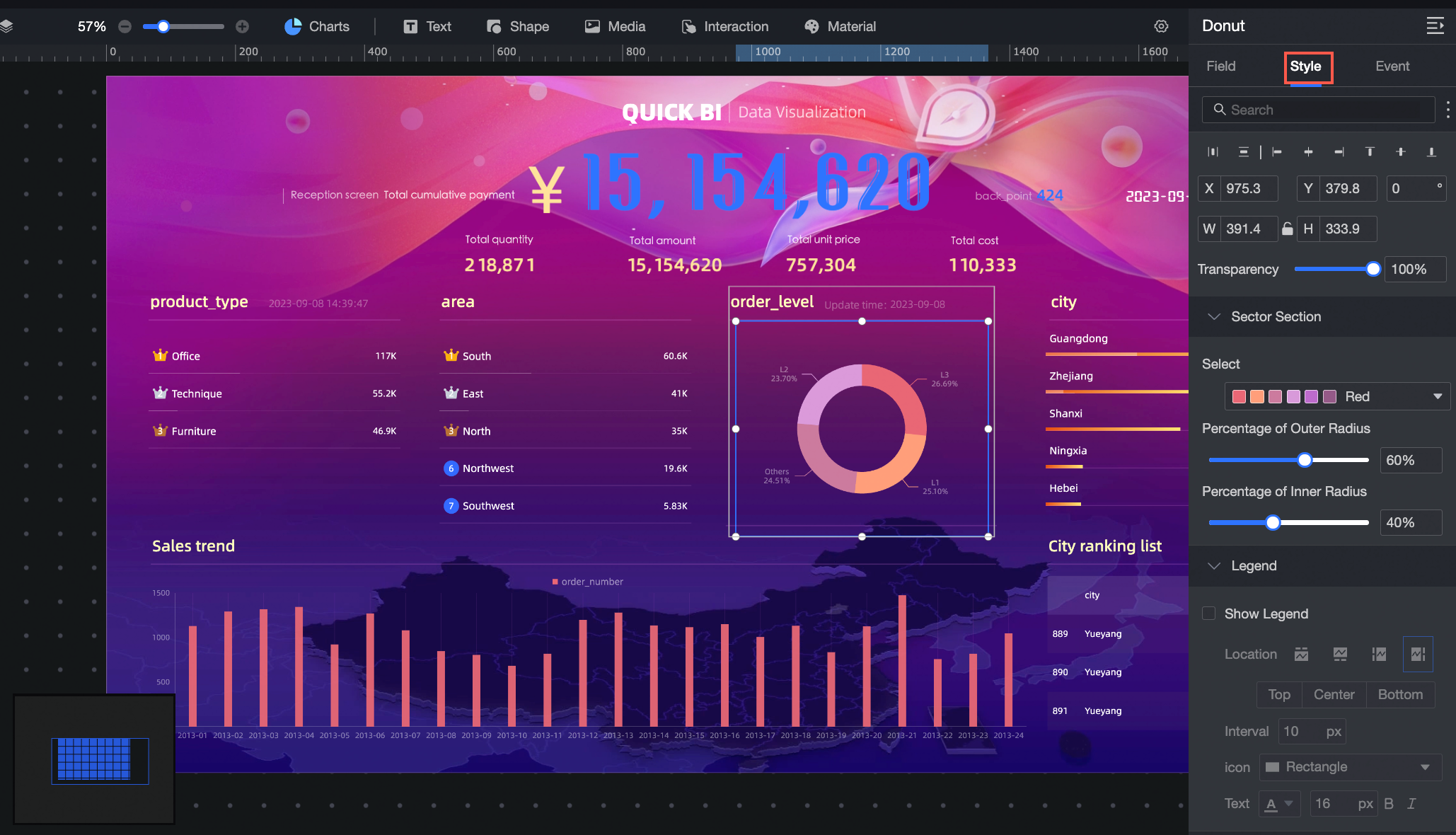
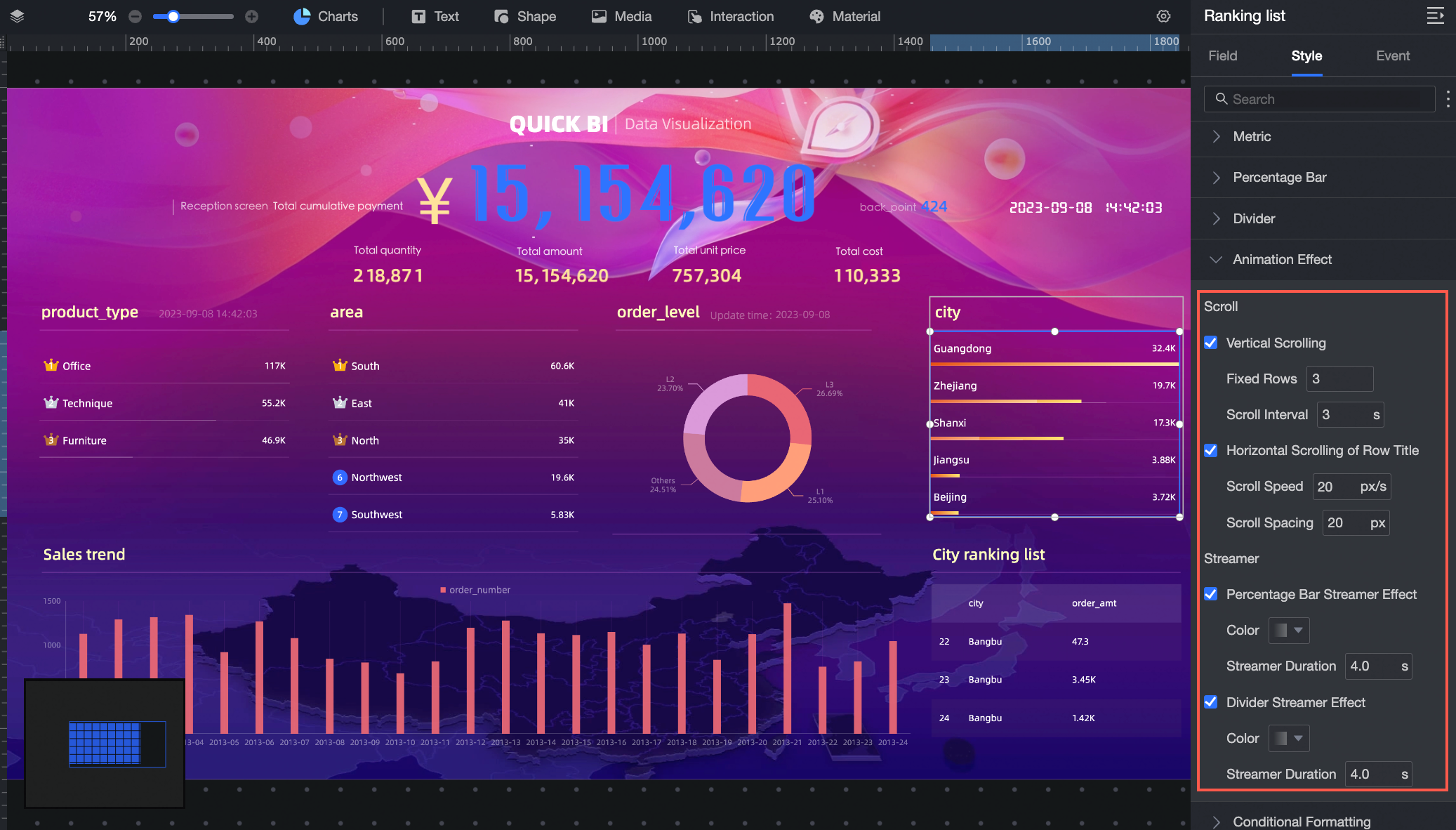
For more information, see Configure chart styles.
Data processing pane
Allows you to select datasets, add data, modify data formats, and process data.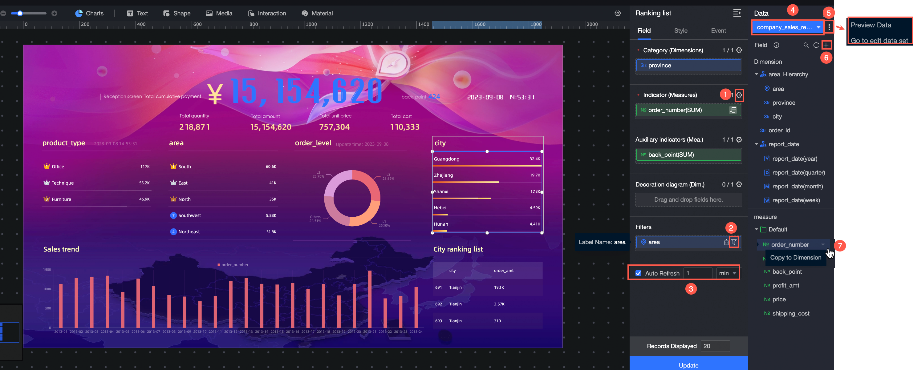 For more operations, see Configure chart data.